We create brands that are deeply connected to vision, rich with meaning, and crafted to inspire, align, and endure. Beautiful Brand Intelligence.
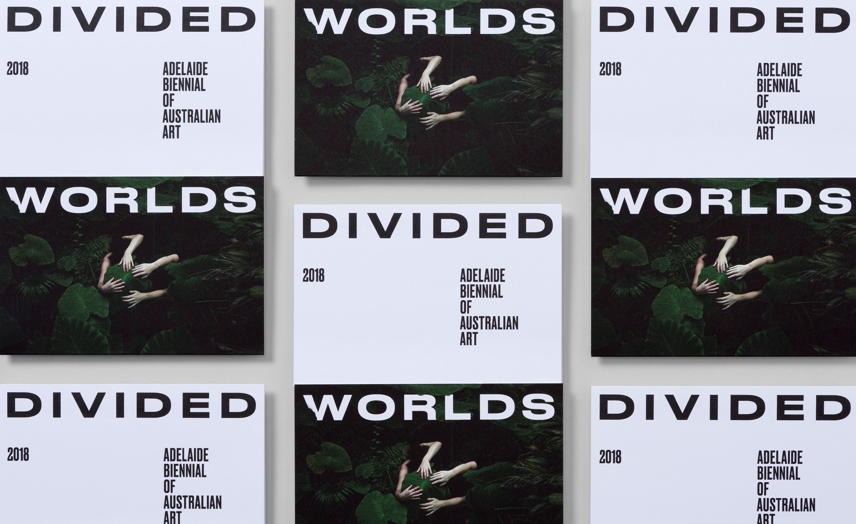
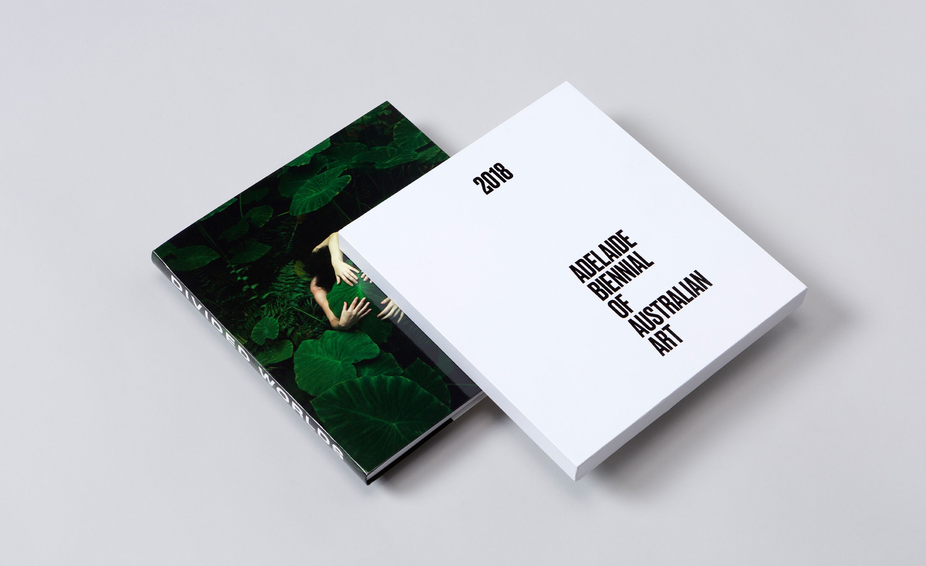
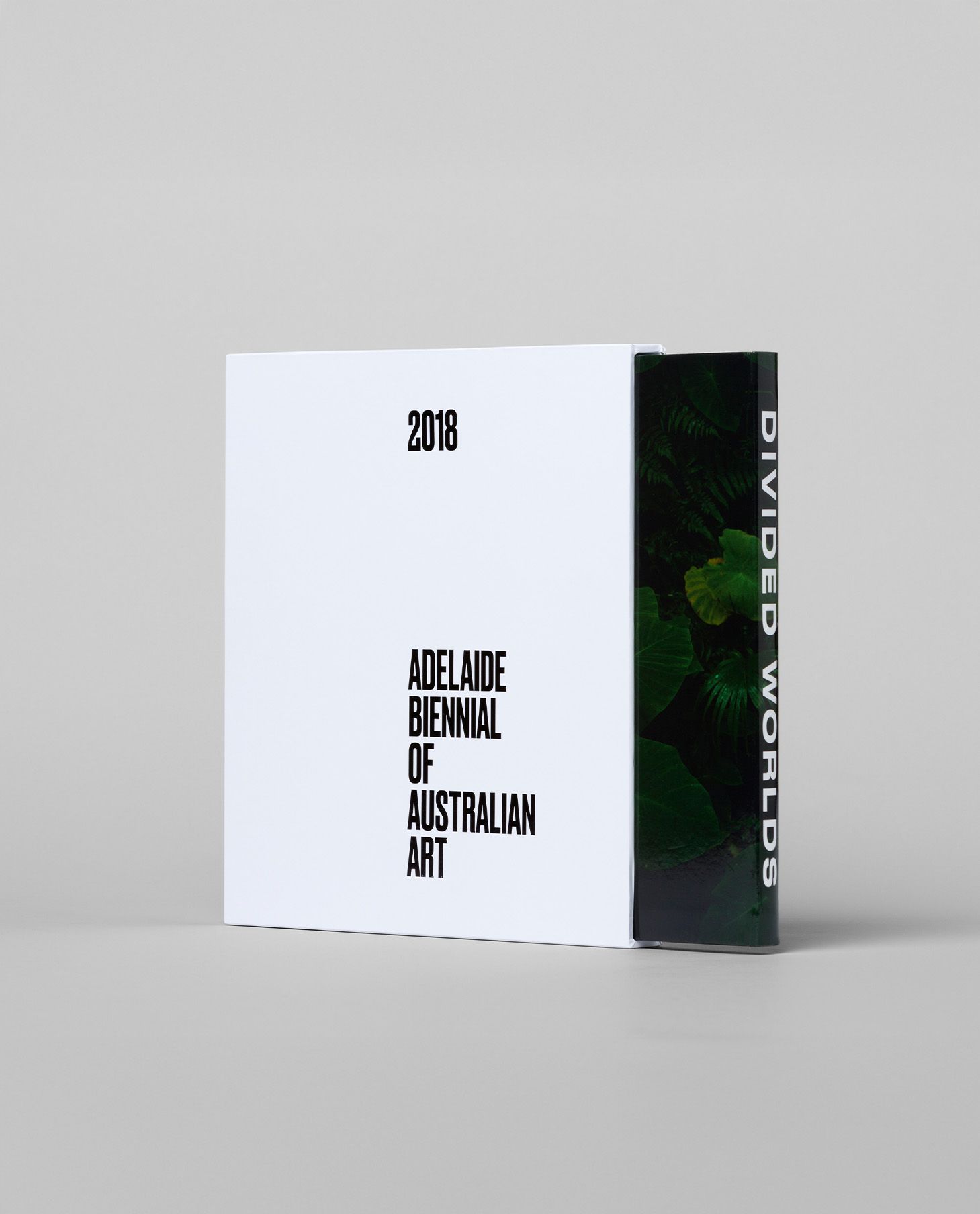
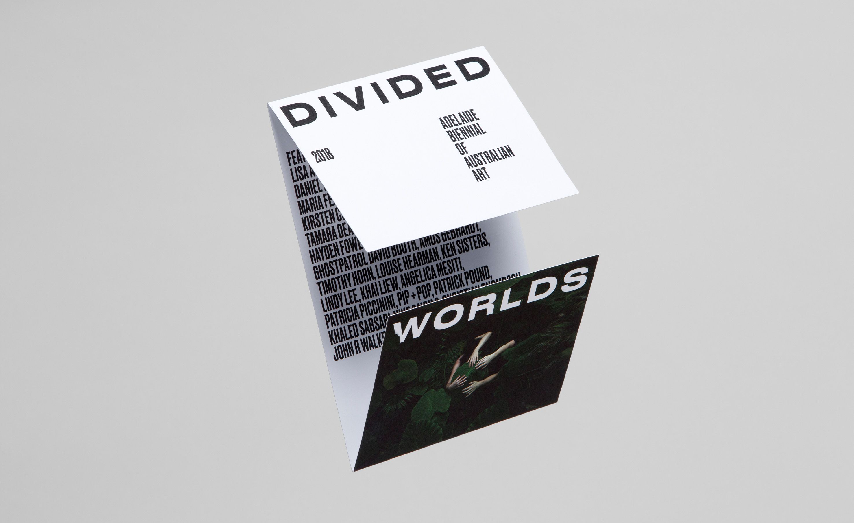
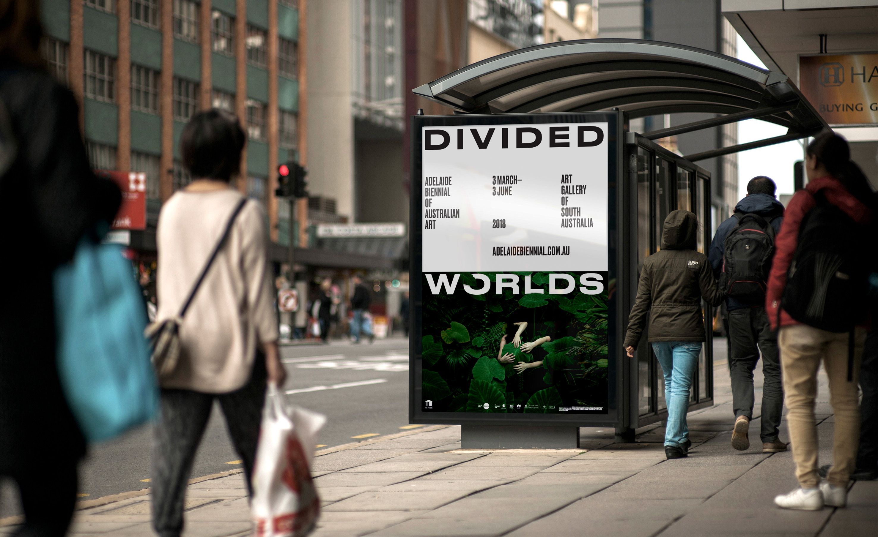
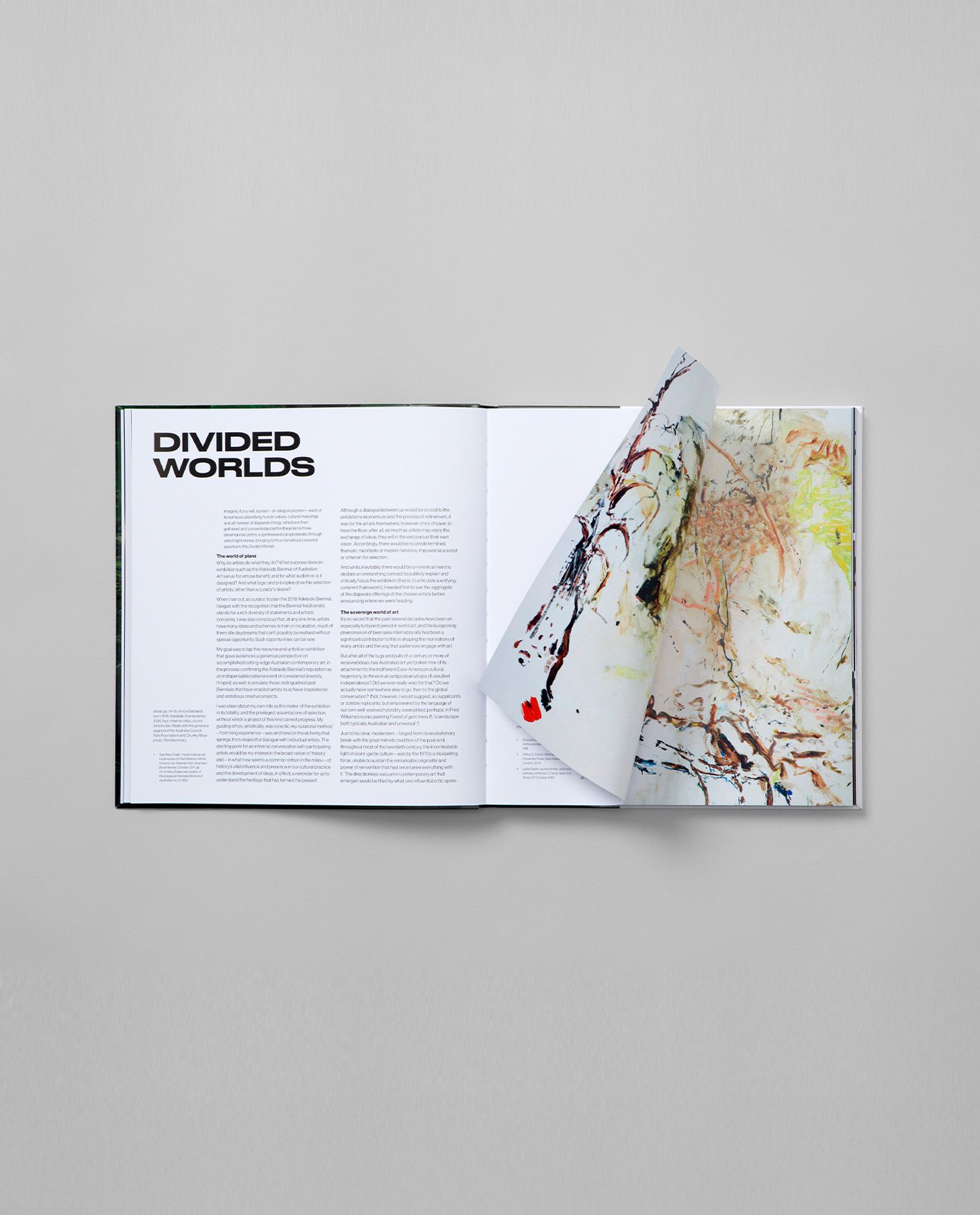
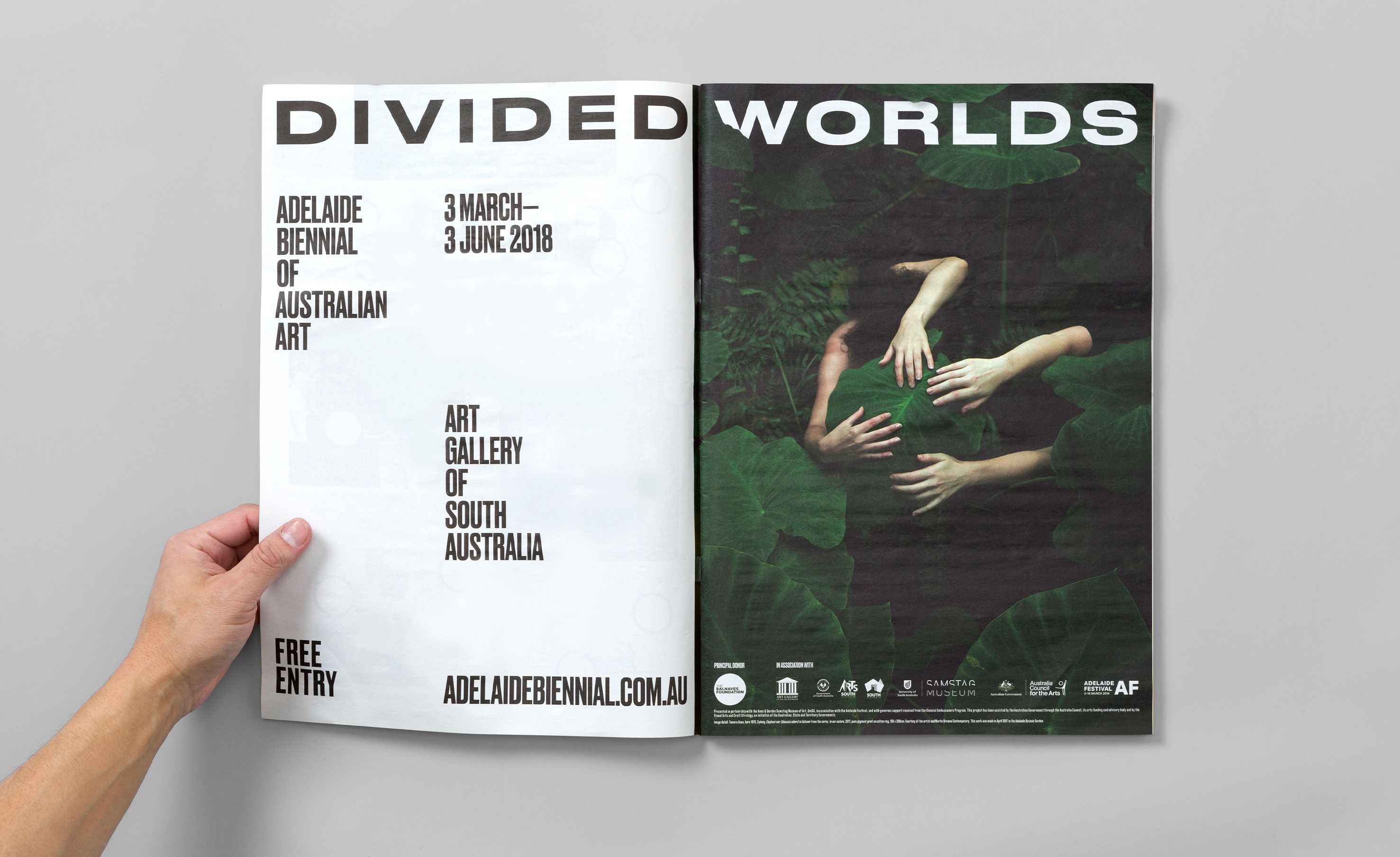
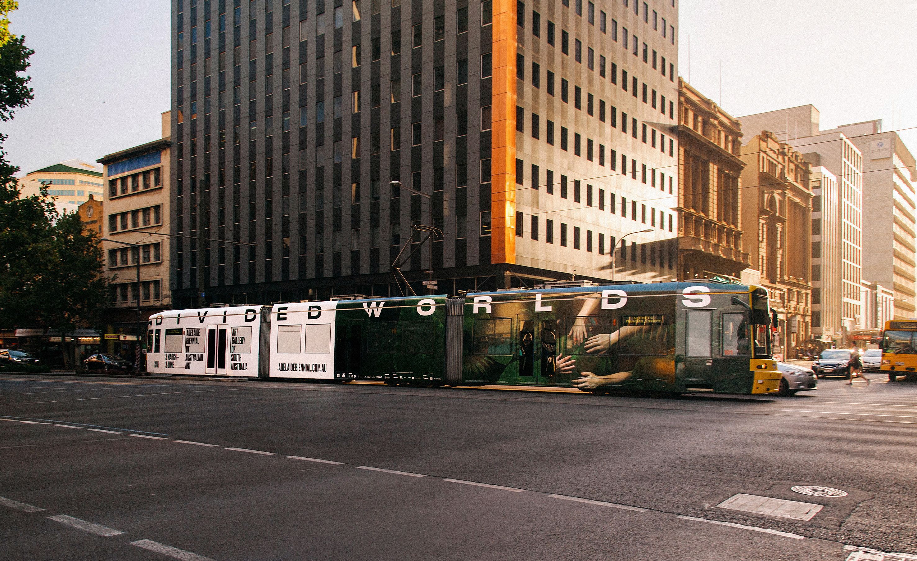
Divided Worlds set out to explore the tensions that shape us: cosmos and evolution, past and future, beauty and environment. Our role was to translate that ambition into an integrated brand and campaign system for the Art Gallery of South Australia’s Adelaide Biennial, unifying curatorial meaning with public visibility. We developed an evocative visual language anchored by dark, atmospheric imagery and stark, confident typography. This balance of restraint and drama enabled clear navigation across mediums while preserving the exhibition’s mystery and intellectual weight. The result was a coherent experience from posters and press to book design and signage, connecting audiences to the Biennial’s ideas before they ever entered the gallery.
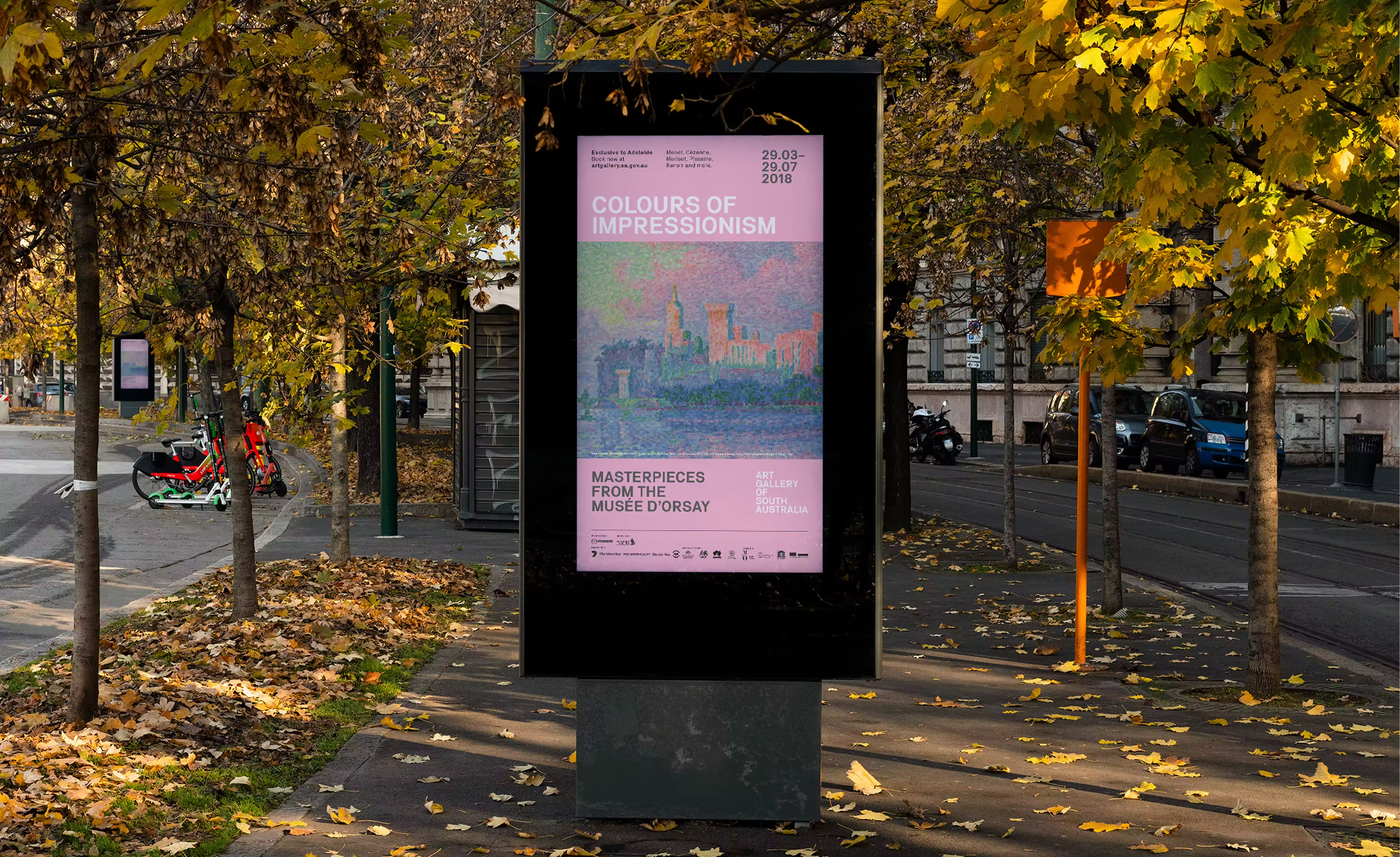
Art Gallery of South Australia
The Arts
Exhibition brand identity and graphic system
Campaign art direction and key visuals
Outdoor advertising and large format
Digital display and social assets
Website and event page assets
Print collateral and press templates
Gallery wayfinding and signage toolkit
Campaign guidelines and rollout support
Achieving stakeholder alignment on a campaign that pushed beyond safe conventions. We needed to secure acceptance for a visually bold direction that could carry a complex theme across multiple channels without diluting curatorial intent or accessibility for broader audiences.
We treated “Divided Worlds” as a system problem, not a single artwork. The strategy centred on distinctive brand assets that would be remembered and recognised at low attention: high-contrast, near-monochrome imagery paired with large-scale, uncompromising type. Our system operationalised that insight by locking typography, image tonality, and layout ratios into a repeatable kit of parts.
The tone walked a line between elegance and provocation: enough edge to signal contemporary practice, enough clarity to make wayfinding effortless. We carried the system into campaign, catalogue and signage, ensuring every touchpoint reinforced the same distinctive codes. This created an experience where the brand behaved as well as it looked—coherent, legible and memorable.
Divided Worlds demonstrates how strategic branding and design can hold complexity without becoming complicated. A disciplined system created room for expression, helped teams deliver faster, and made the exhibition more discoverable and memorable across channels. If your institution needs a brand that performs operationally as well as it inspires creatively, we can help.