We create brands that are deeply connected to vision, rich with meaning, and crafted to inspire, align, and endure. Beautiful Brand Intelligence.
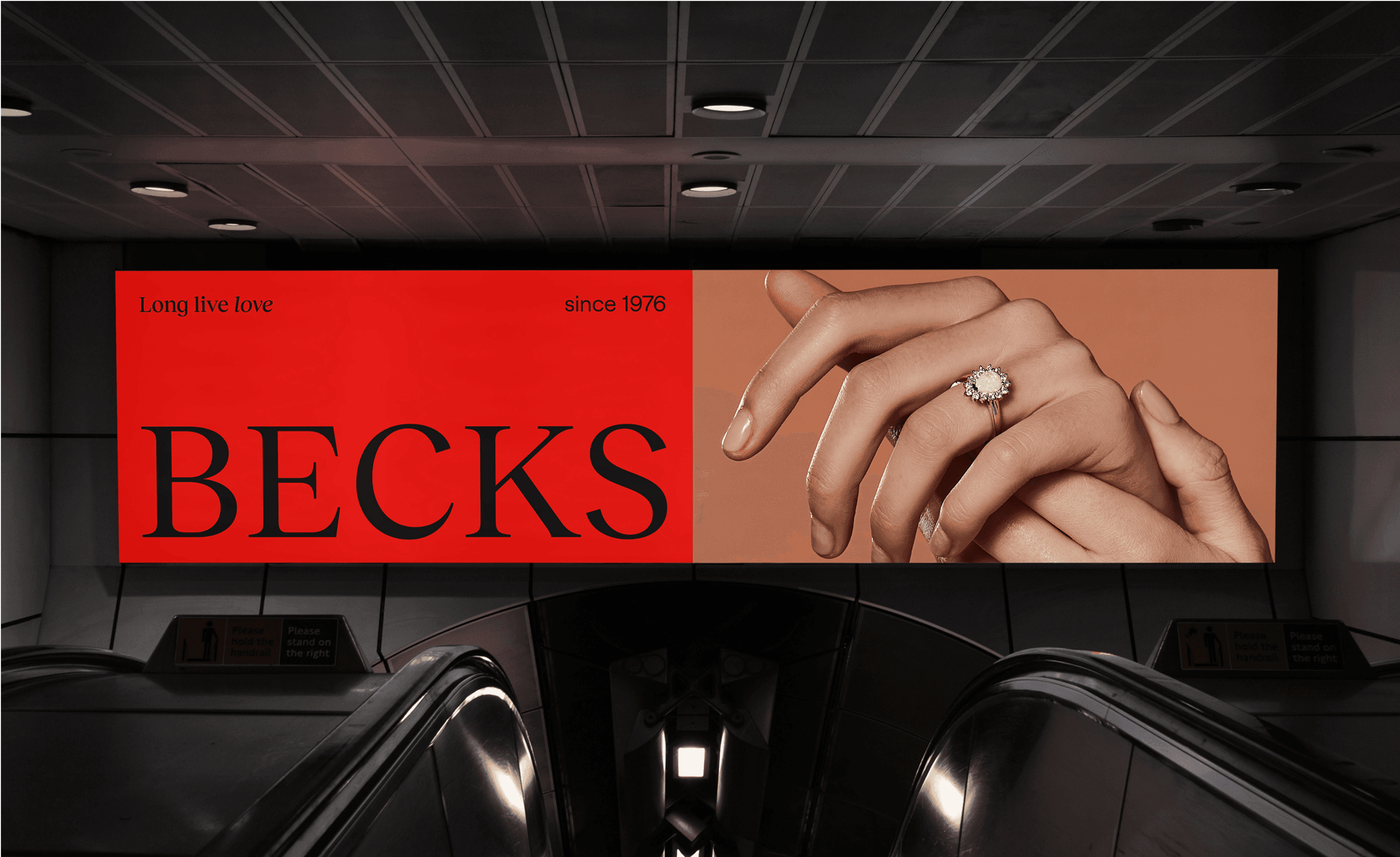
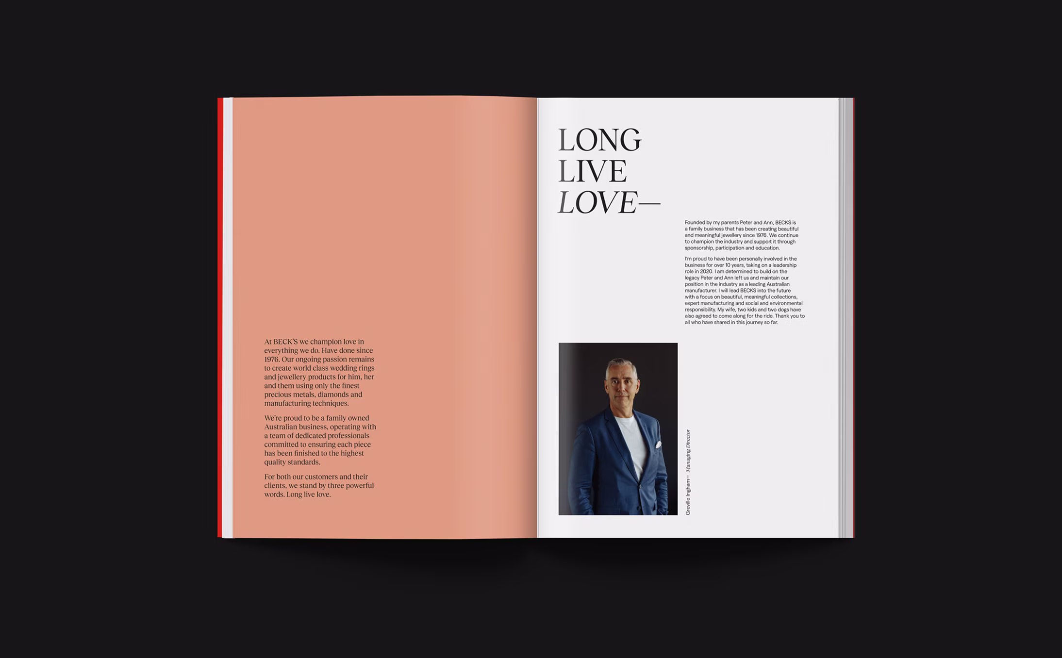
A manufacturing jeweller with nearly 50 years of legacy wanted to lead a changing category. We helped Becks shift from a traditional, male-led brand into a contemporary identity that signals quality, connection and confidence. The result was a bold repositioning anchored by a memorable name, a sculptural visual language and an identity system designed to scale.
Becks is one of Australia’s oldest and largest manufacturing jewellers, founded as Peter W Beck in 1976. After the founder’s passing, the next generation sought to modernise while honouring craft. In a category crowded with clichés and dated tropes, our brief was to validate the decision to rebrand, establish a clear strategy and create an identity that drives recognition and relevance across wholesale and consumer touchpoints. The mandate: evidence-based, distinctive and ready to perform in market.
Becks
Beauty
Brand design
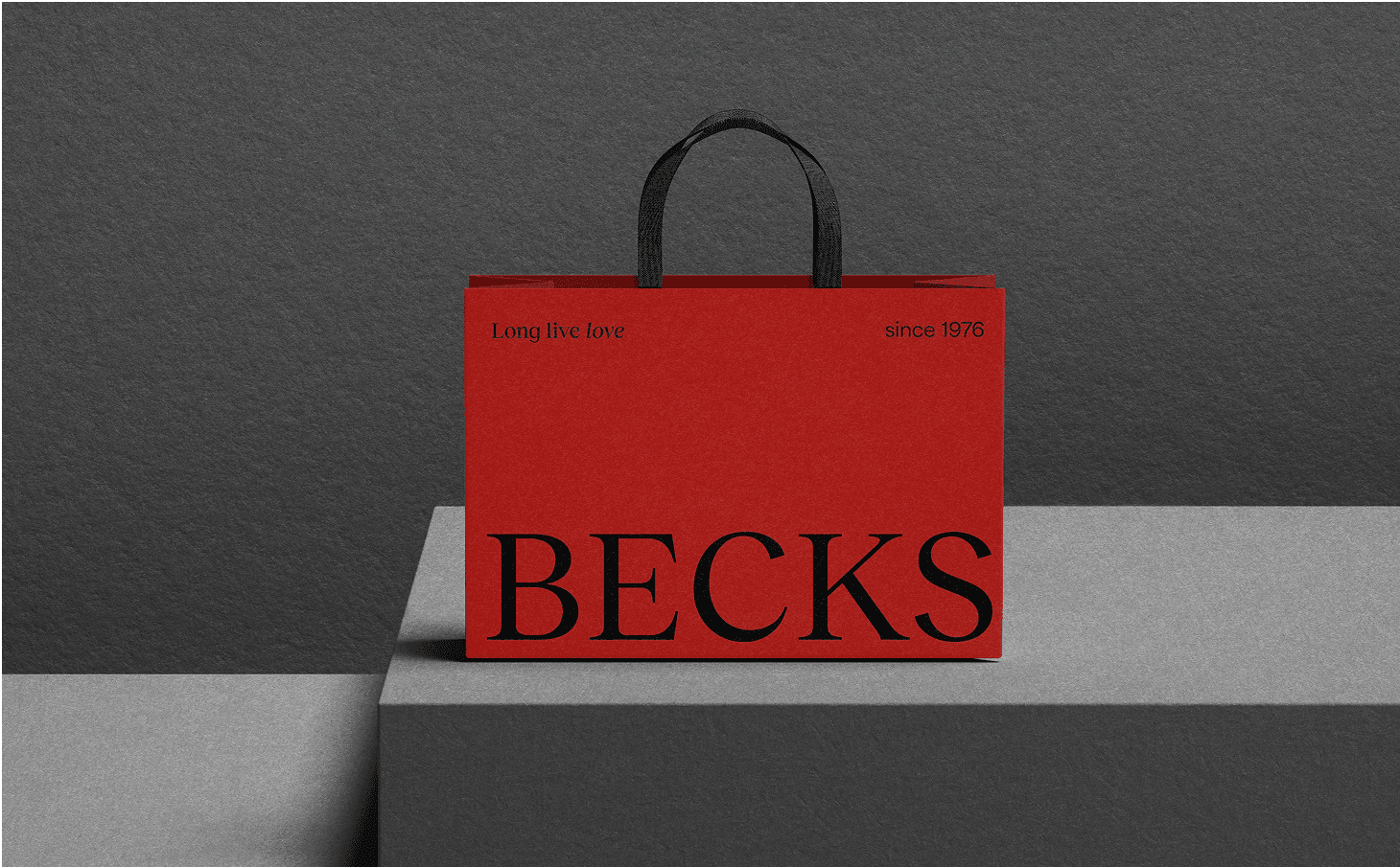
Packaging design
Motion design & animation
Studio photography

The category had become visually homogenous: soft-focus romance, generic couples, and conservative palettes — imagery that blended into the feed. Becks needed to signal leadership while navigating headwinds, including a softening wedding and engagement market.
We needed to retain equity, sharpen distinctiveness, and build a system that worked from bench to billboard. The brand had to look beautiful and behave intelligently — codified, scalable and unmistakably Becks.
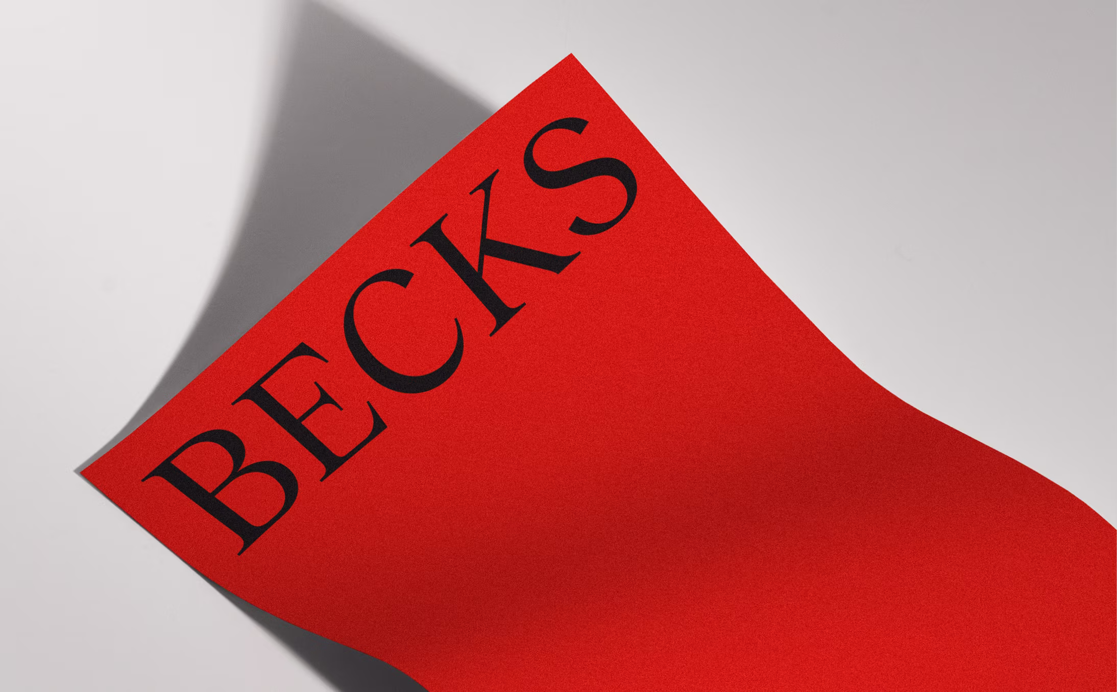
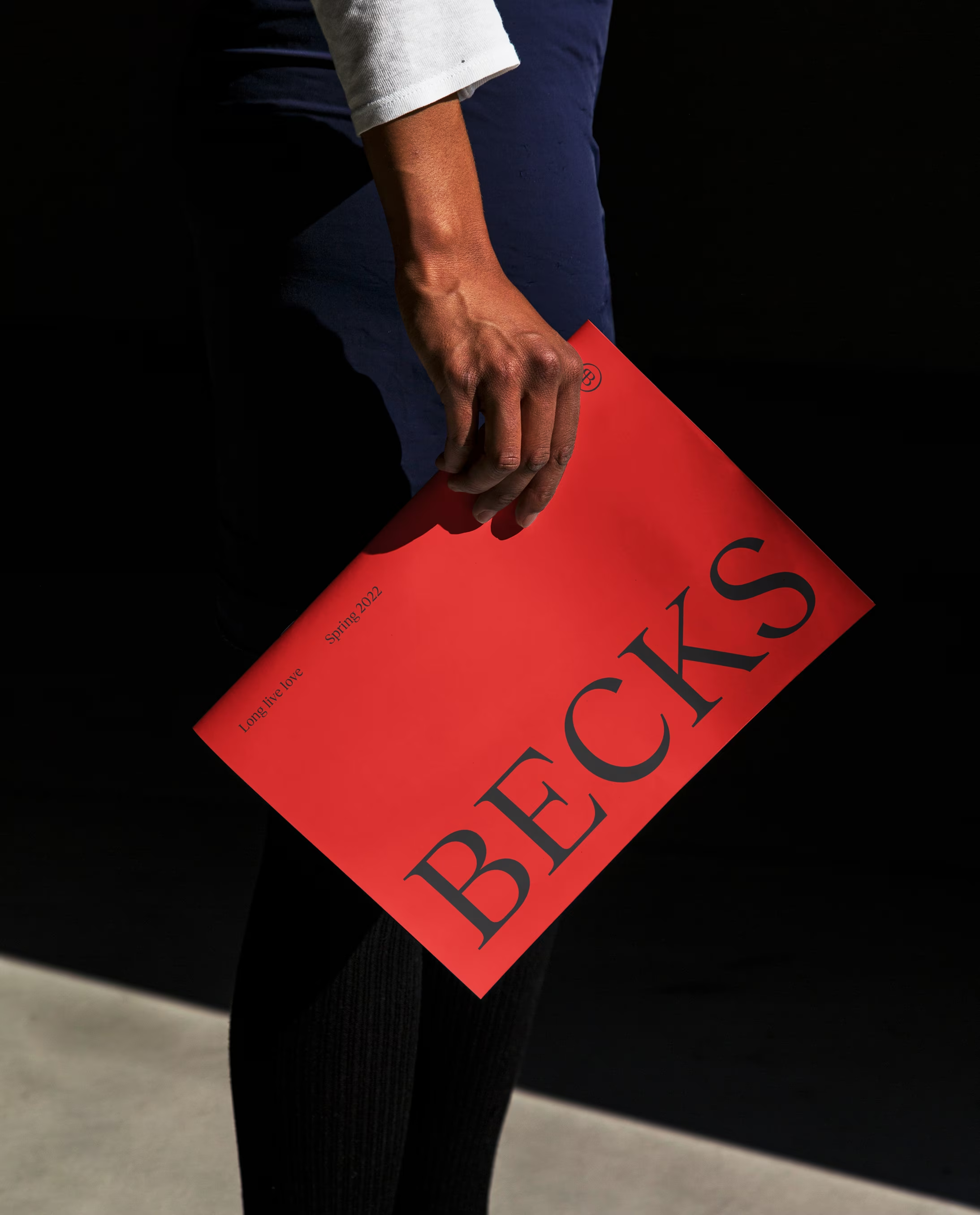
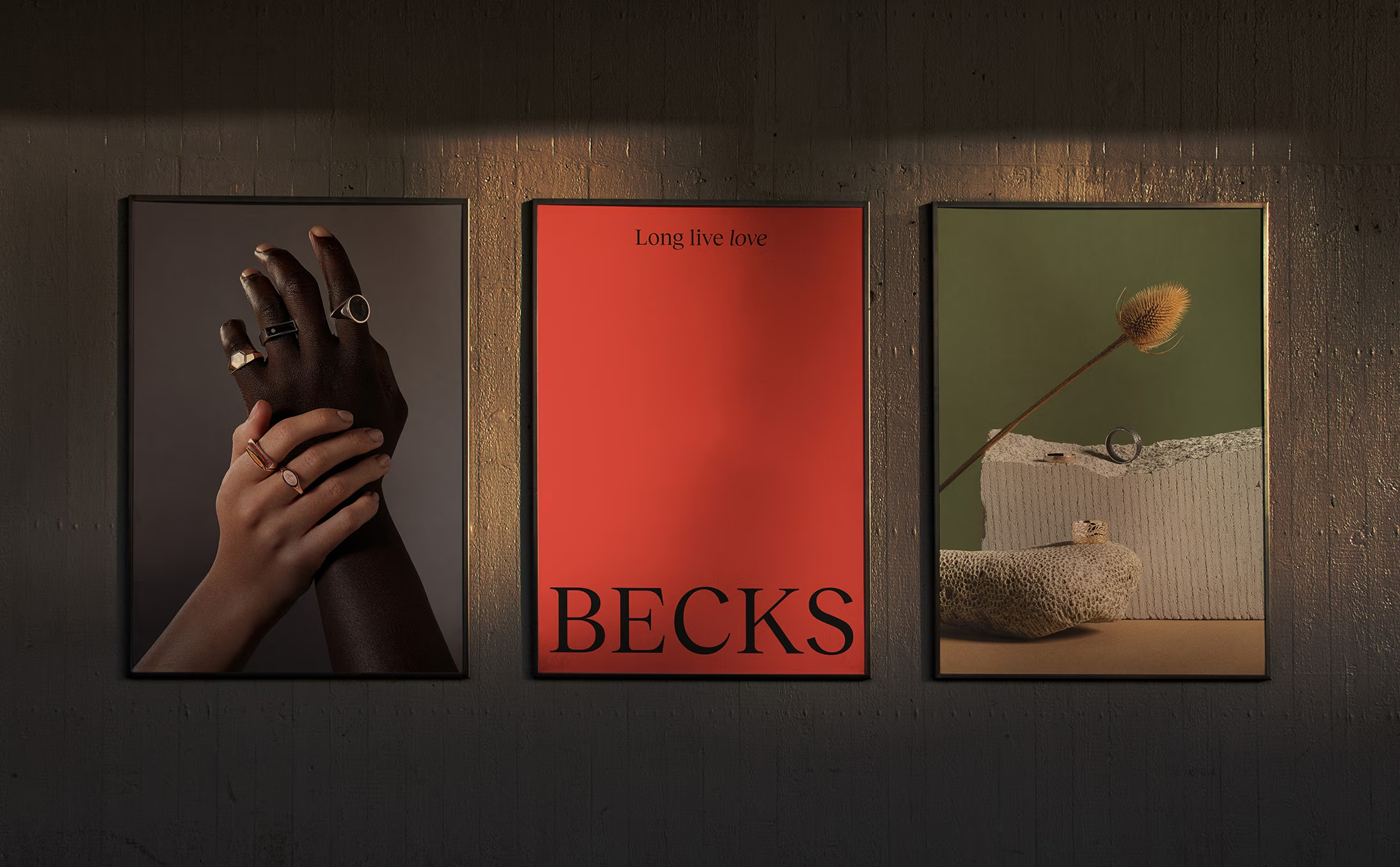
Distinctive assets drive mental availability. We built a brand system around a single, ownable cue: red. It cuts through category sameness, aids recall, and flexes elegantly from luxury to lifestyle. The new identity pairs a bold logotype with refined serif typography and a contemporary grid — ensuring clarity and consistency across packaging, print, digital and motion.
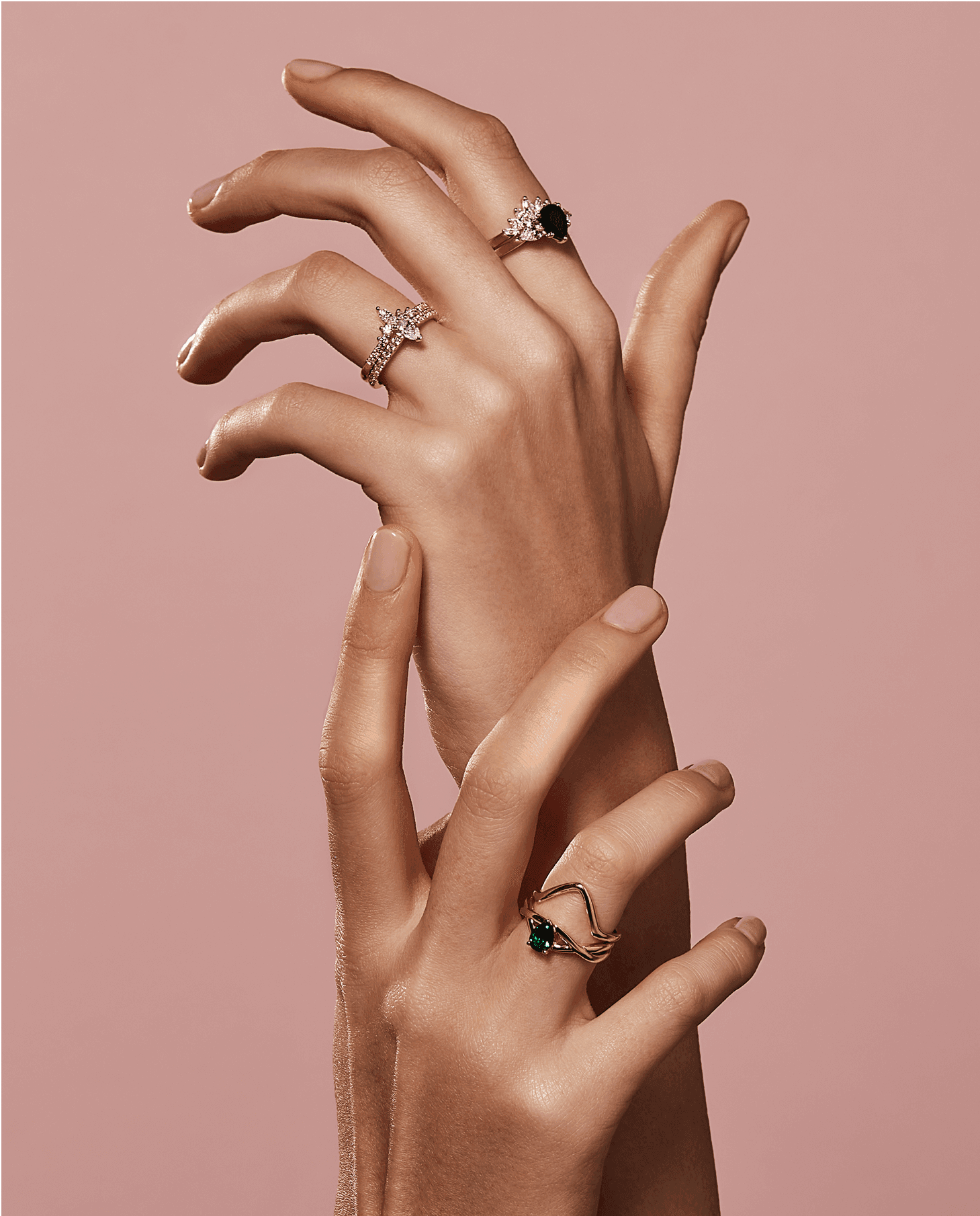
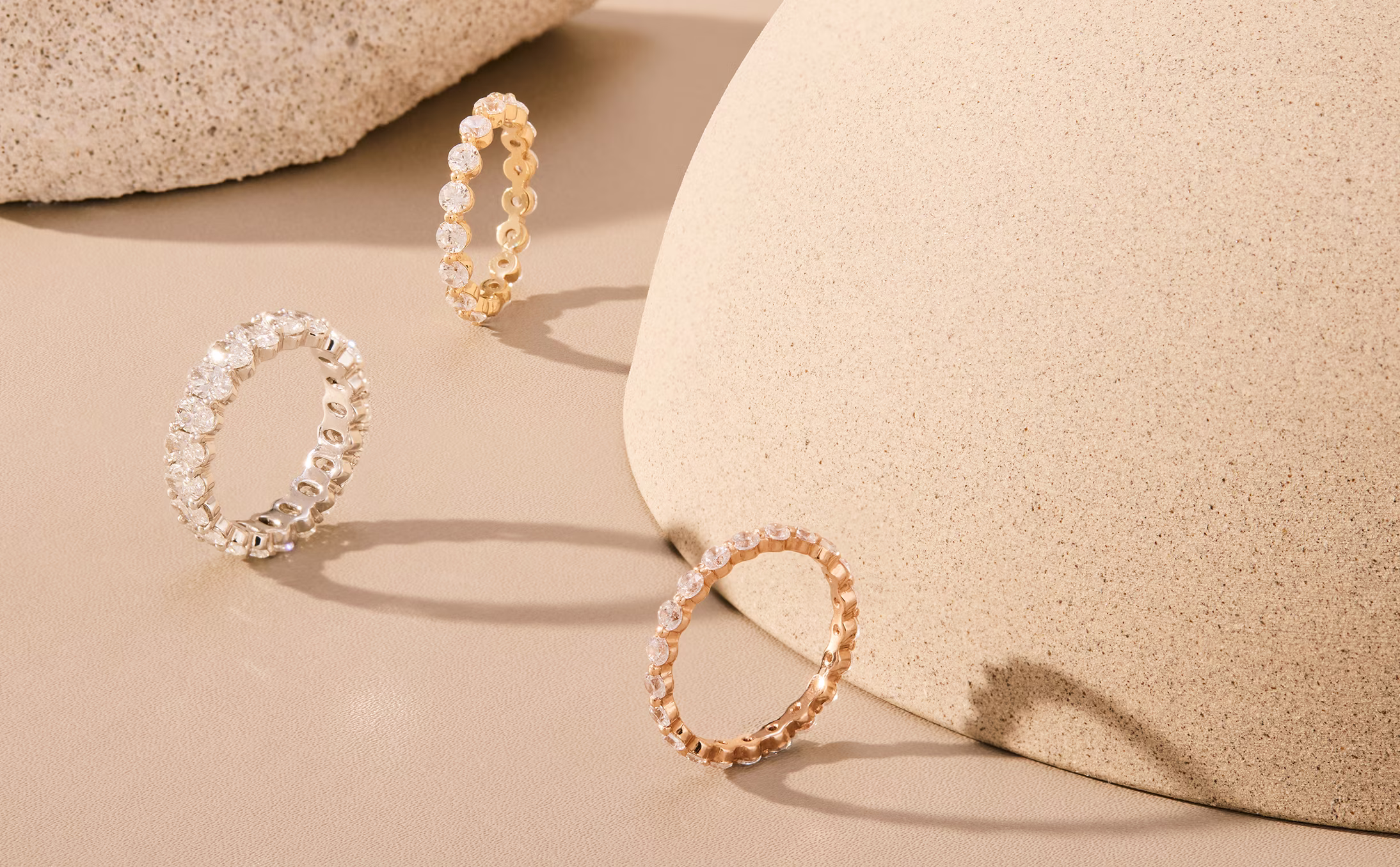
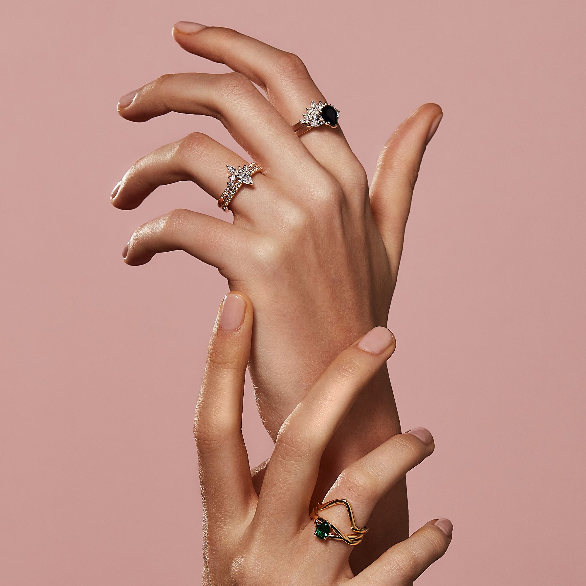
To replace cliché romance, we developed a sculptural image system using hands—human, diverse and intimate — shot with dramatic studio lighting for depth and tactility. This recentres the product and the wearer’s connection, rather than generic scenes. We validated the Becks name, crafted the “Long Live Love” idea, and codified behaviours to ensure the brand performs across channels, partners and seasons. The result positions Becks as a connected, modern leader—instantly recognisable and robust in application.
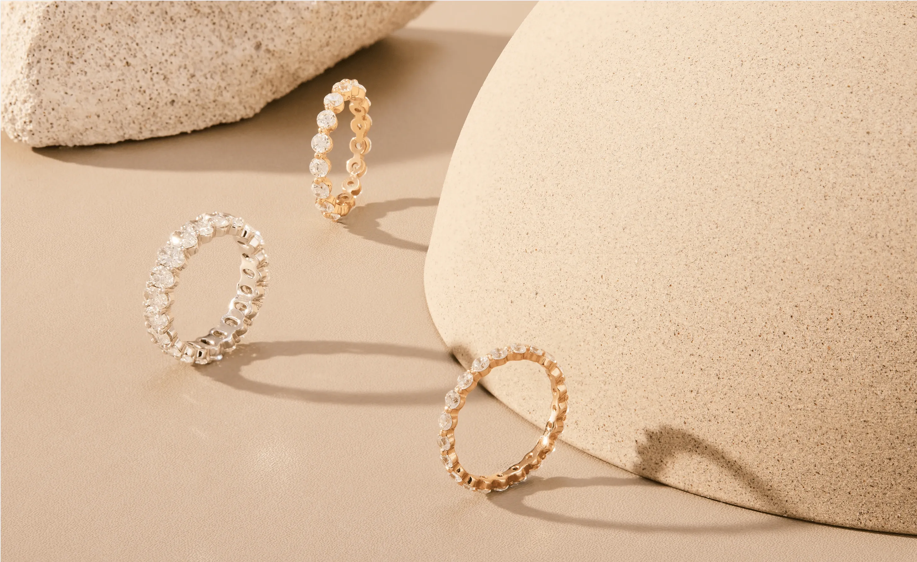
Hands tell the story. We designed a sculptural image system that focuses on touch, tension and form—hands meeting metal, light meeting edge. By centring diverse skin tones and close, purposeful gestures, we move beyond staged romance to something intimate and authentic. The result is both human and iconic: strong silhouettes, crisp highlights, and shadow that frames each piece. It’s a language that scales—from hero campaigns to product pages—ownable at a glance and unmistakably Becks. Jewellery shown not as props in scenes, but as objects of connection.
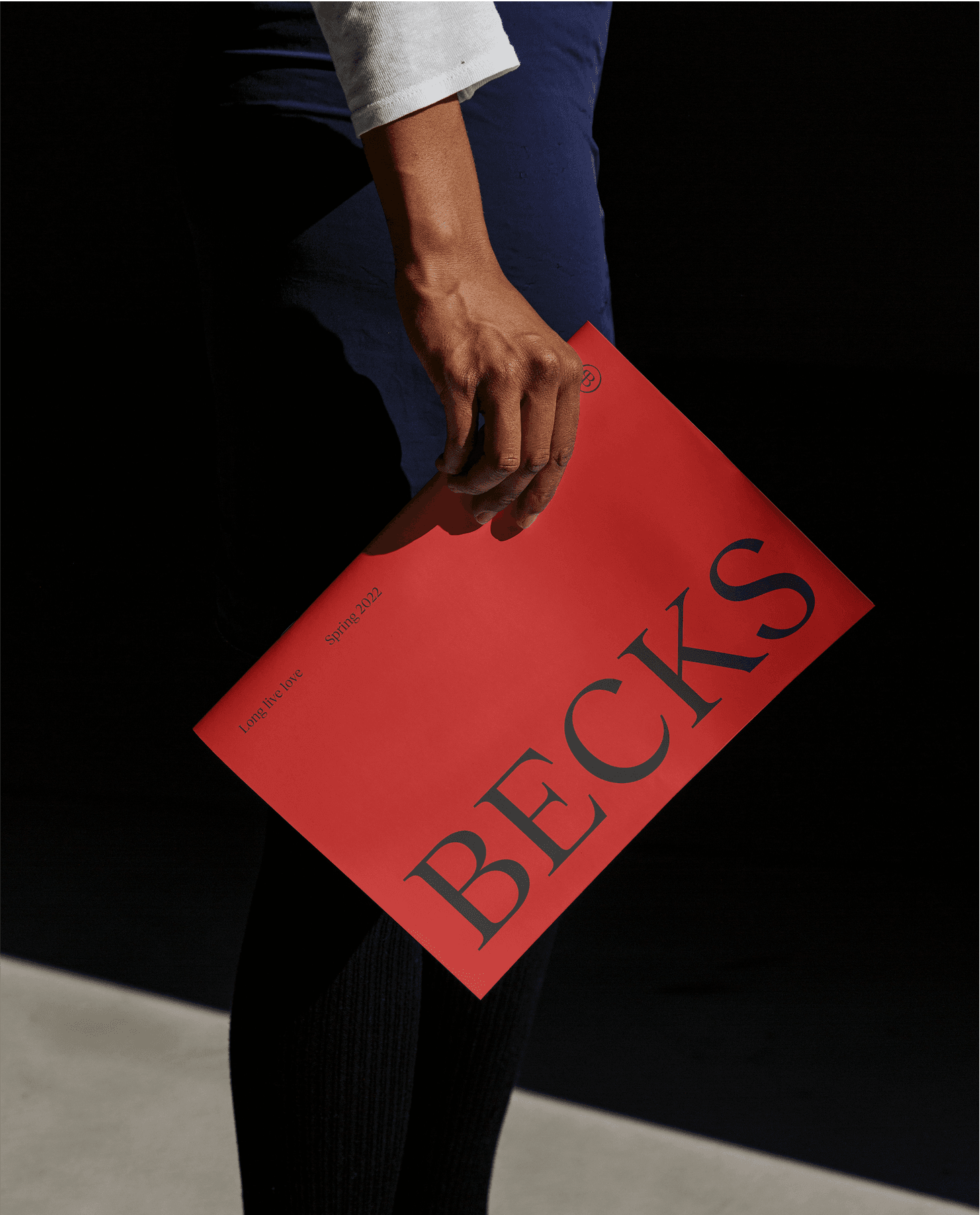
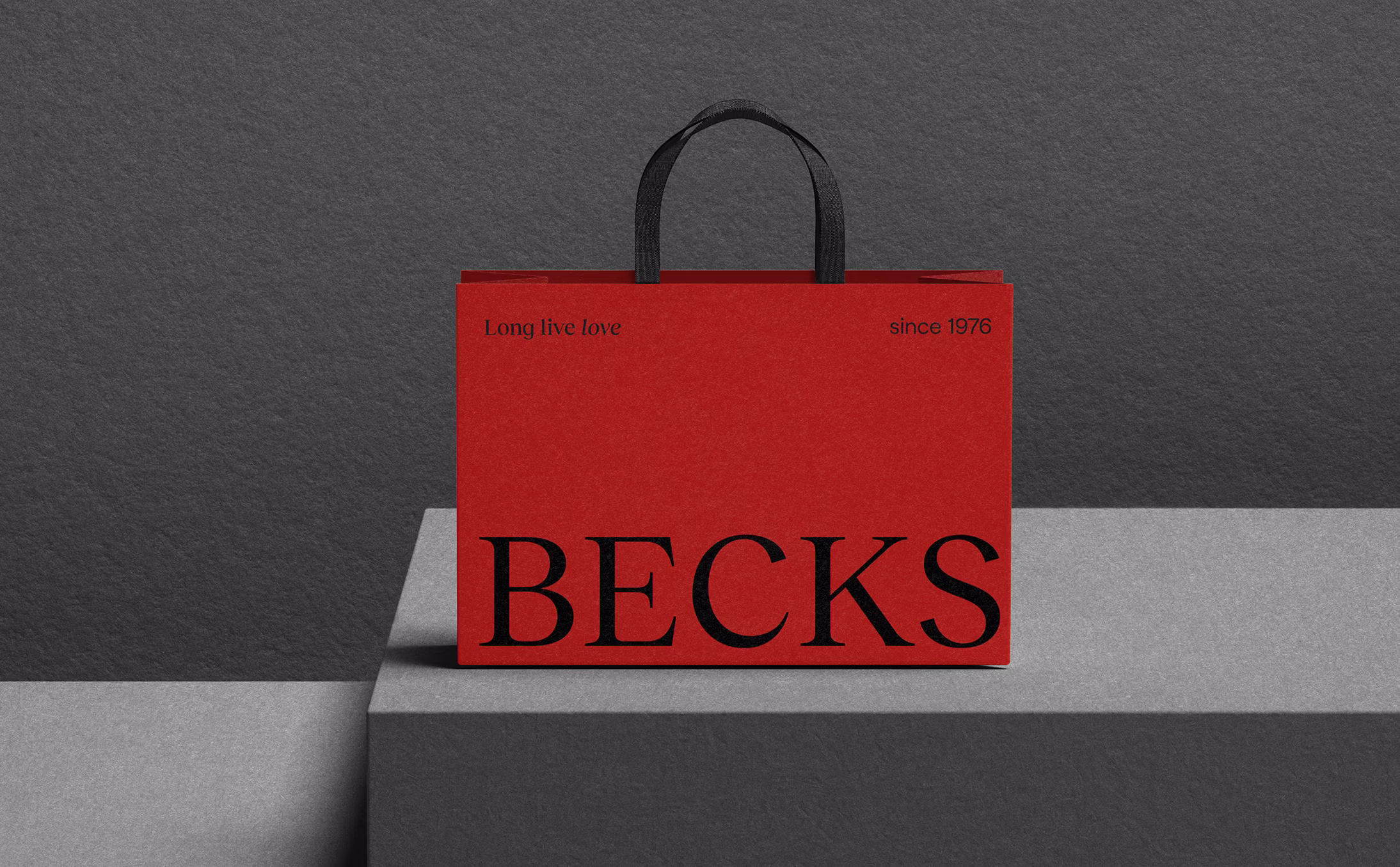
We chose red—and committed to it. In a sea of champagne neutrals and muted metallics, red delivers instant recognition and energy. It signals confidence without sacrificing elegance, carrying seamlessly from print to packaging to digital. Paired with refined serif typography and a disciplined grid, the palette balances impact with restraint. This is distinctiveness with a job to do: catch the eye, store the memory, and guide the system. Own the cue, repeat it consistently, and it becomes the shortcut to Becks in any channel or context.
Becks now presents as a contemporary, connected lifestyle brand — bold, human and built for scale. A clear idea, a single distinctive cue, and a disciplined system turned recognition into an asset the business can rely on. It’s strategic branding and design working together: identity embedded into behaviours so the brand performs in the market, not just on a page. If you’re ready to build a brand with long-term impact, let’s talk.
Jonathan VDK
Josh Geelen
Emerson Hoskin