We create brands that are deeply connected to vision, rich with meaning, and crafted to inspire, align, and endure. Beautiful Brand Intelligence.
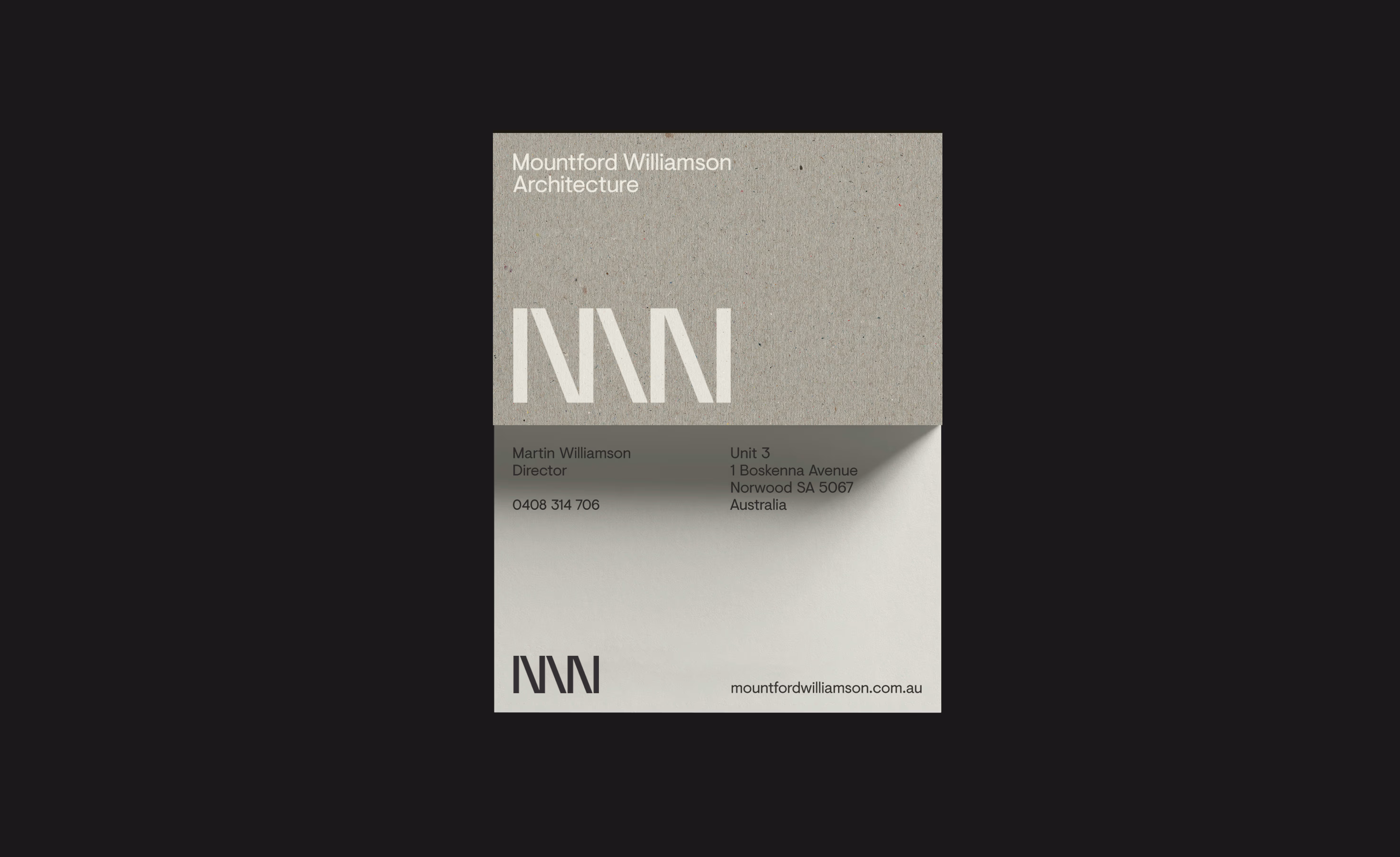
Mountford Williamson Architecture (MWA) is a design-led practice shaping residential, community and education environments across South Australia. Our brief was to elevate a brand that had not kept pace with the calibre of the work — aligning identity, language and behaviour with the practice’s quiet confidence and technical depth.
StudioBand® approached the rebrand as a business system, clarifying purpose, codifying design principles and developing a toolkit that could support both marketing and day-to-day operations. The objective was to create a brand that reflects the integrity of the architecture while enabling consistent and scalable application across the practice.
Mountford Williamson Architects
Architecture
Brand strategy and narrative
Logomark and identity system
Colour, typography and layout rules
Brand language and tone-of-voice guide
Lead capture and conversion pathways
Art direction and image principles
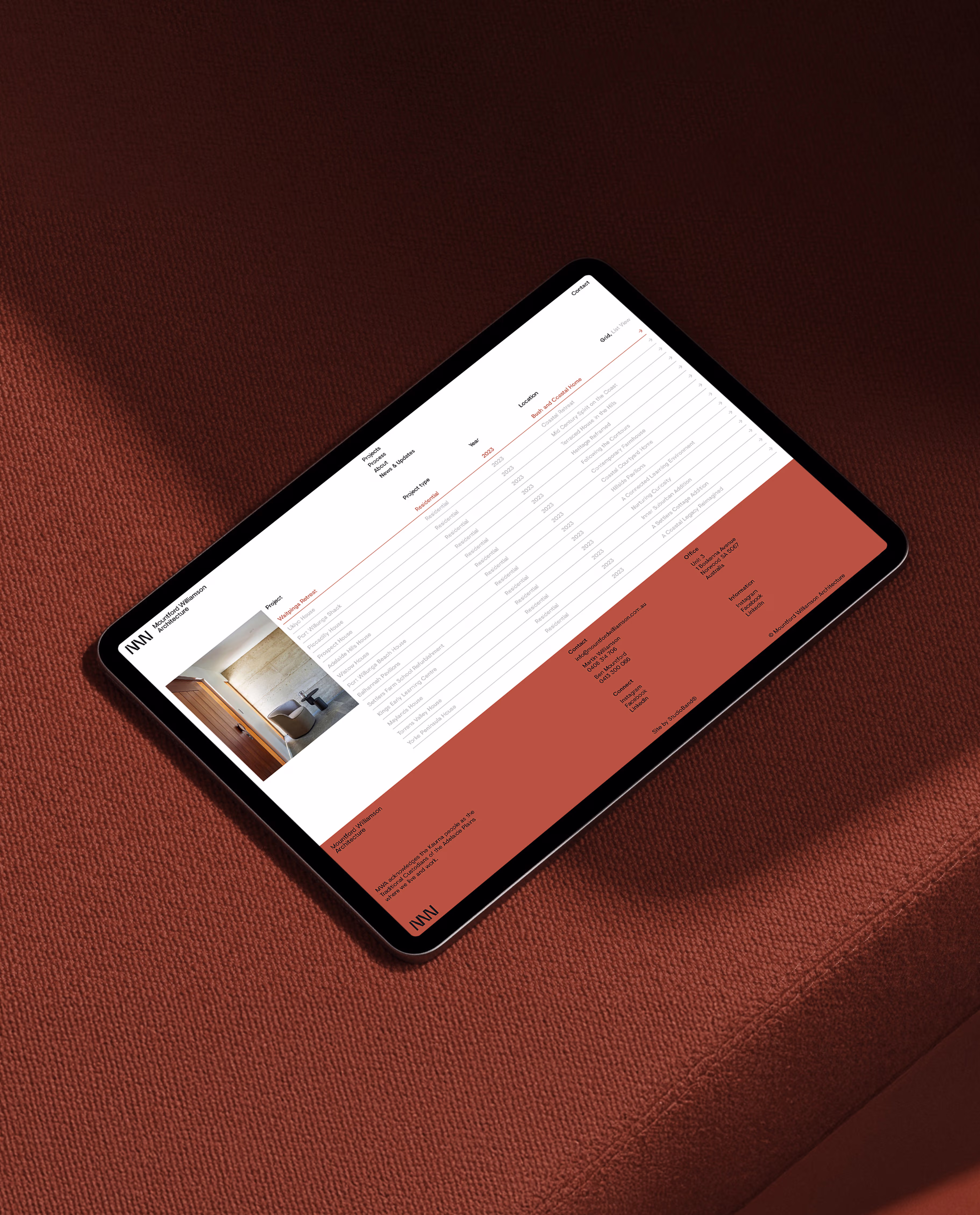
Website design and development
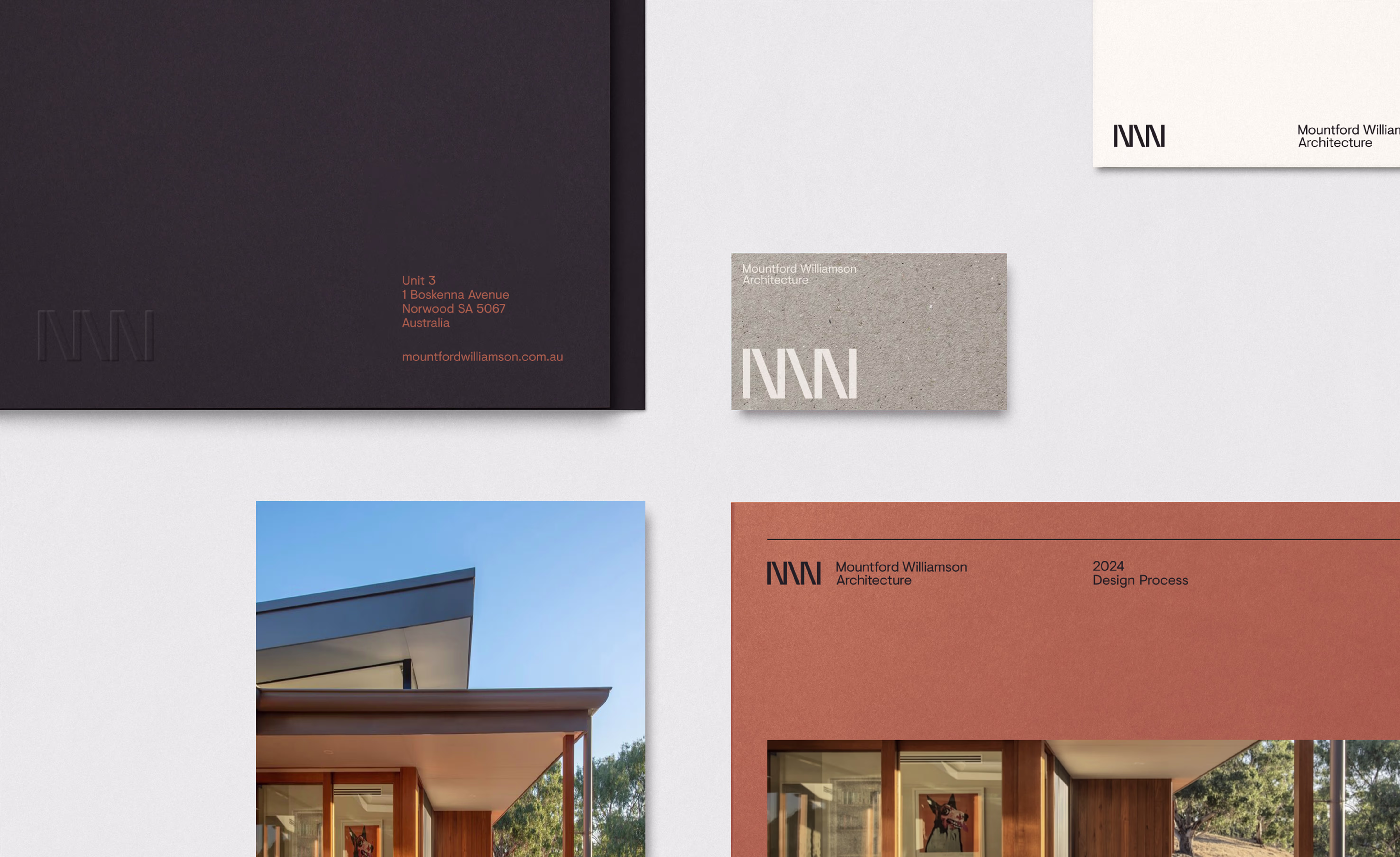
Collateral templates
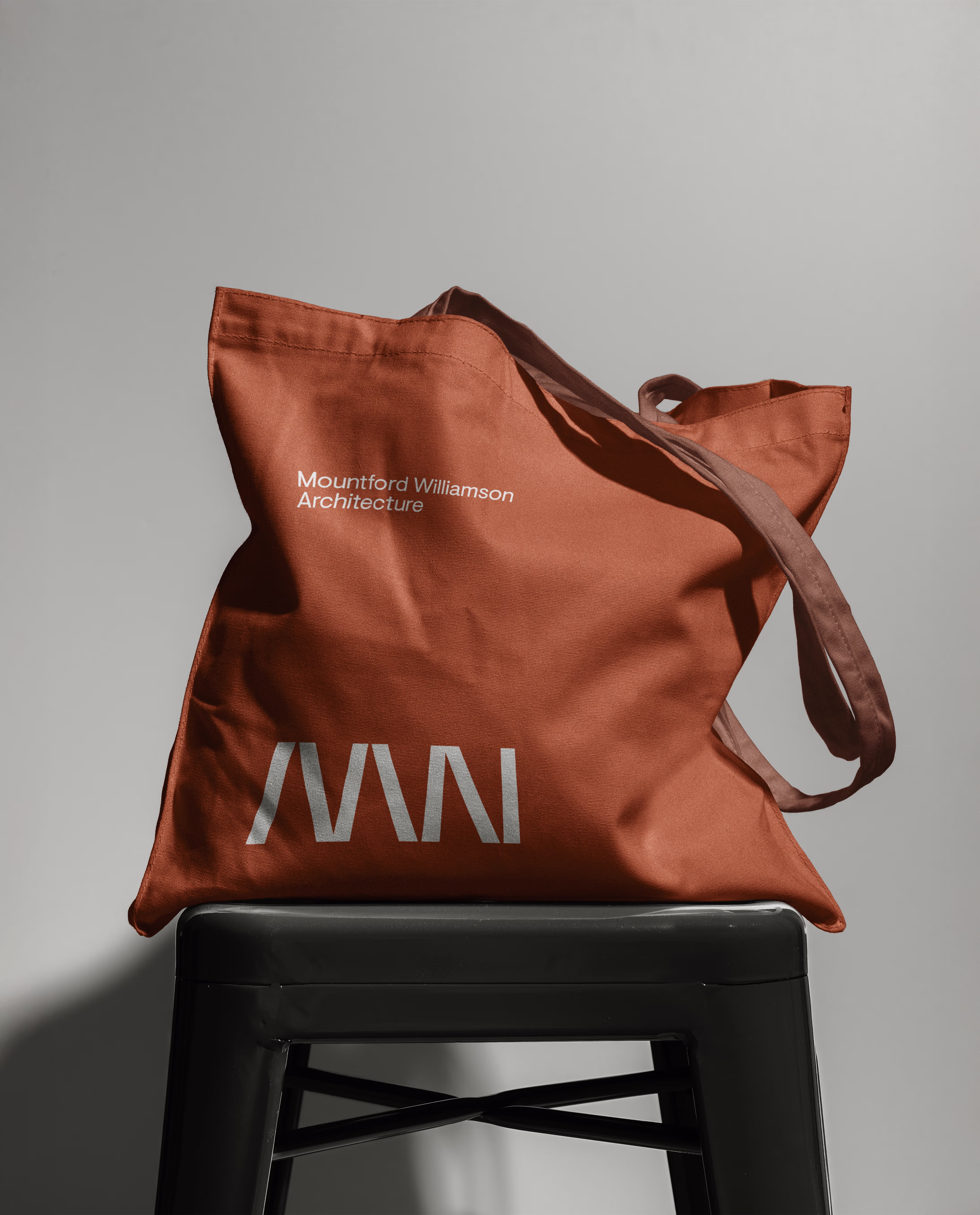
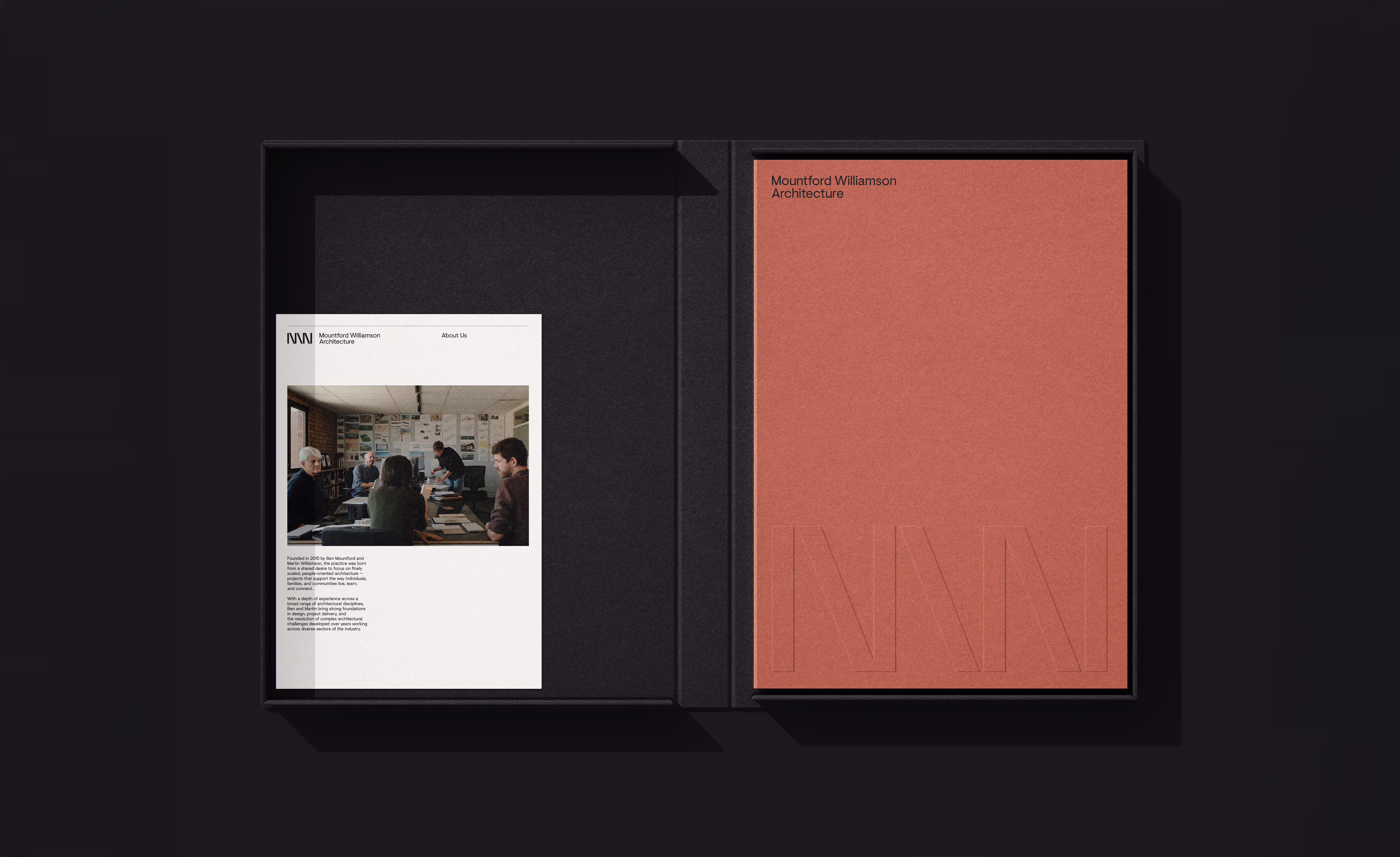
Refined monogram capturing structure, simplicity and practice initials, expressed through balanced geometry. The mark reflects the discipline of architecture — ordered yet adaptable. While distilling the practice’s identity into a timeless and versatile symbol.
MWA’s work is defined by restraint, precision and a strong response to context. The brand needed to reflect these qualities without becoming overly expressive or decorative. Our approach focused on creating an identity that feels considered and intentional — mirroring the way the practice approaches architecture.
We developed a refined monogram and typographic system grounded in clarity and proportion, supported by a warm, material-led colour palette. Together, these elements establish a visual language that is understated yet distinctive, allowing the work to lead while the brand provides a consistent and recognisable frame.
Beyond expression, the brand needed to function seamlessly across a wide range of applications — from tender documentation and proposals to digital platforms and site signage. The challenge was to create a system that could scale without losing its sense of clarity or cohesion.
We developed a modular framework built on clear layout rules, grid structures and language principles. This toolkit enables the MWA team to apply the brand consistently with minimal friction, supporting both efficiency and recognisability across every touchpoint.


Brand becomes powerful when it’s easy to use. We built a toolkit MWA can apply across proposals, project sheets, website, social and signage with minimal lift and maximum consistency. Clear ratios, layout rules and language guidelines reduce decision fatigue, so the team spends less time formatting and more time doing what they do best—designing. This is brand as an operational system: scalable, distinctive and calm under pressure. It helps the practice show up the same way every time, building recognition and trust with each interaction and every project released.
Quiet confidence is a design choice. For MWA, we created an identity that speaks in the same language as their architecture: considered, contextual and enduring. The monogram references structure and proportion, while the warm palette draws from Australian materials — stone, timber, light. Typography is precise without being precious, allowing work to lead and brand to support. Together, these elements form a system that’s instantly recognisable yet never intrusive, giving the practice the right kind of presence where it matters most: in conversations, on site and in clients’ homes.

The result is a brand that aligns closely with the architecture it represents — calm, precise and enduring. The system provides clarity and consistency across communications, supporting the practice’s growth while maintaining the intimacy and integrity that define its work.
Jonathan VDK
AADC Awards Finalists - Brand Identity: Small Boutique
AADC Awards Finalists - Digital Design