We create brands that are deeply connected to vision, rich with meaning, and crafted to inspire, align, and endure. Beautiful Brand Intelligence.
Annesley Junior School is a South Australian institution with deep roots and a progressive outlook. Originally founded in 1902 and later reformed as a junior school in 2012, Annesley’s mission is anchored in a contemporary, child-centred approach to learning.
Working with the school leadership and council, we were engaged to align brand strategy, identity and activation with that ambition. The outcome is a digital-first brand system that honours heritage while enabling growth and clarity across every touchpoint. As a leading Adelaide branding agency, we brought strategic branding and design craft to an education leader ready to scale its impact.
Annesley Junior School
Education
Brand discovery and stakeholder engagement
Brand strategy and activation plan
Identity system and guidelines
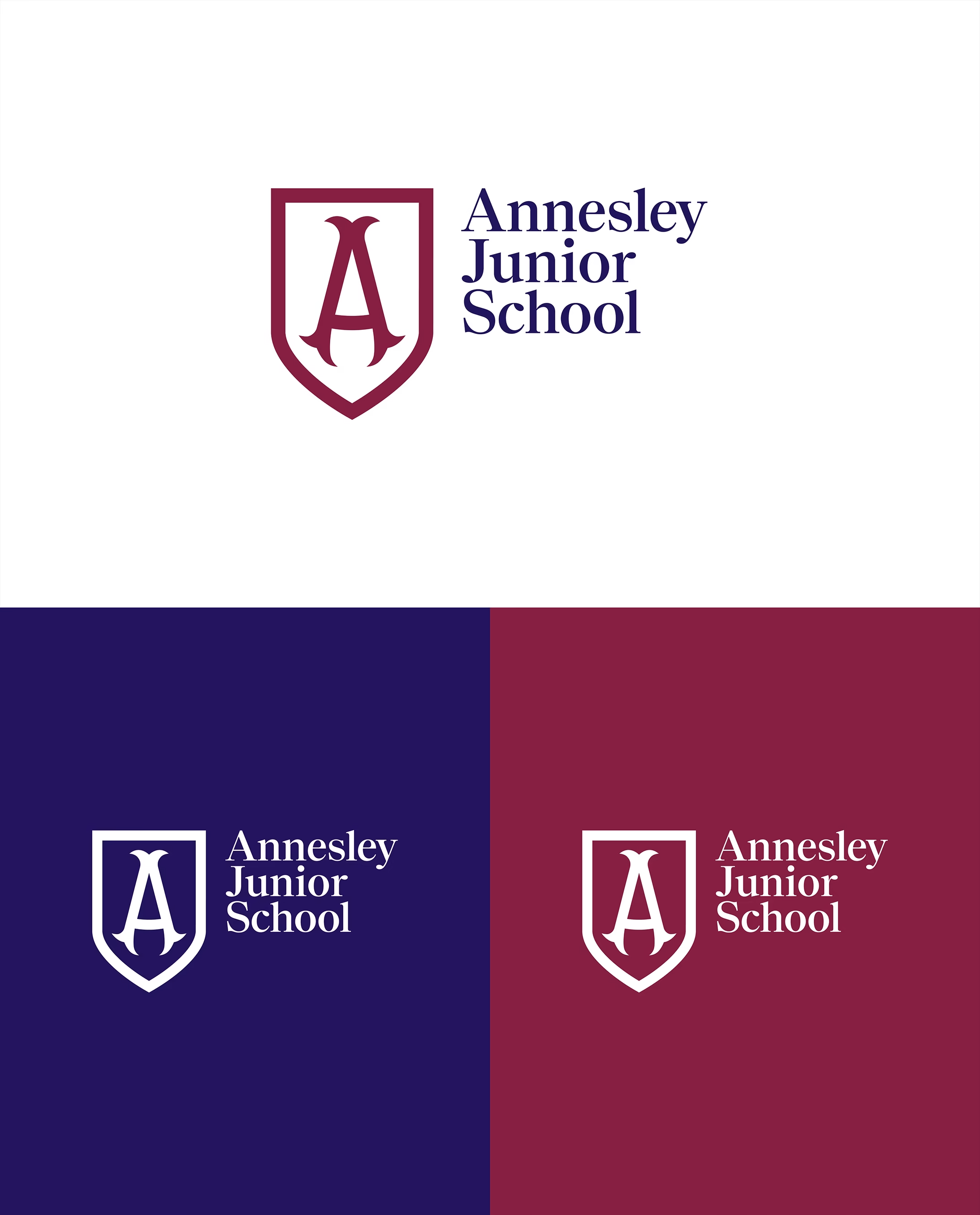
Refined shield and digital asset suite
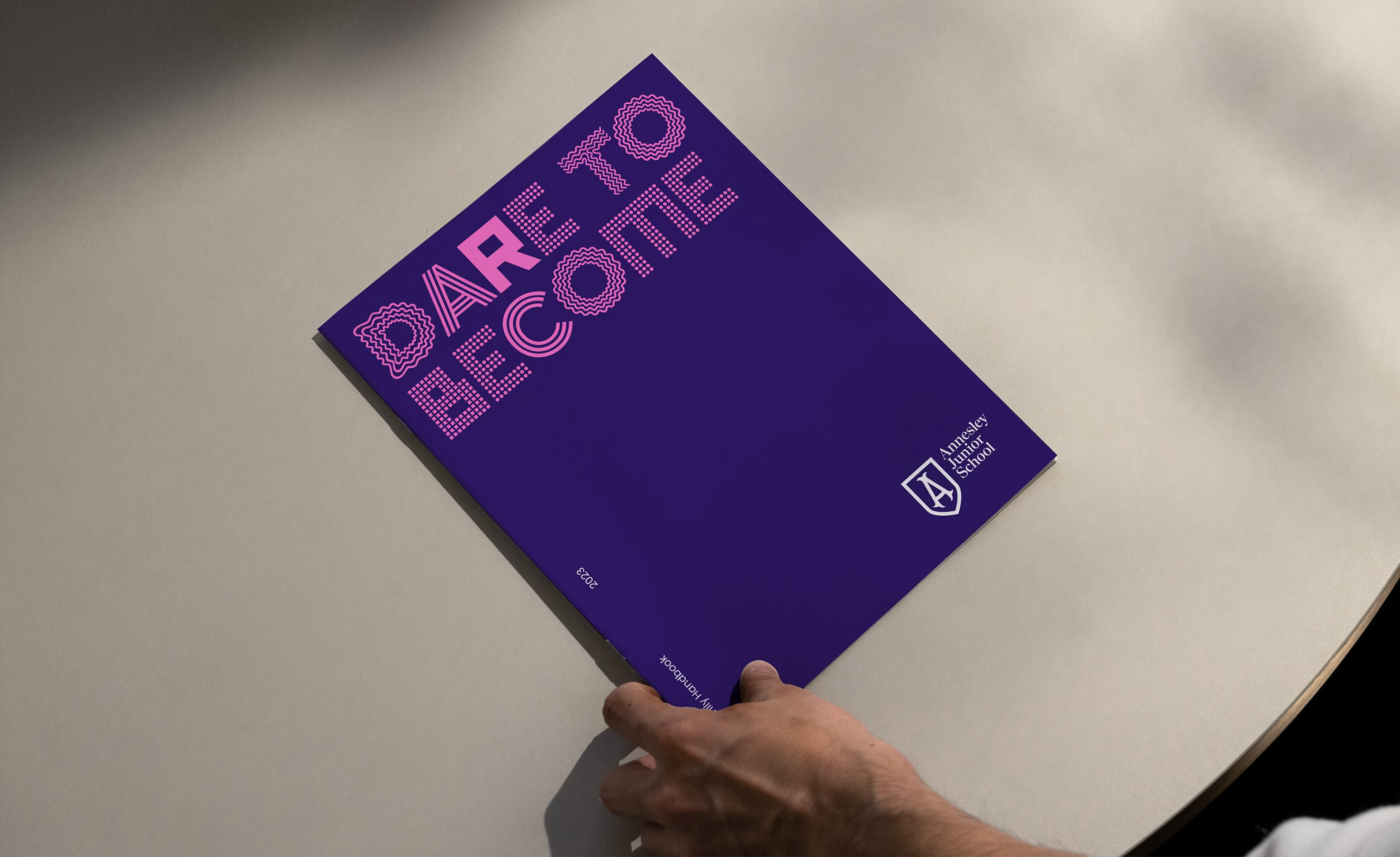
Custom display typeface: Gillingham Display
Messaging anchored to dare to become
Refined shield mark
for clarity and digital responsiveness while preserving heritage cues.


Gillingham Display
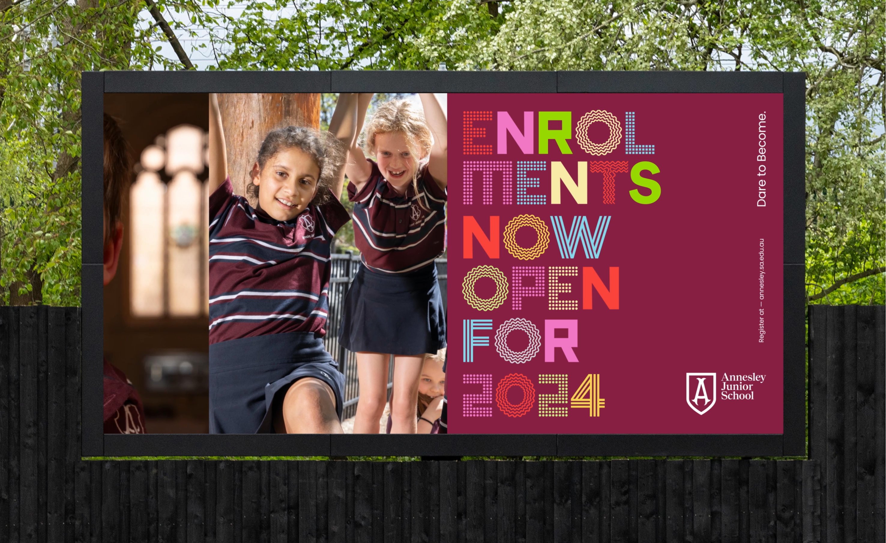
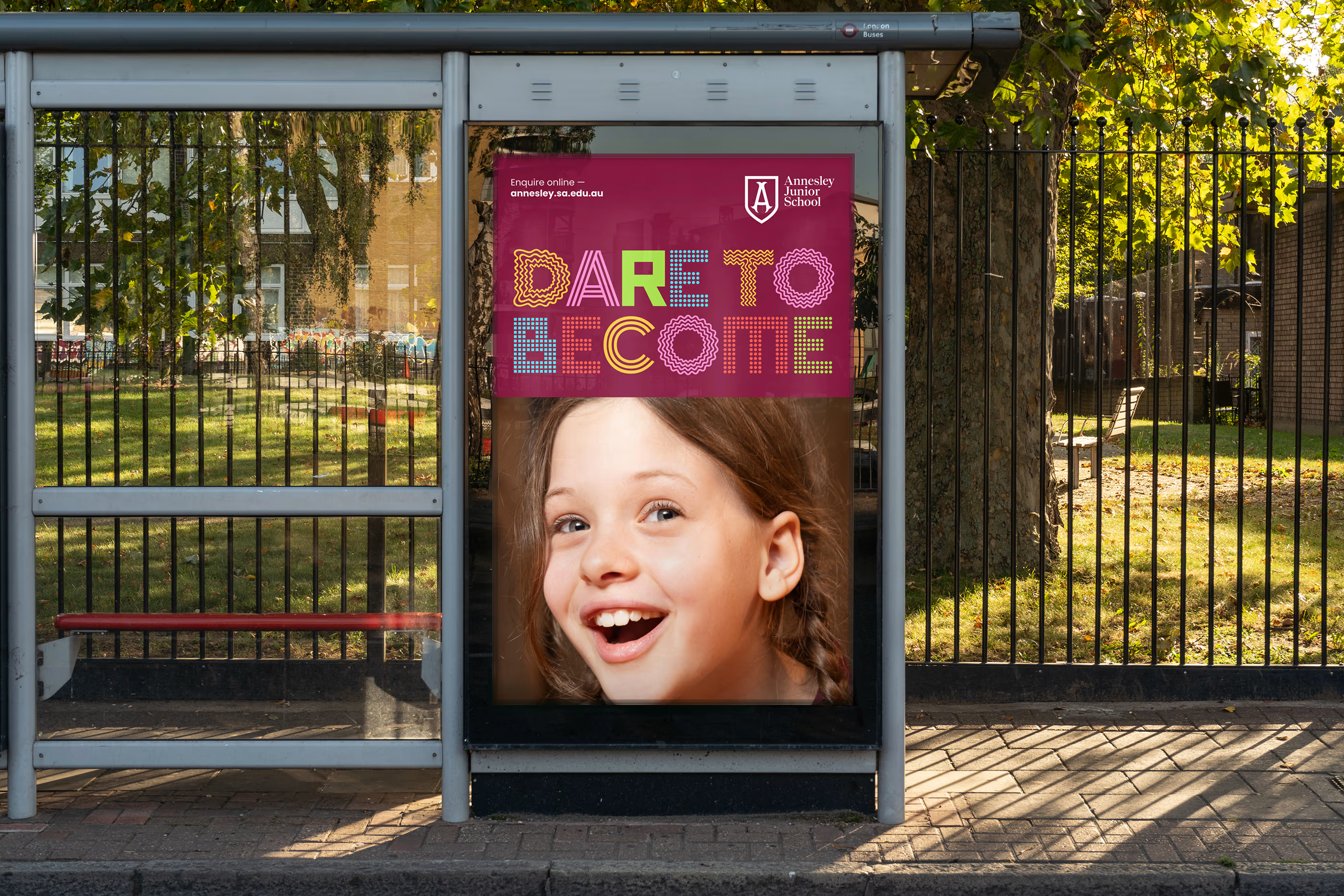
custom typeface, inspired by value-led Gillingham Display is Annesley’s voice turned visual. Each character is informed by pictograms that reflect the school’s values, giving headlines a confident, human energy. Named for the 120-year-old Gillingham Hall, the typeface bridges past and present, pairing expressive forms with disciplined spacing for legibility at scale.
In social posts, event promotions and campaign work, it becomes an instant signifier of Annesley, lifting recognition while allowing flexible tone from playful to formal. It is a distinctive brand asset designed to earn memory and build long-term mental availability.ictograms and named for Gillingham Hall, the school’s 120-year-old hall.
Translate a revered history into a living brand system that reflects a bold, innovative pedagogy. The identity needed to respect Annesley’s legacy and community while becoming expressive, future-ready and consistent across environments from classrooms to communications. Stakeholder engagement across staff, students and parents was essential to ensure strategic alignment and community buy-in.
We built an evidence-based brand system that aligns purpose, culture and communication. Guided by the school motto dare to become, we refined the Annesley shield for digital performance, created a custom display typeface, and evolved the colour system to improve distinction and accessibility. The strategy was informed by a structured stakeholder program to surface shared values and ensure adoption. The result is a coherent, flexible identity that expresses confidence without losing the warmth and heritage that define Annesley’s community.
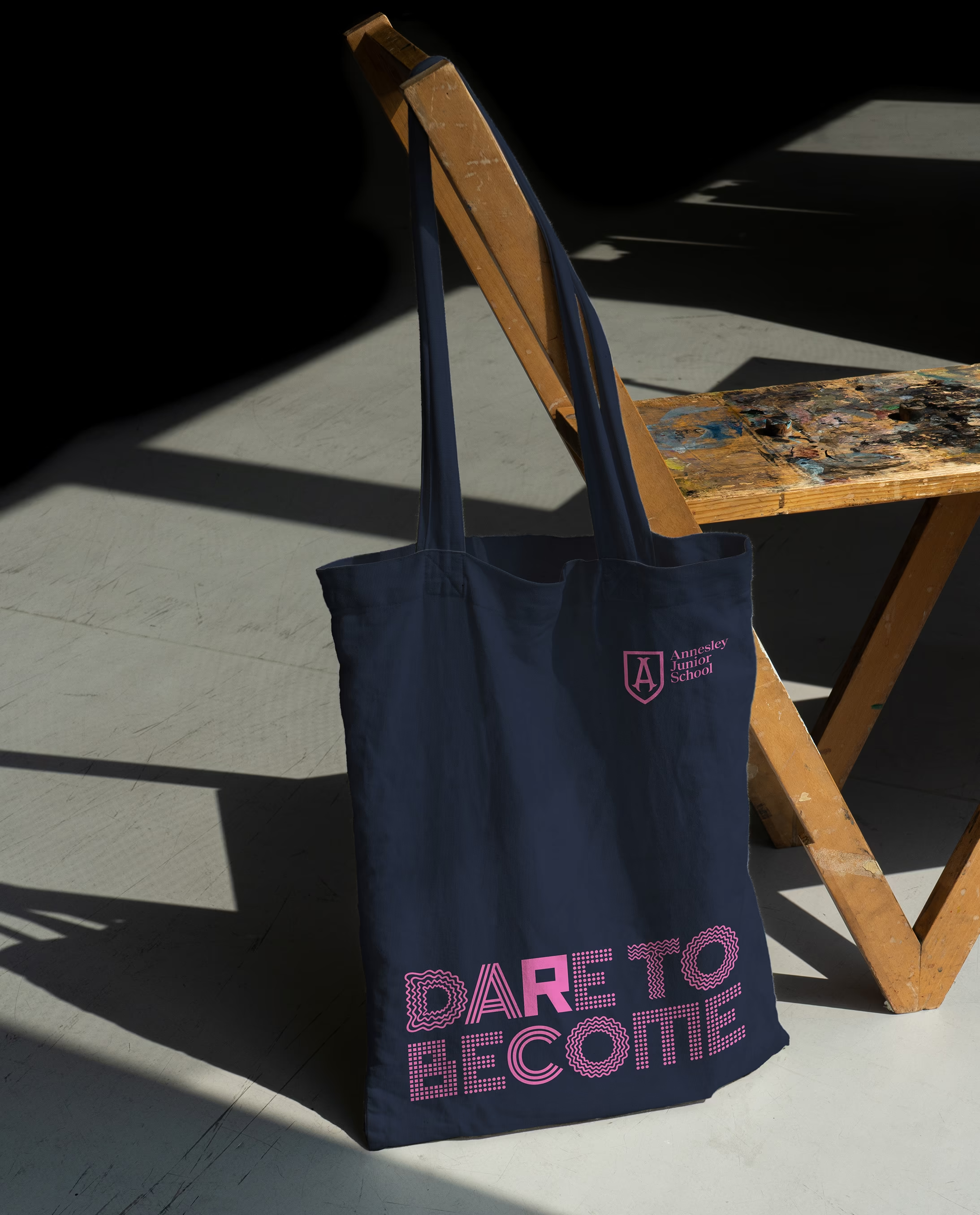
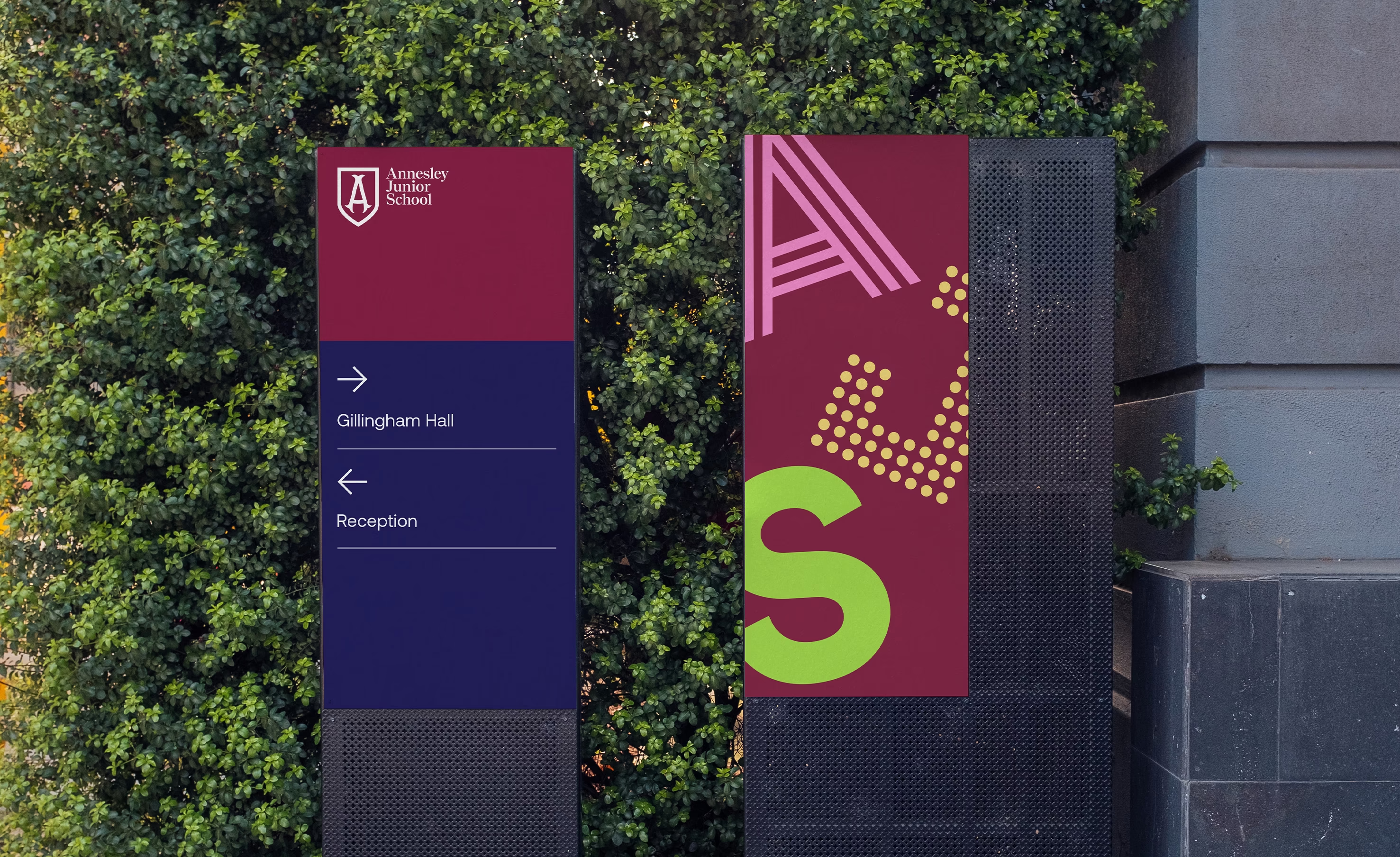
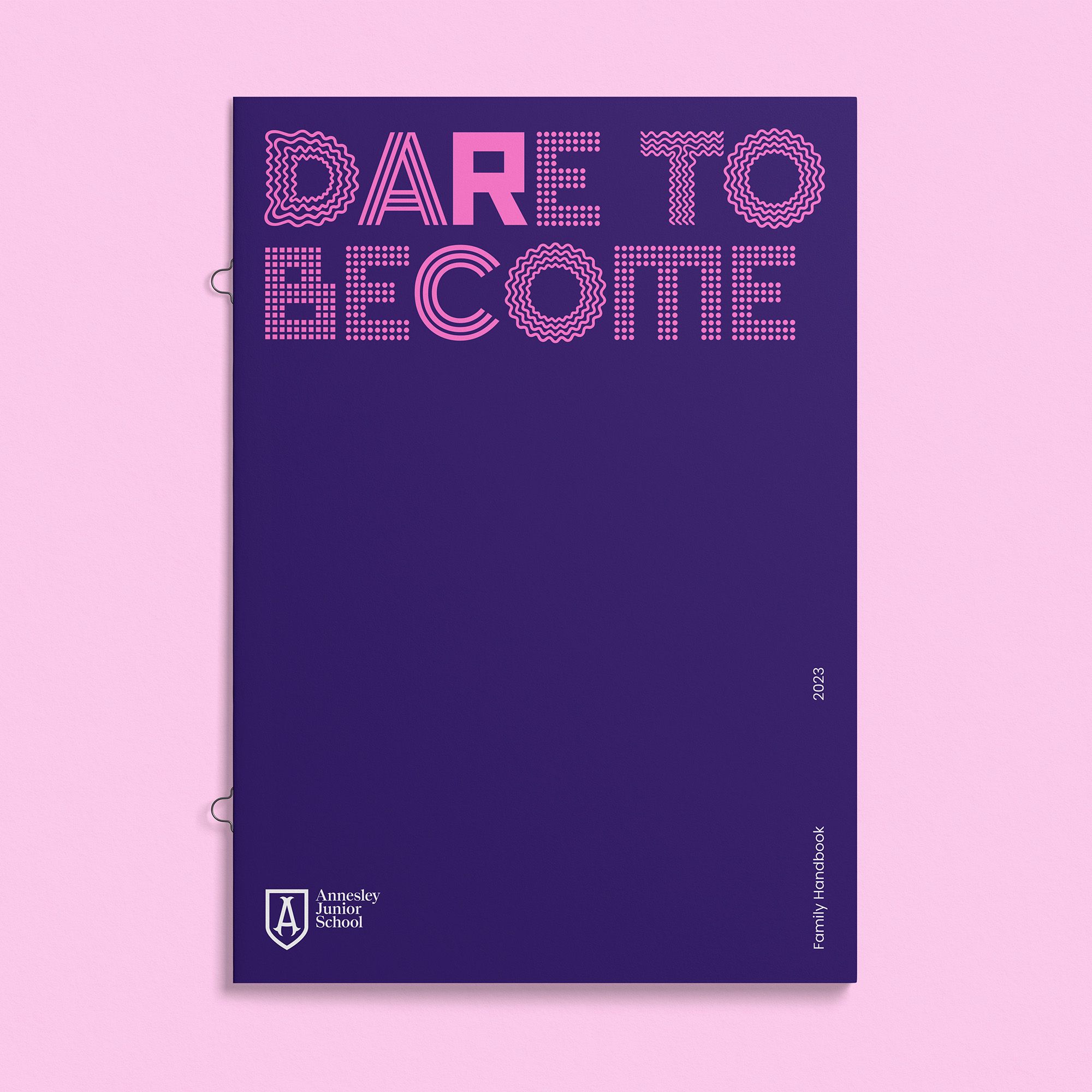
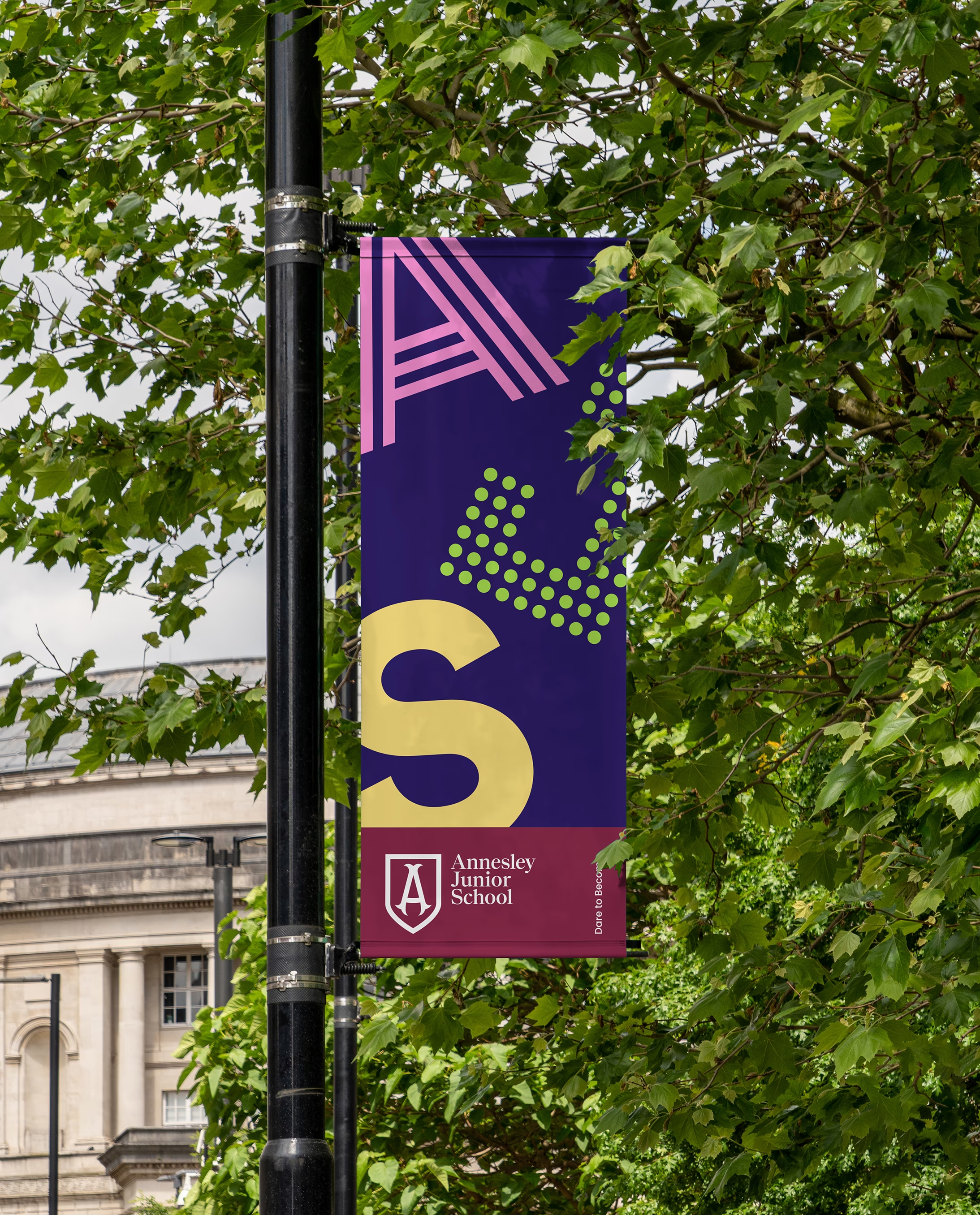
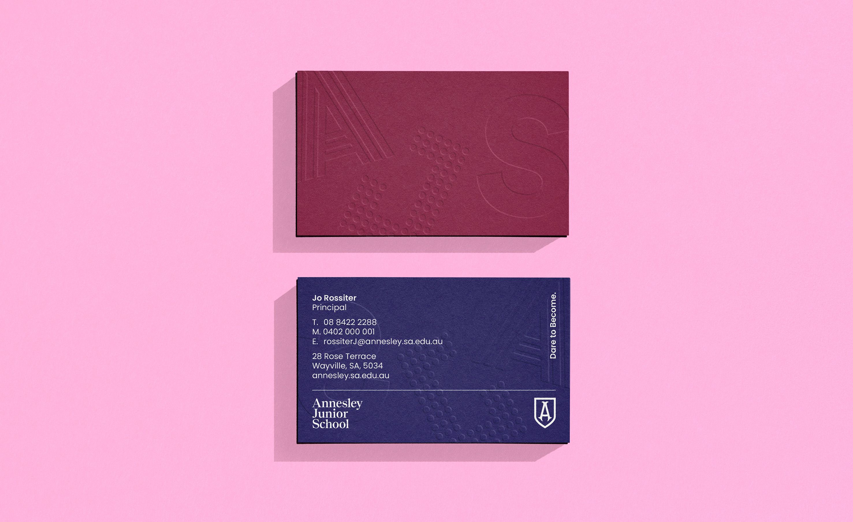
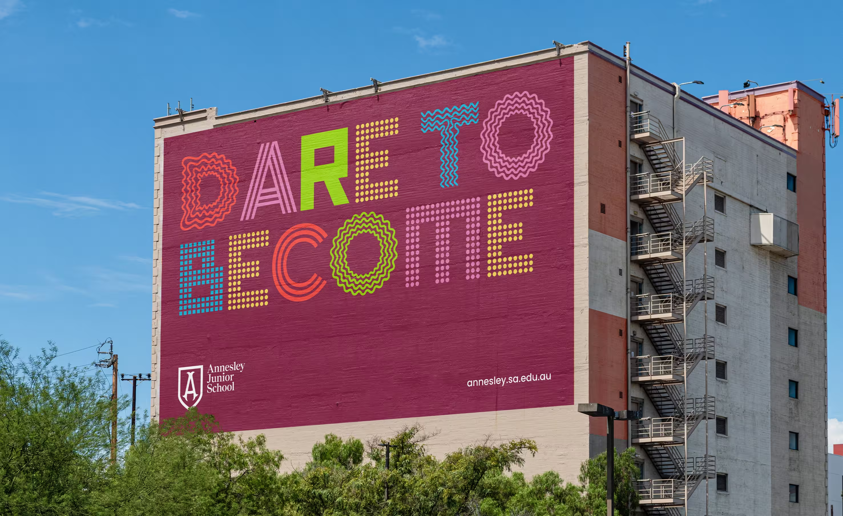
The refreshed brand positions Annesley as one of South Australia’s leading junior primary schools, strengthening recognition and community connection. By balancing heritage with a contemporary, International Baccalaureate approach to learning, the identity reflects both the school’s legacy and its progressive outlook.
Designed as a cohesive brand system, it enables clearer storytelling and consistent application across channels — supporting staff, students and families with an experience that feels aligned, distinctive and enduring.
Iliana Nalbantska
AADC Awards Finalists — Brand Identity: Small Boutique