We create brands that are deeply connected to vision, rich with meaning, and crafted to inspire, align, and endure. Beautiful Brand Intelligence.
When Coopers Brewery, the largest independently owned brewery in Australia, approached us to develop a distinct identity for their hospitality venues, the challenge was one of alignment and authenticity.
The Coopers Alehouse brand needed to complement the revered Coopers masterbrand while standing strong as a venue experience in its own right. For an institution with more than 150 years of brewing heritage, this was about more than just aesthetics, it was about stewardship of a legacy.
Coopers Alehouse
Hospitality and Beverage
Deliverables
Brand strategy
Brand development
Custom typeface
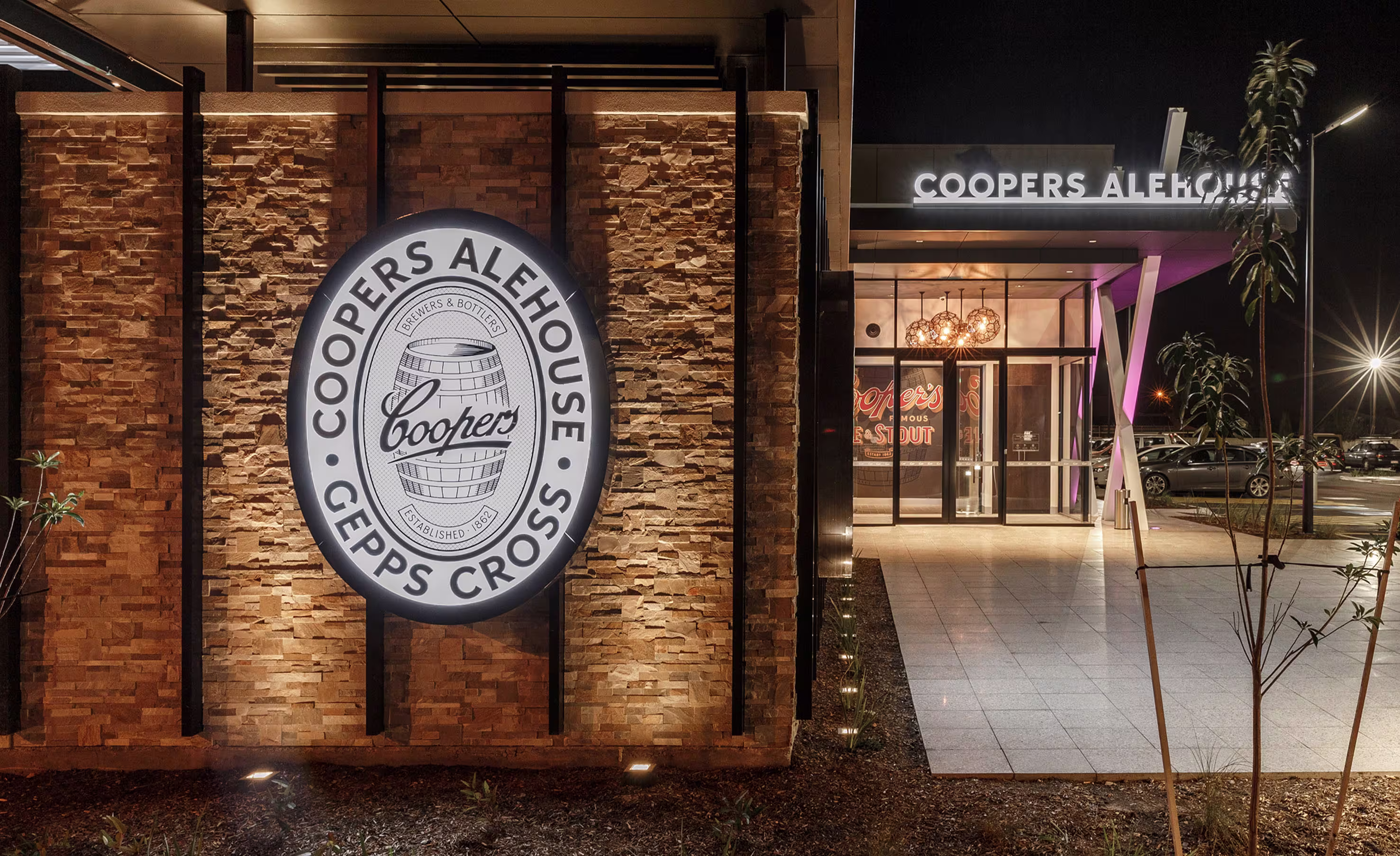
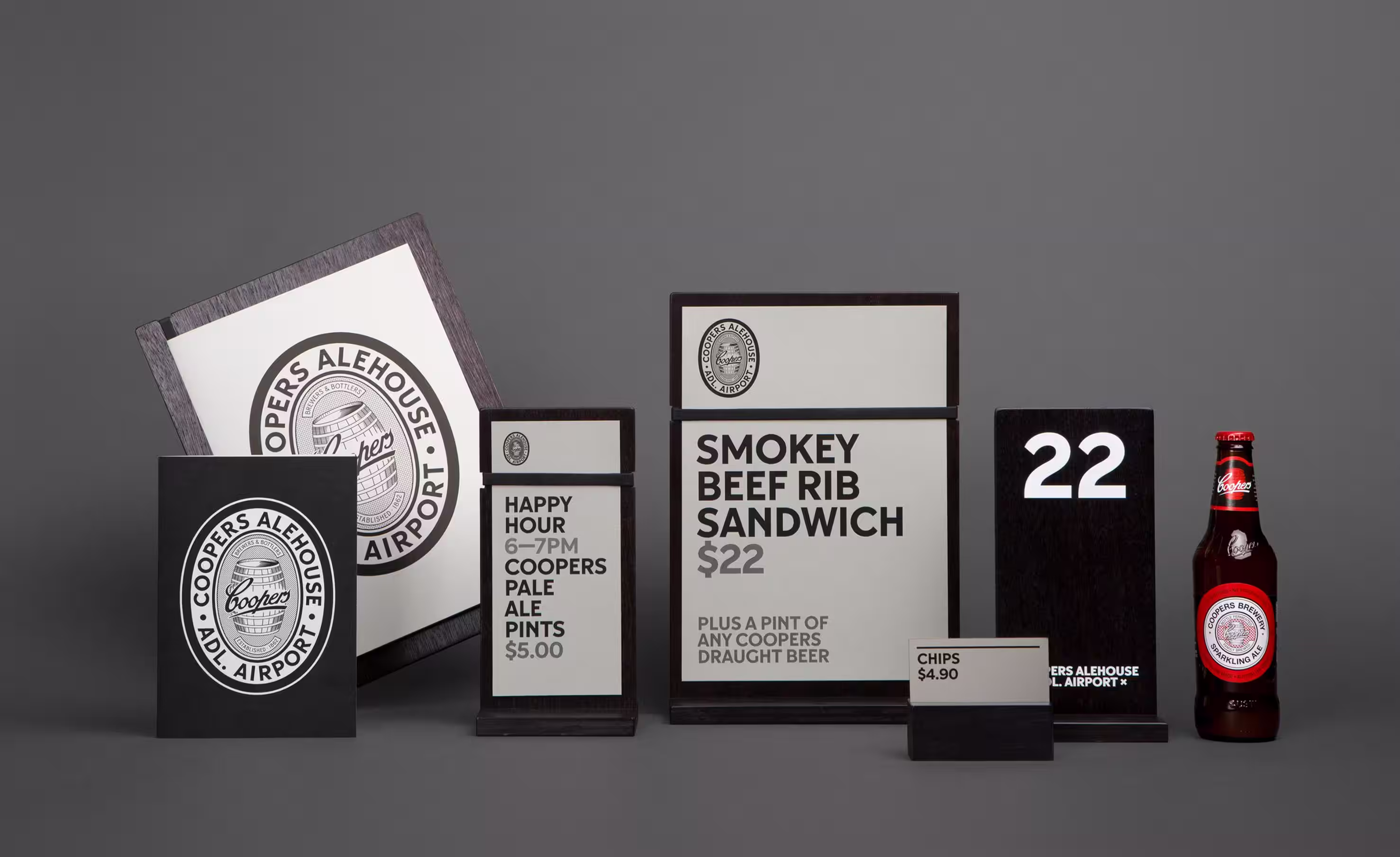
Signage and wayfinding
Venue collateral
Uniform design
Brand guidelines
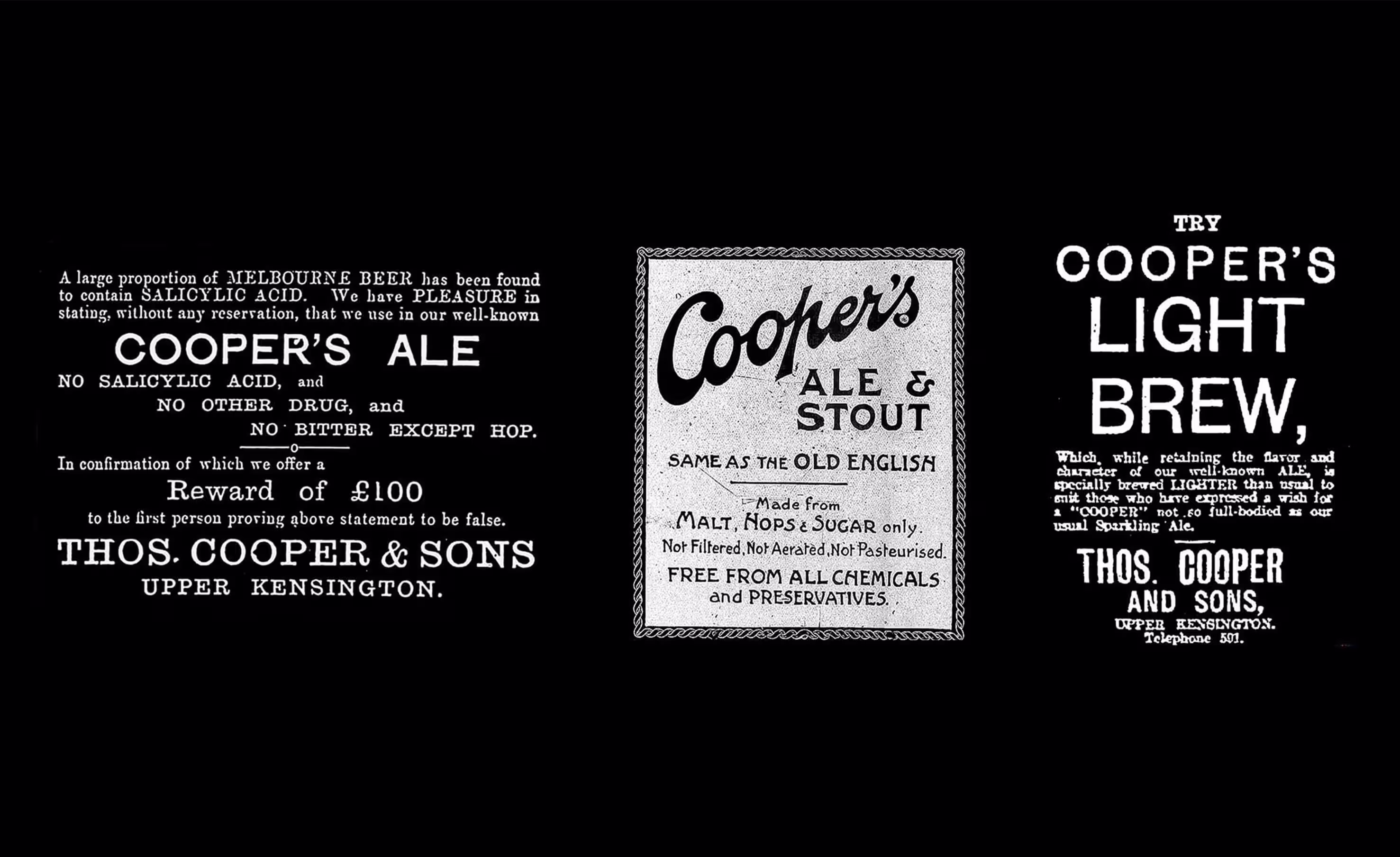
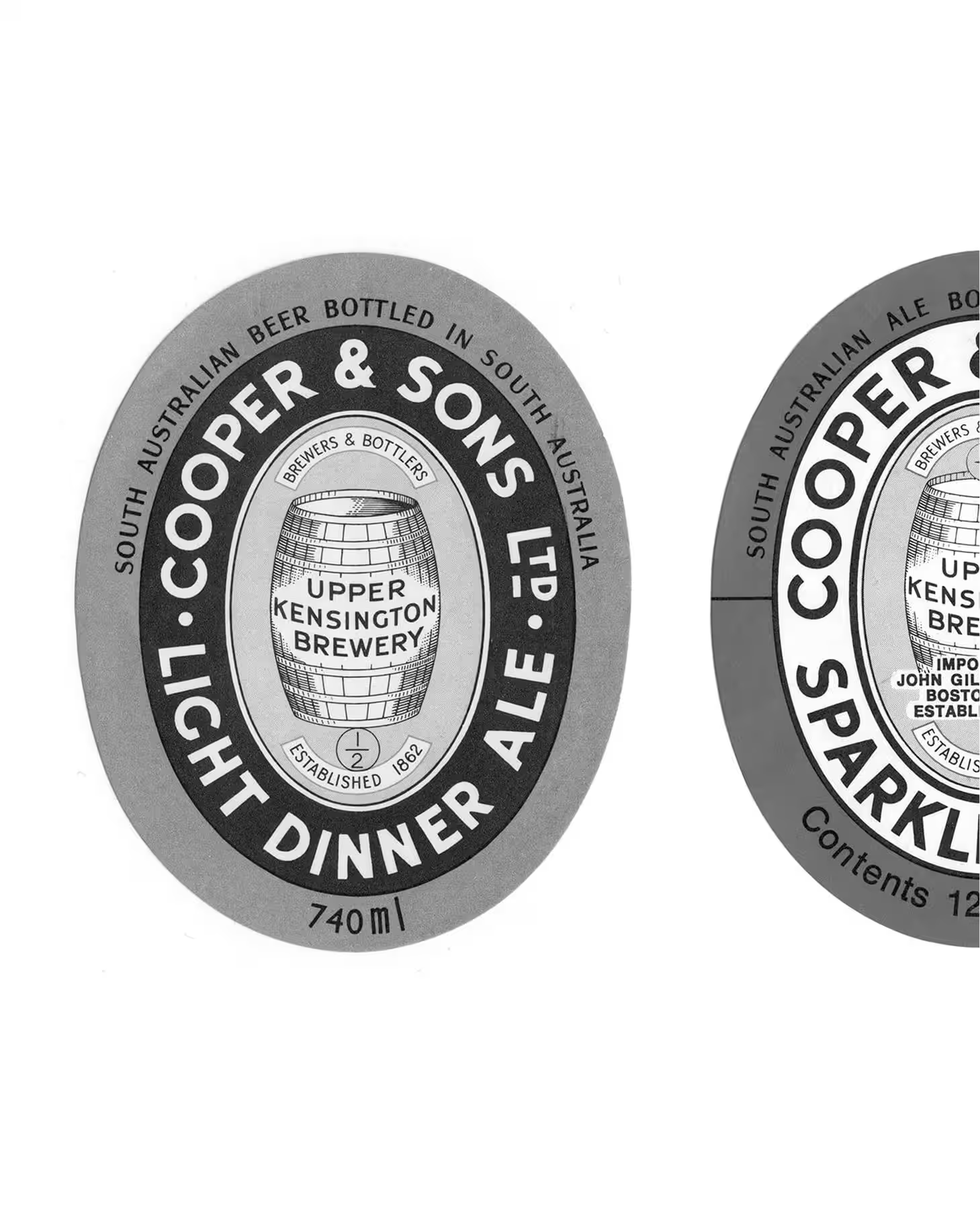
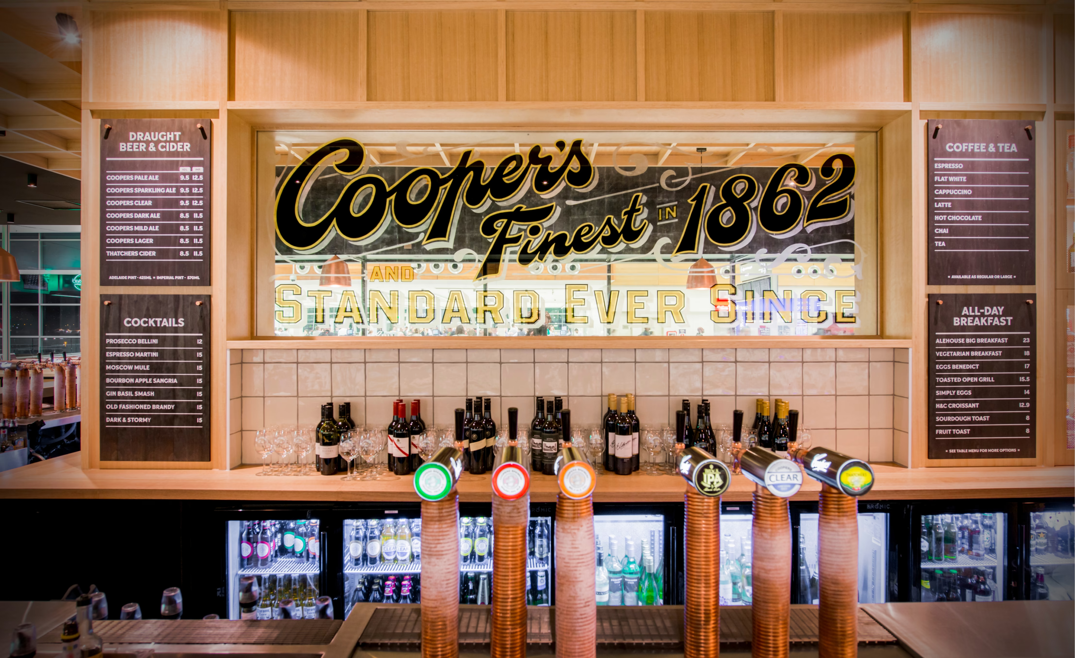
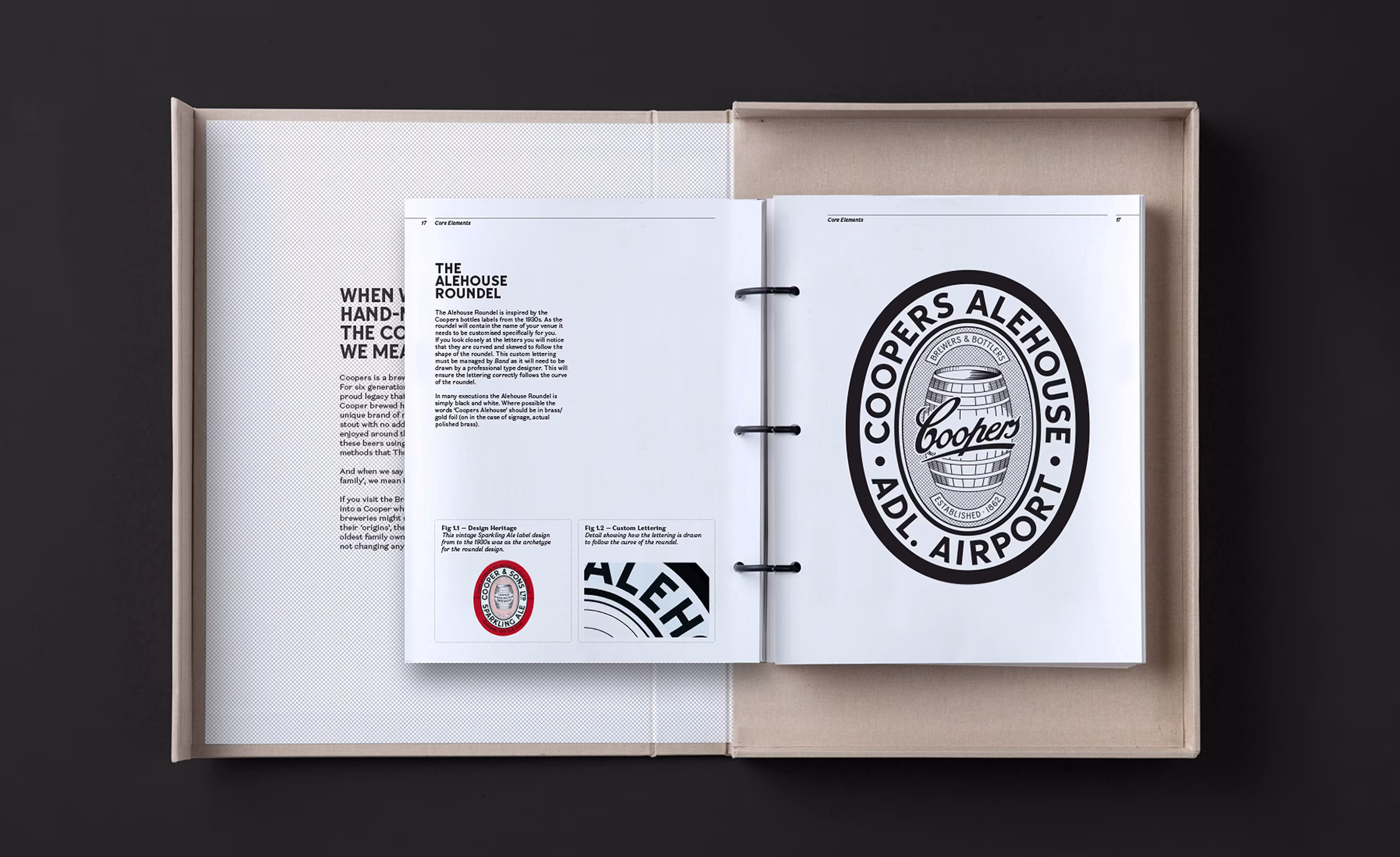
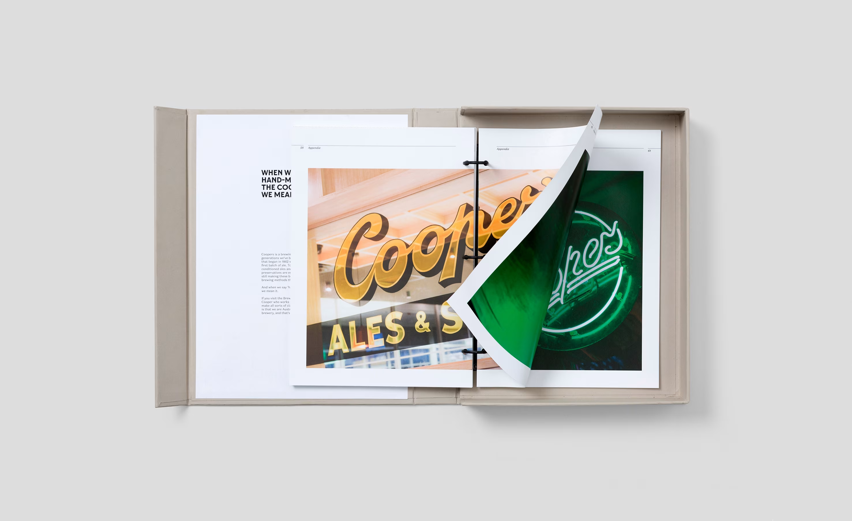
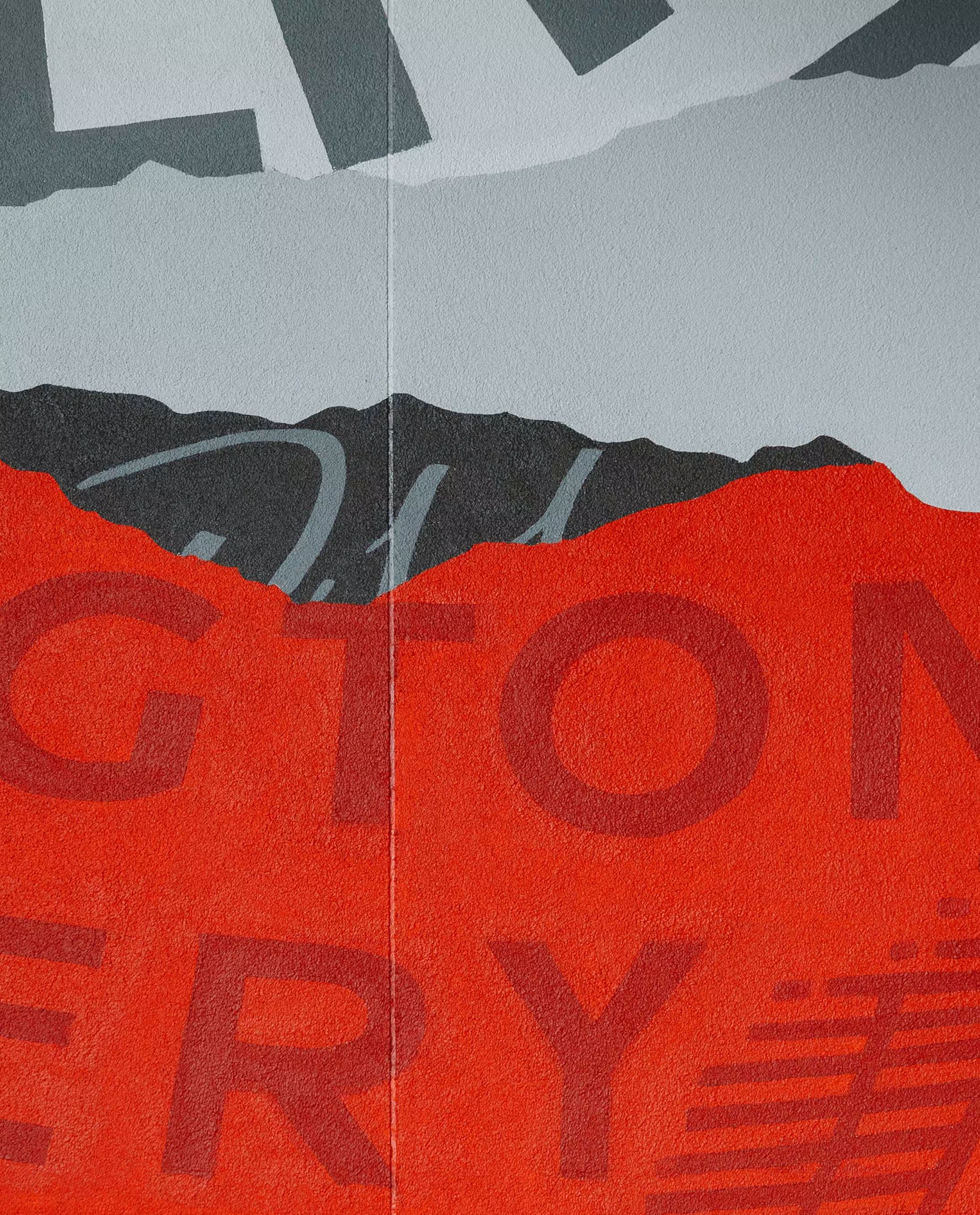
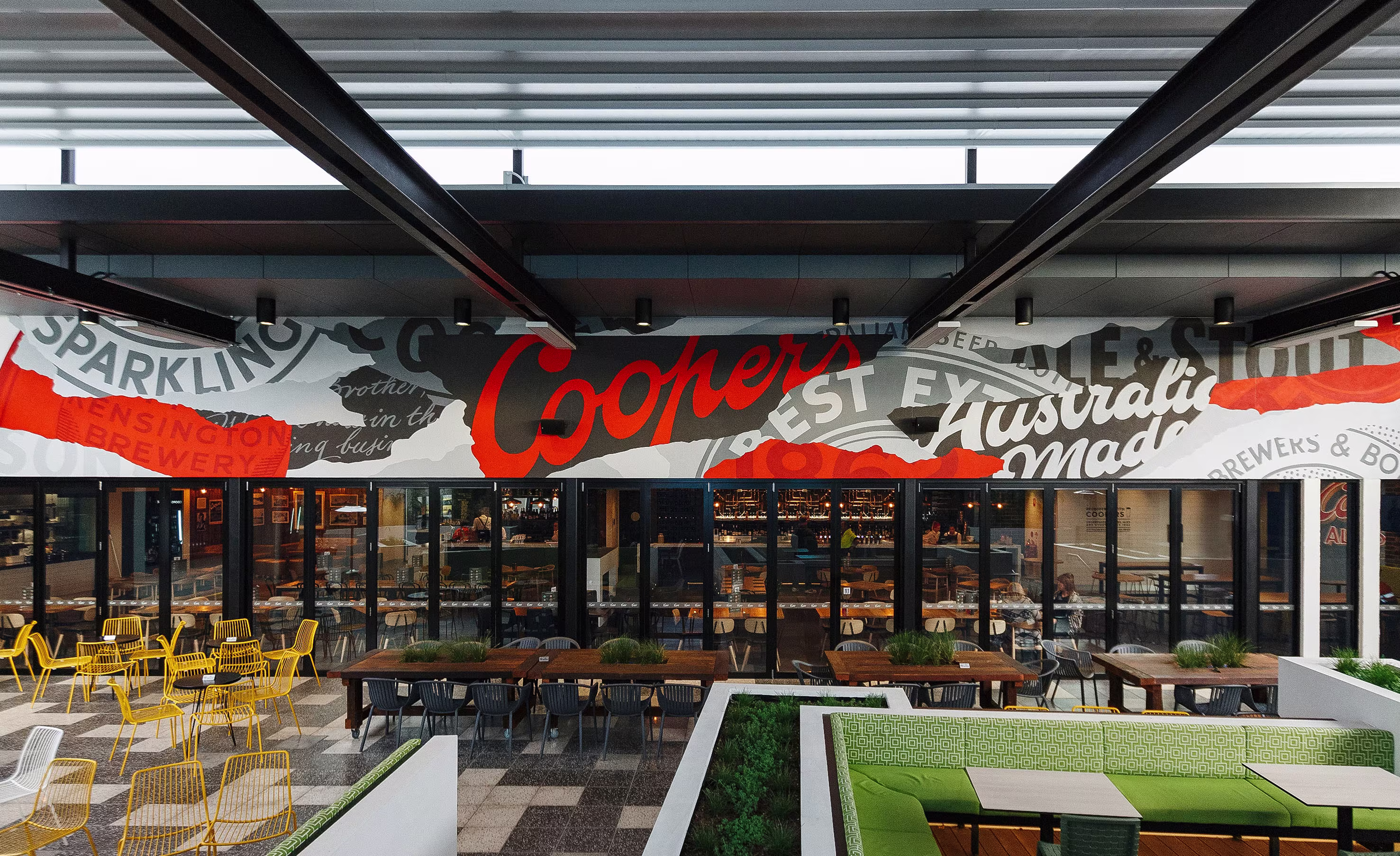
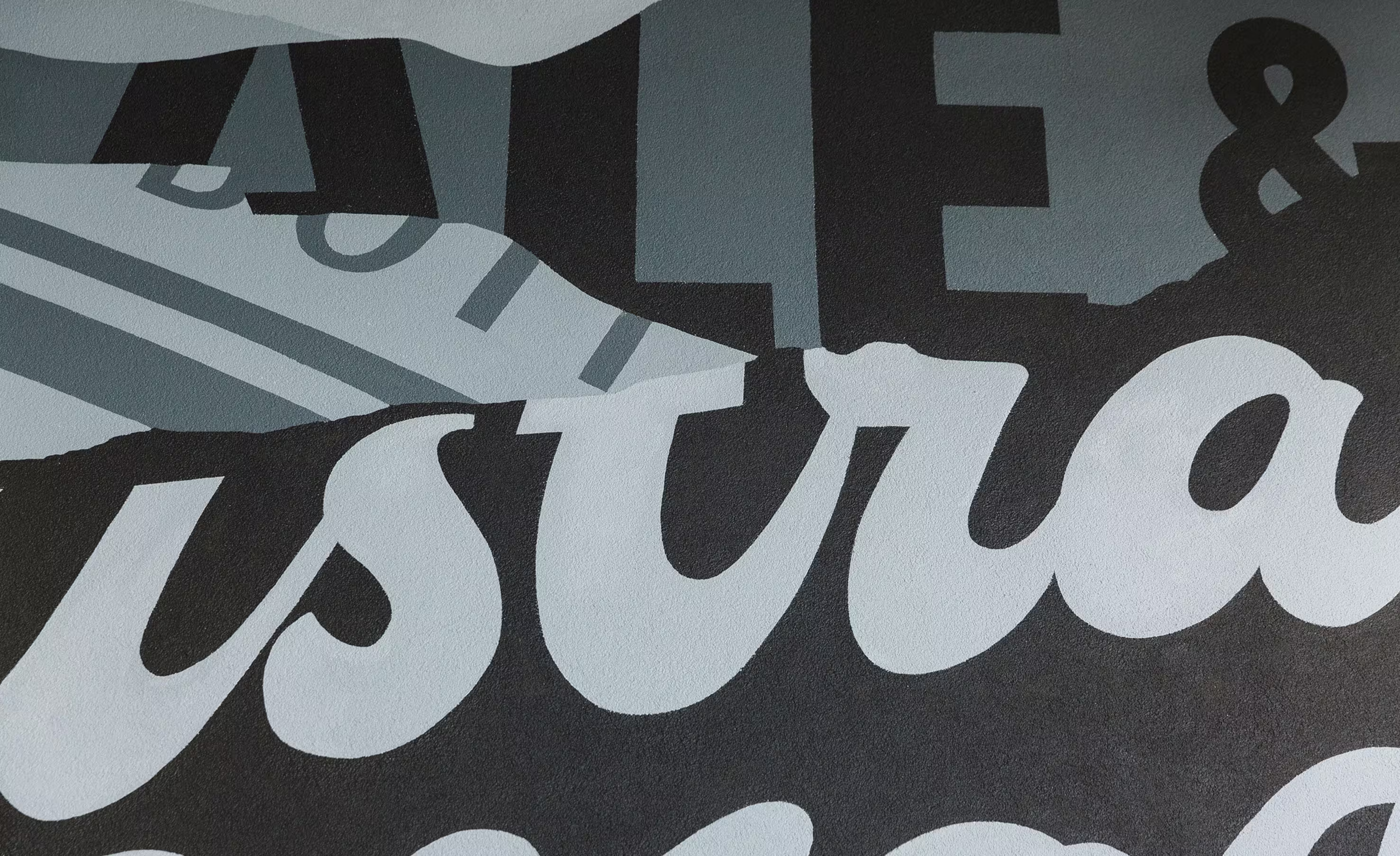
The Coopers Alehouse brand draws heavily on Coopers’ archival beer labels and historic advertising, some dating back more than 150 years. These rich visual artefacts informed everything from the custom typeface to the signage and murals. By referencing original typography, colour palettes and composition styles, we were able to create a brand identity that feels both familiar and fresh. This connection to the past wasn’t just aesthetic, it was strategic. It helped ground the venues in the legacy of the brewery, creating authenticity at every touchpoint...


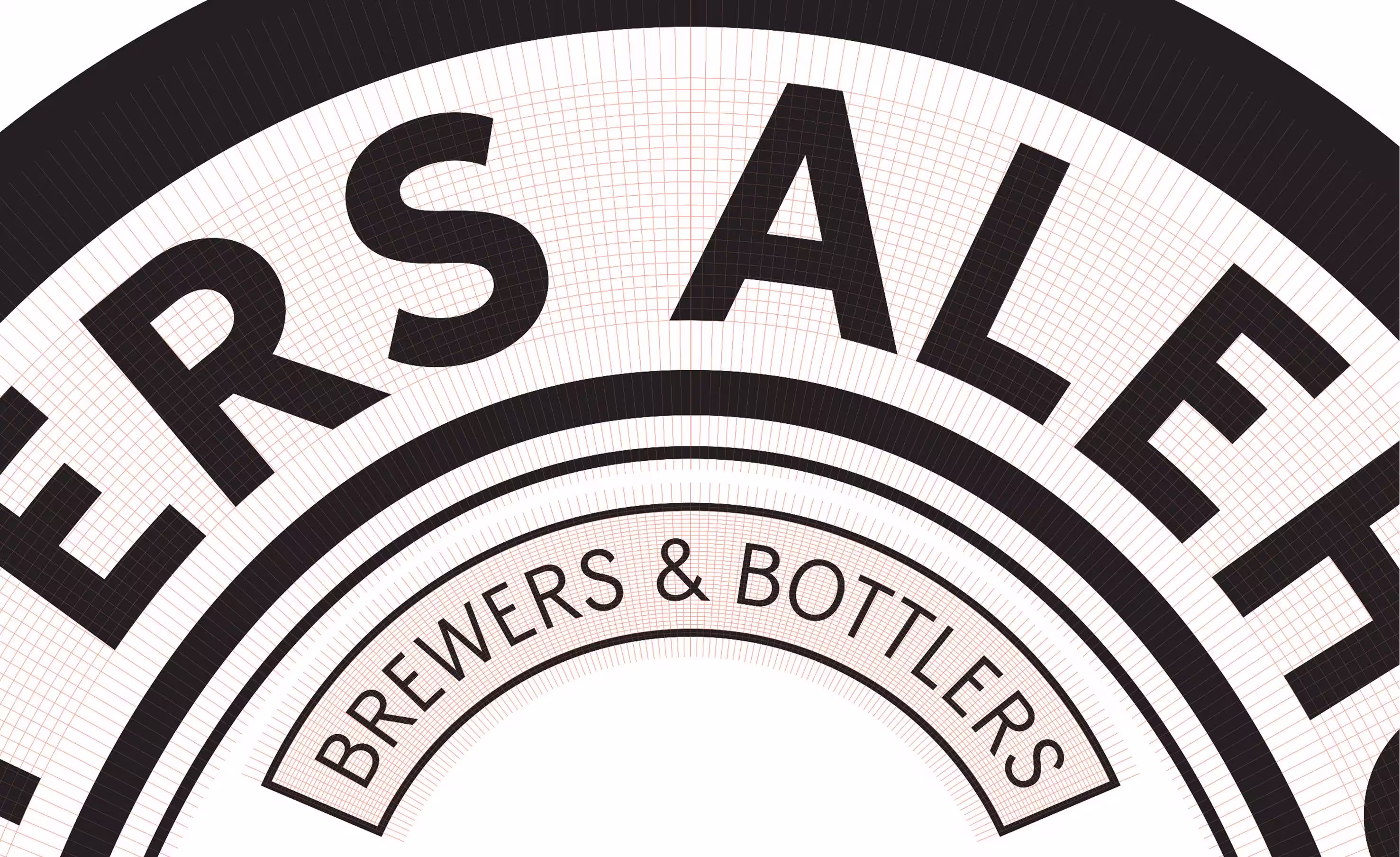
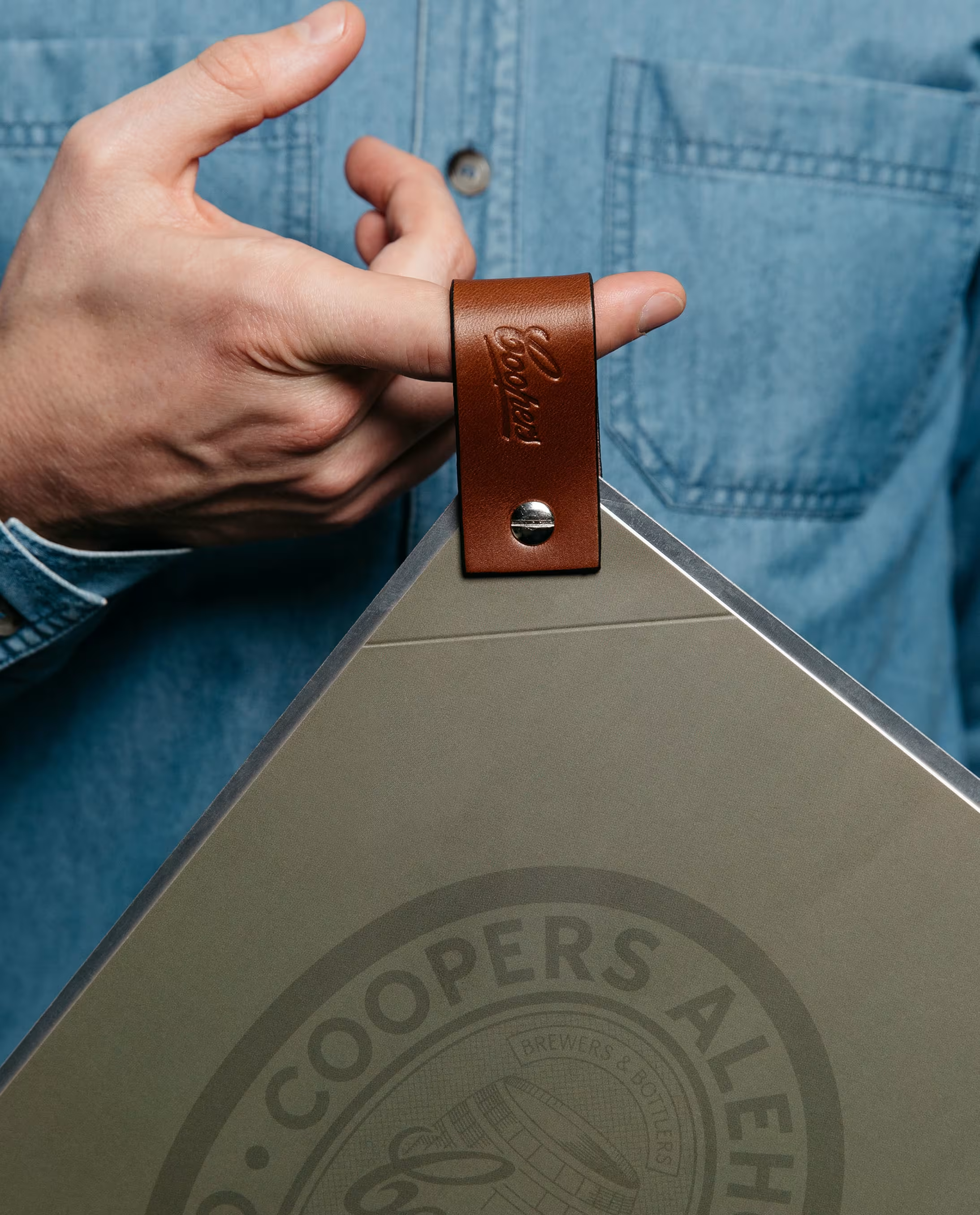
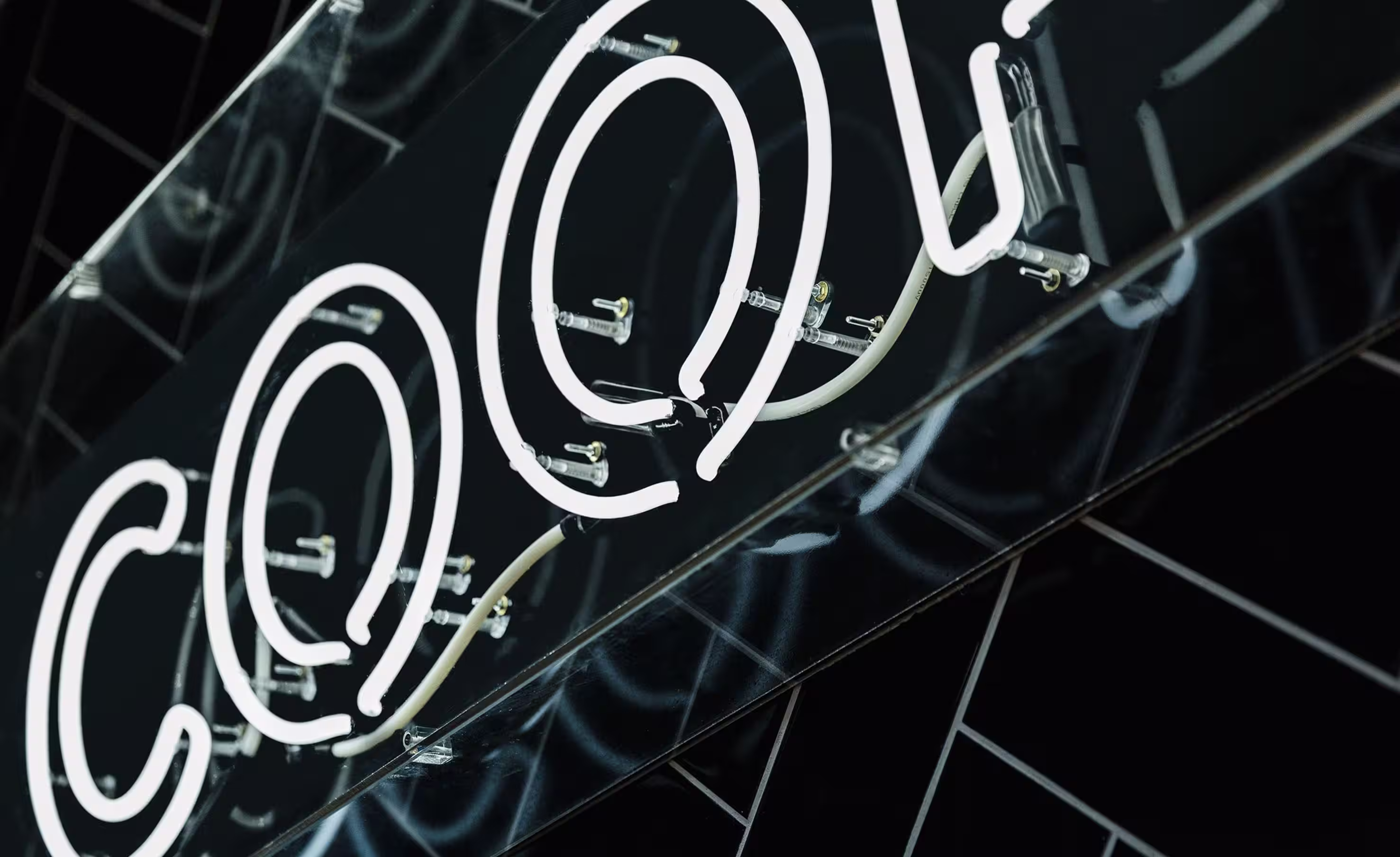
A key element of the Coopers Alehouse brand was Sparkling Bold — a custom typeface inspired by letterforms found on Coopers’ historical beer labels. To bring this vision to life, we engaged award-winning type designer Dave Foster to craft the font under our creative direction. The result is a characterful and contemporary typeface that carries the legacy of the brand into a new era. Each curve and serif is a nod to the past, reinforcing authenticity and consistency across signage, collateral, and spatial applications.
Our approach was to create a venue brand that could celebrate Coopers’ rich history while functioning as a standalone hospitality brand. The identity needed to feel true to Coopers’ legacy, but with enough flexibility to express itself across a diverse range of touchpoints from uniforms and menus to signage and murals.
We immersed ourselves in Coopers’ history, drawing on archived beer labels, advertising ephemera and museum pieces to inform the brand direction. From this foundation, we built a holistic design system that honoured the past while elevating the present.
A custom typeface — Sparkling Bold by Dave Foster — was crafted from historic Coopers typography. Traditional fabrication and signwriting techniques brought authenticity to the spatial branding, with expressive murals by Tristan Kerr reinforcing the sense of place and story. Every detail, from environmental graphics to uniforms, was designed with historical integrity and hospitality functionality in mind.


The Coopers Alehouse brand proves that heritage and hospitality can co-exist with impact. It’s a case study in how thoughtful brand strategy and crafted design can translate a company’s legacy into everyday customer experience.
Mark Lobo
Tristan Kerr
Dave Foster