We create brands that are deeply connected to vision, rich with meaning, and crafted to inspire, align, and endure. Beautiful Brand Intelligence.
Oakridge Wines is one of Australia’s leading cool-climate producers, celebrated for Chardonnay and Pinot Noir crafted with minimal-intervention methods that showcase Yarra Valley terroir. Our brief was to translate the acclaimed cellar door experience into a benchmark direct-to-consumer website that feels as tactile and considered as the wine itself.
That matters because brands grow when mental availability meets physical availability: make it easy to buy, and distinctive to remember. By designing an evidence-based brand system online, we aimed to lift organic traffic, wine club subscriptions and conversion — without compromising the integrity of the Oakridge brand.
Oakridge Wines
Food & Drink
UX research and journey mapping
Information architecture and content design
UI design system and component library
E-commerce (D2C) design and optimisation
Wine club flows and onboarding
Conversion copy and micro-interactions
Photography and video direction
Technical SEO foundations and schema
Accessibility and performance tuning
Analytics dashboards and event tracking
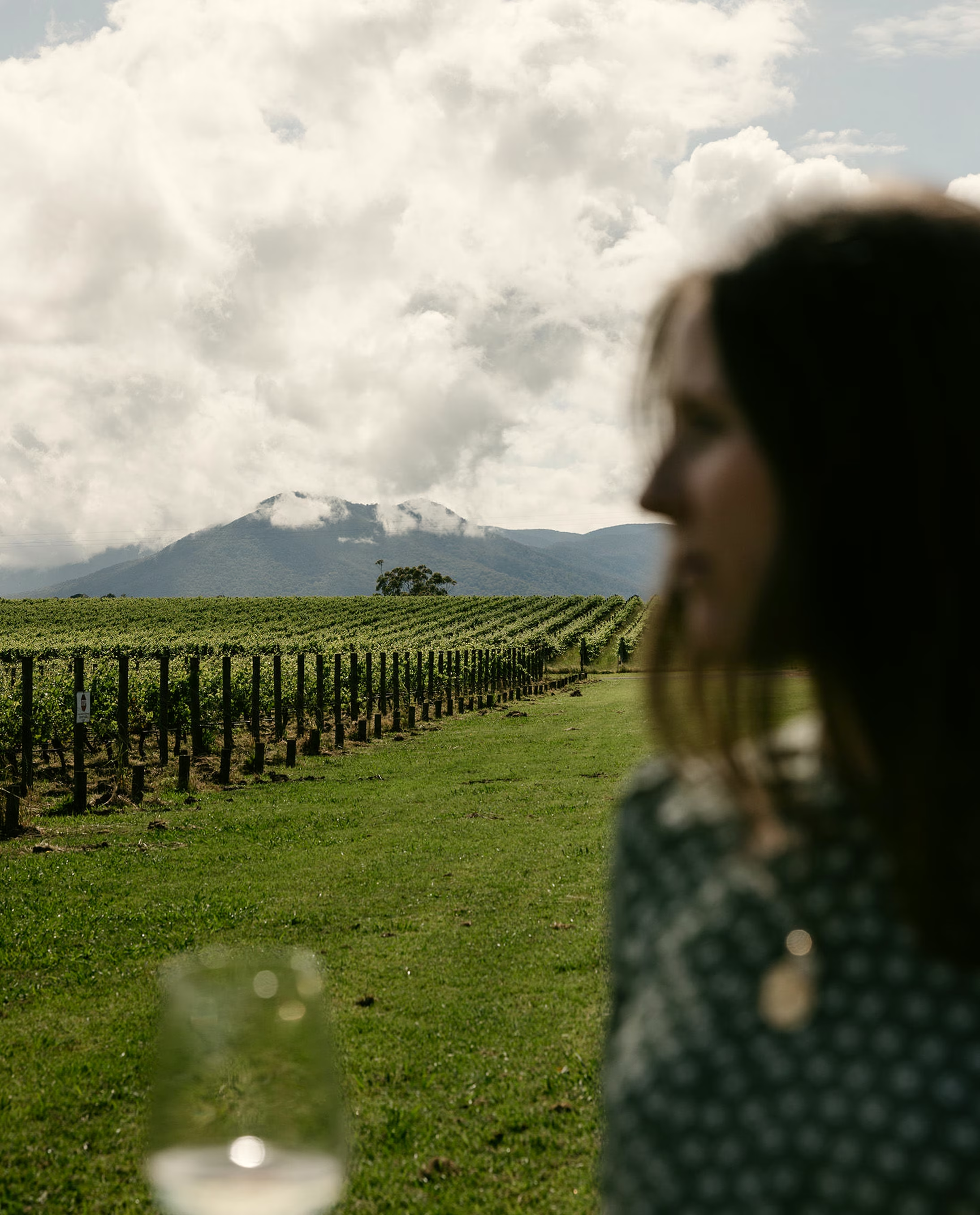
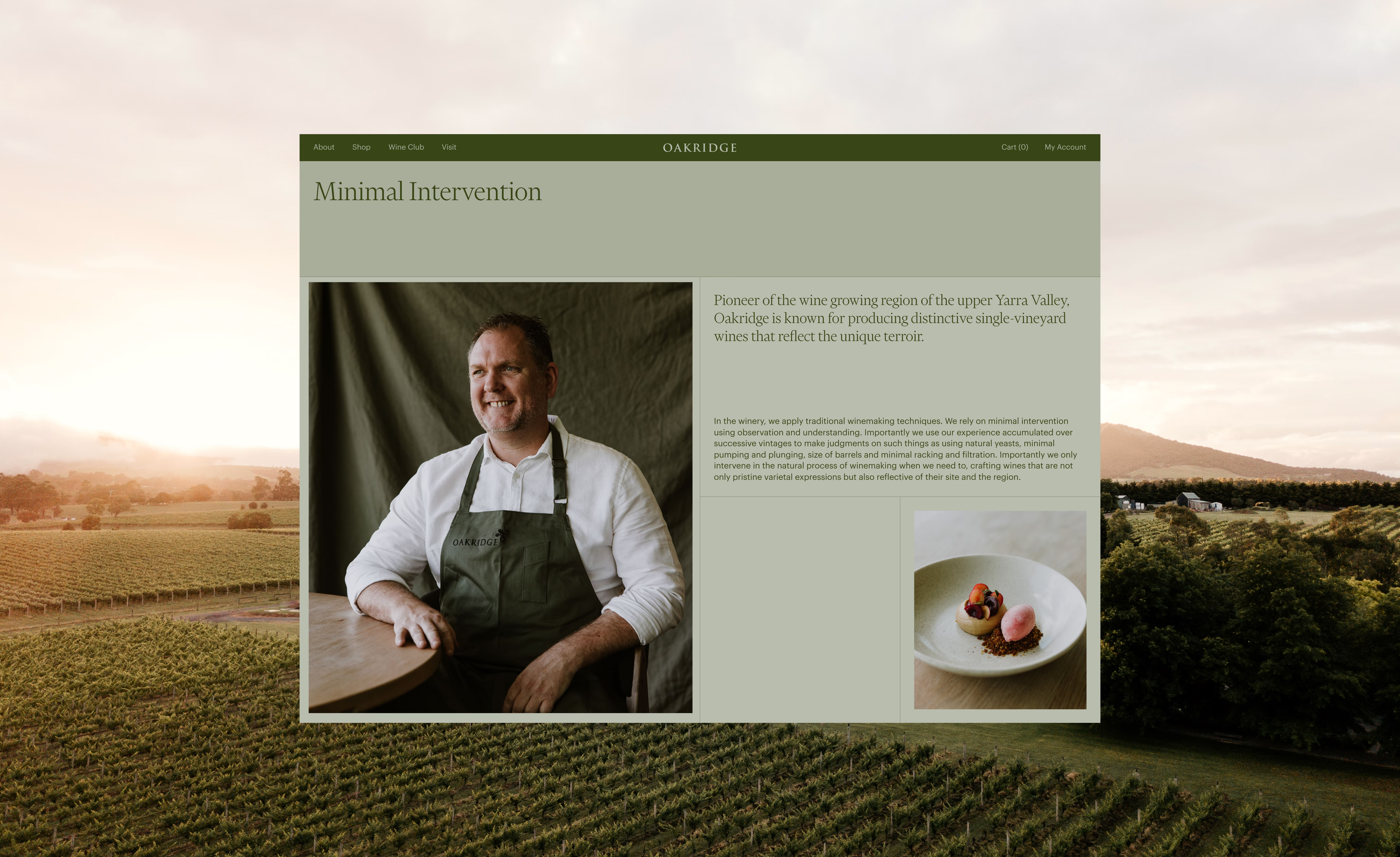
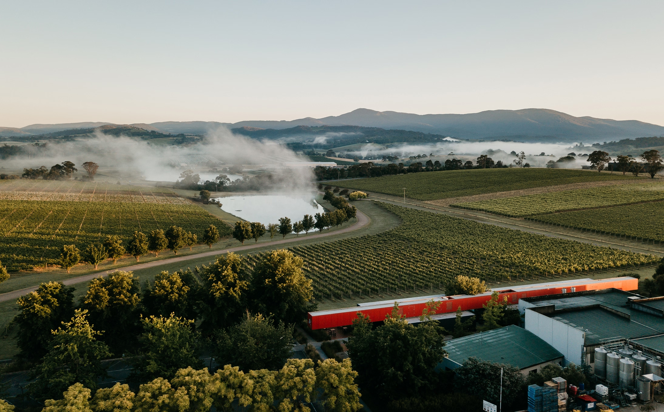
The Yarra Valley is a destination — not a quick stop. Oakridge’s cellar door is extraordinary, but distance limits visitation. The challenge was to bring that sense of place to people’s screens: capturing atmosphere, process and product without losing performance, clarity or commercial focus. We needed a seamless path from discovery to purchase, and a wine club experience that rewards loyalty while staying true to Oakridge’s reputation.
We built the site around three principles: distinctiveness, ease, and immersion. Distinctiveness came from a branded interface that echoes Oakridge’s craft — typography, tempo, spacing and cues drawn from label details. Ease was engineered through simplified journeys, prominent next steps, and fewer clicks to checkout.
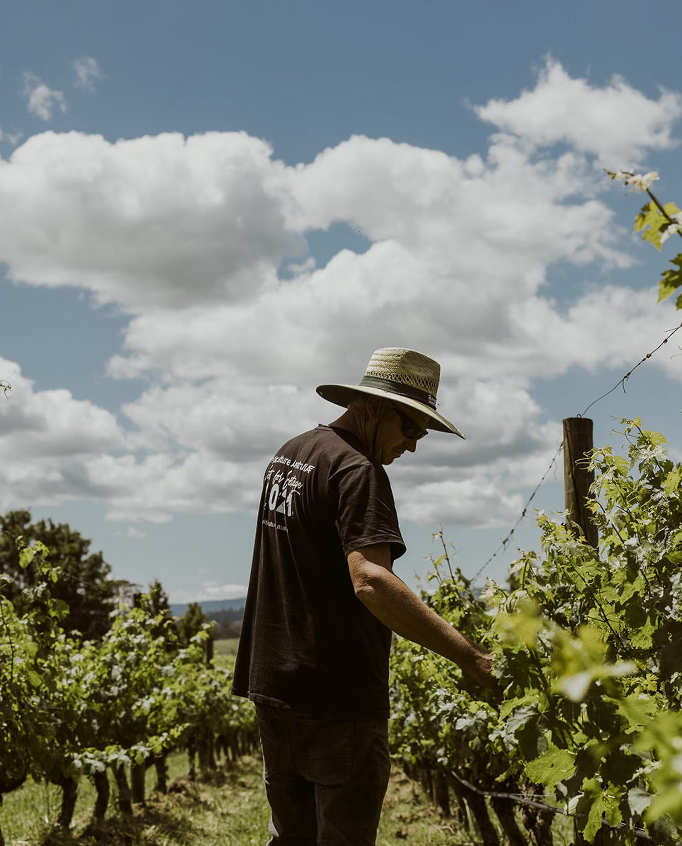
Immersion came via rich photography and video that convey vineyard, cellar and craft in motion. This mix aligns with marketing science: make the brand easy to recognise and easy to buy, then reinforce memory through consistent assets across touchpoints. Post-launch, wine-club sign-ups, organic traffic, engagement and sales improved significantly.
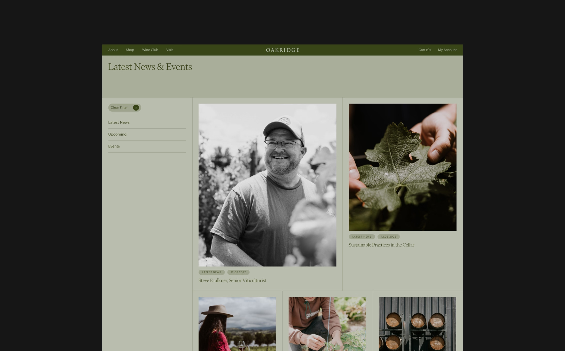
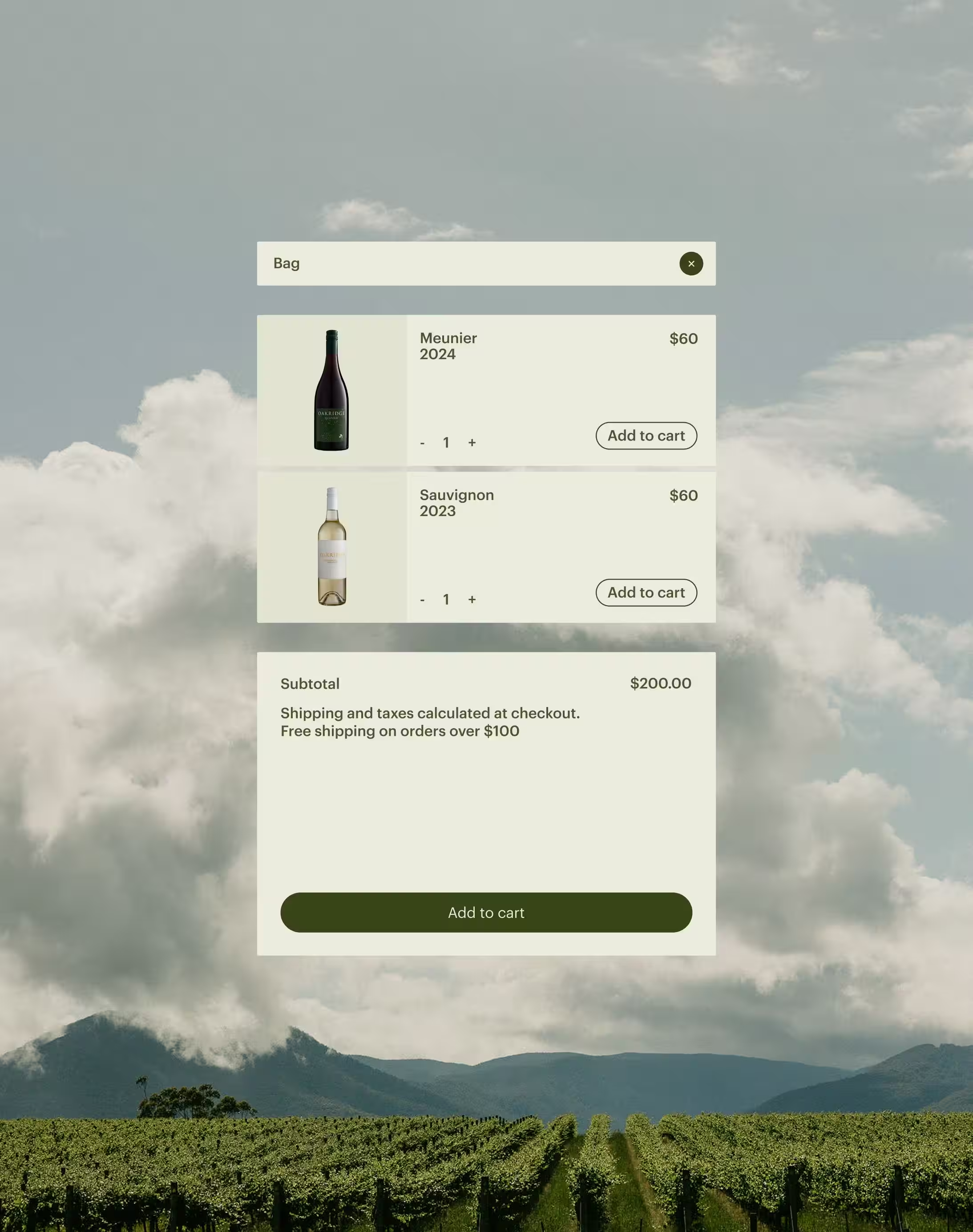
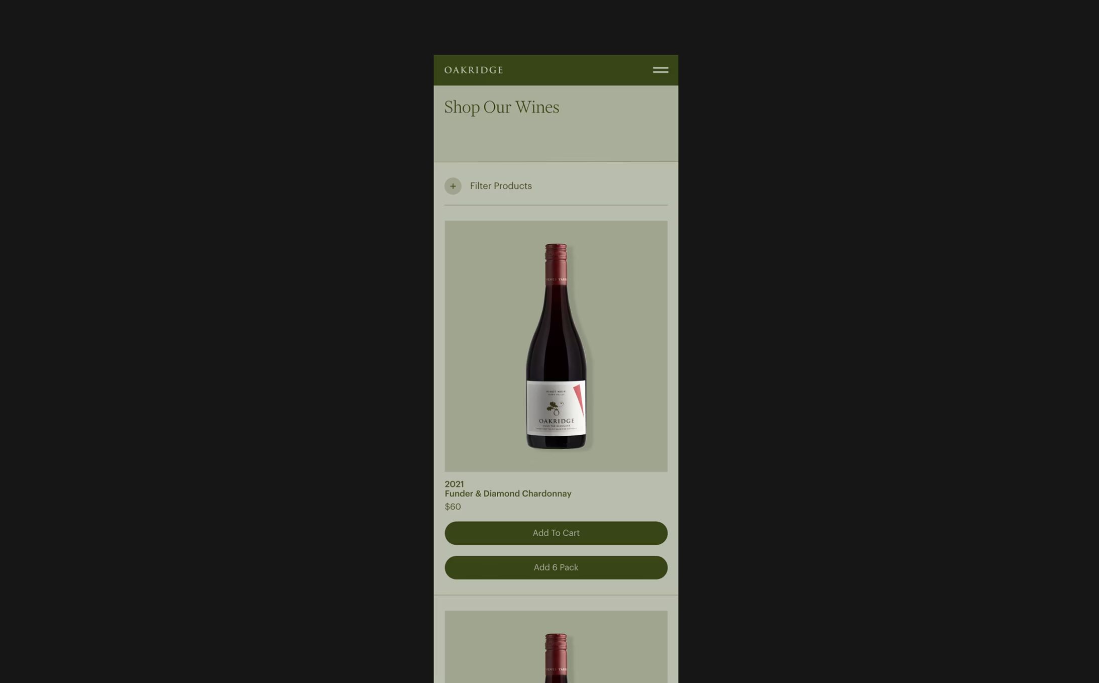
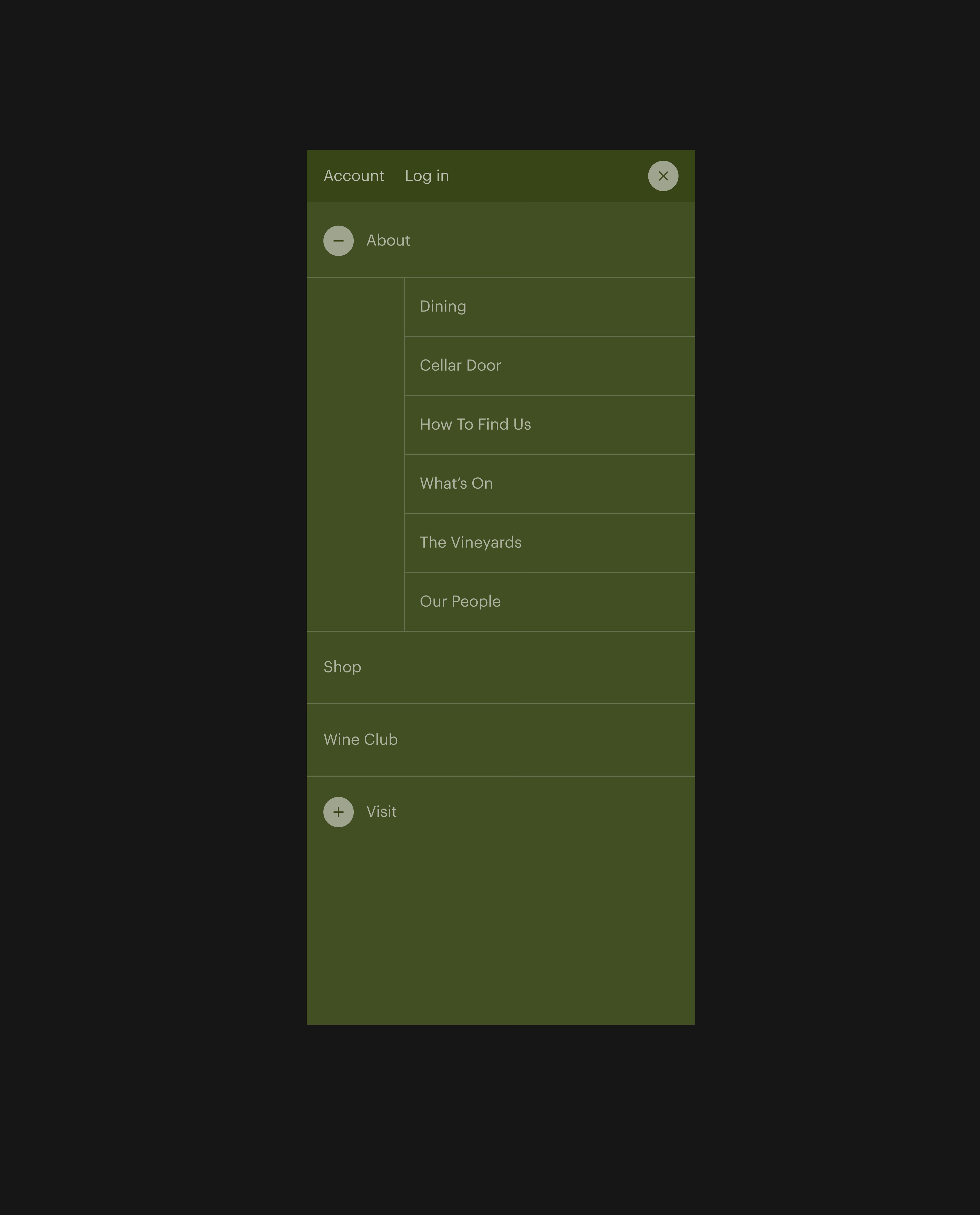
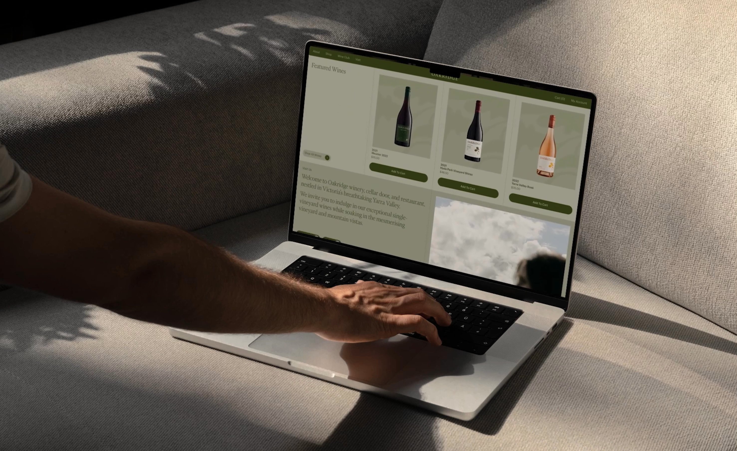
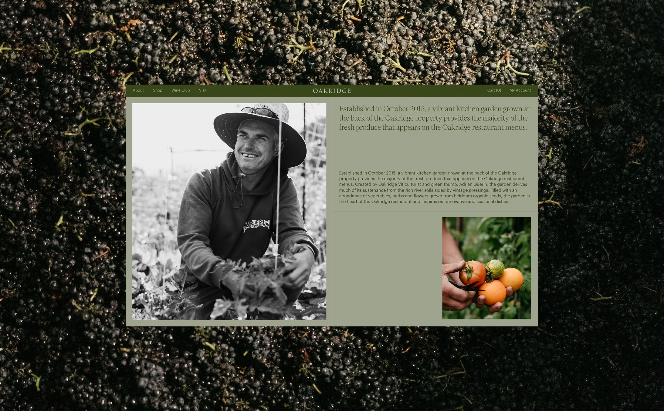
A crafted, brand-led interface is paired with generous negative space and purposeful motion. Product pages prioritise confidence — highlighting provenance, tasting notes and shipping clarity — alongside speed, with streamlined add-to-cart states and lightweight modals.
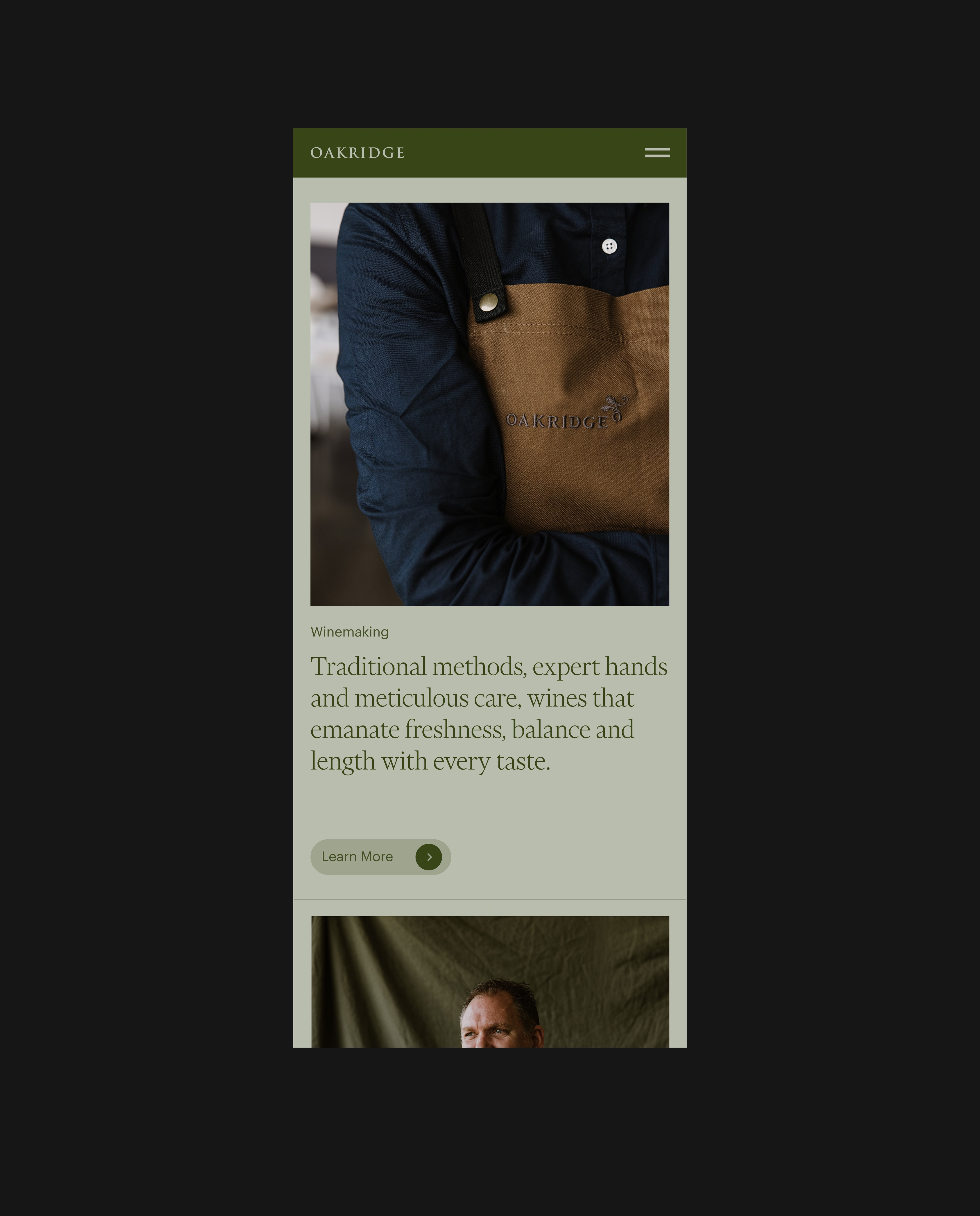
Story-led content sits alongside shoppable modules, allowing visitors to move seamlessly from winemaking to purchase. Video and still imagery ground the experience in the Yarra Valley, while a clear content hierarchy keeps decision-making simple from browsing through to joining the wine club.
This project demonstrates how brand and commerce can operate as a single system. By aligning Oakridge’s identity with a considered direct-to-consumer experience, the website supports both recognition and conversion — creating a journey that feels as refined as the product itself.
AADC Awards Finalist - Digital