We create brands that are deeply connected to vision, rich with meaning, and crafted to inspire, align, and endure. Beautiful Brand Intelligence.
The Building Company has built its reputation on redefining what it means to live well. Since 2018, the business has delivered architecturally led projects that elevate the everyday through craft, precision, and innovation.
As the company grew, it needed a brand that not only reflected the high-end quality of its work but also provided strategic clarity for the future. StudioBand® partnered with The Building Company to articulate its vision, align identity with operations, and create a brand system that would stand as a foundation for its next chapter.
The Building Company
Construction & Building
Brand strategy and positioning
Brand identity development
Wordmark and maker’s mark design
Colour palette and brand toolkit
Website design and development
Graphic design and supporting collateral
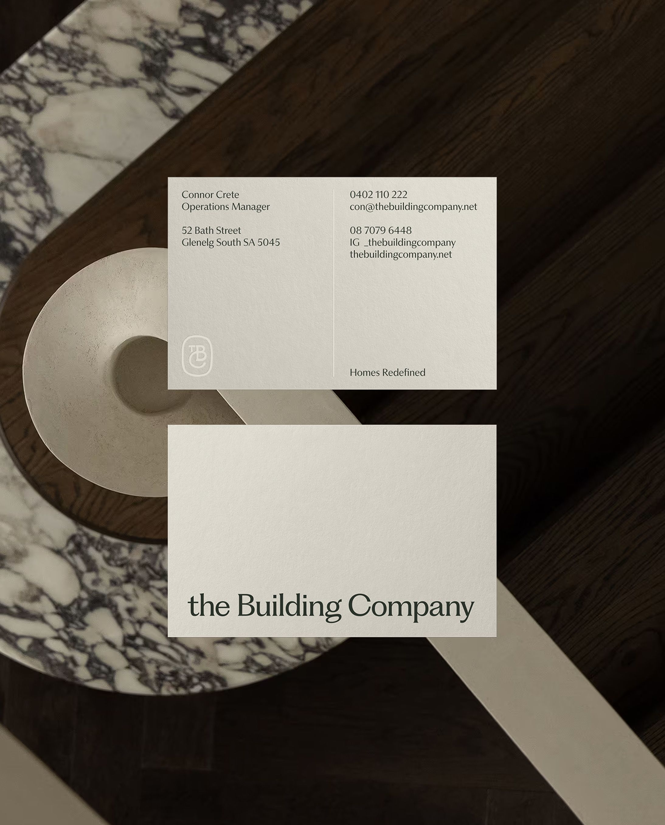
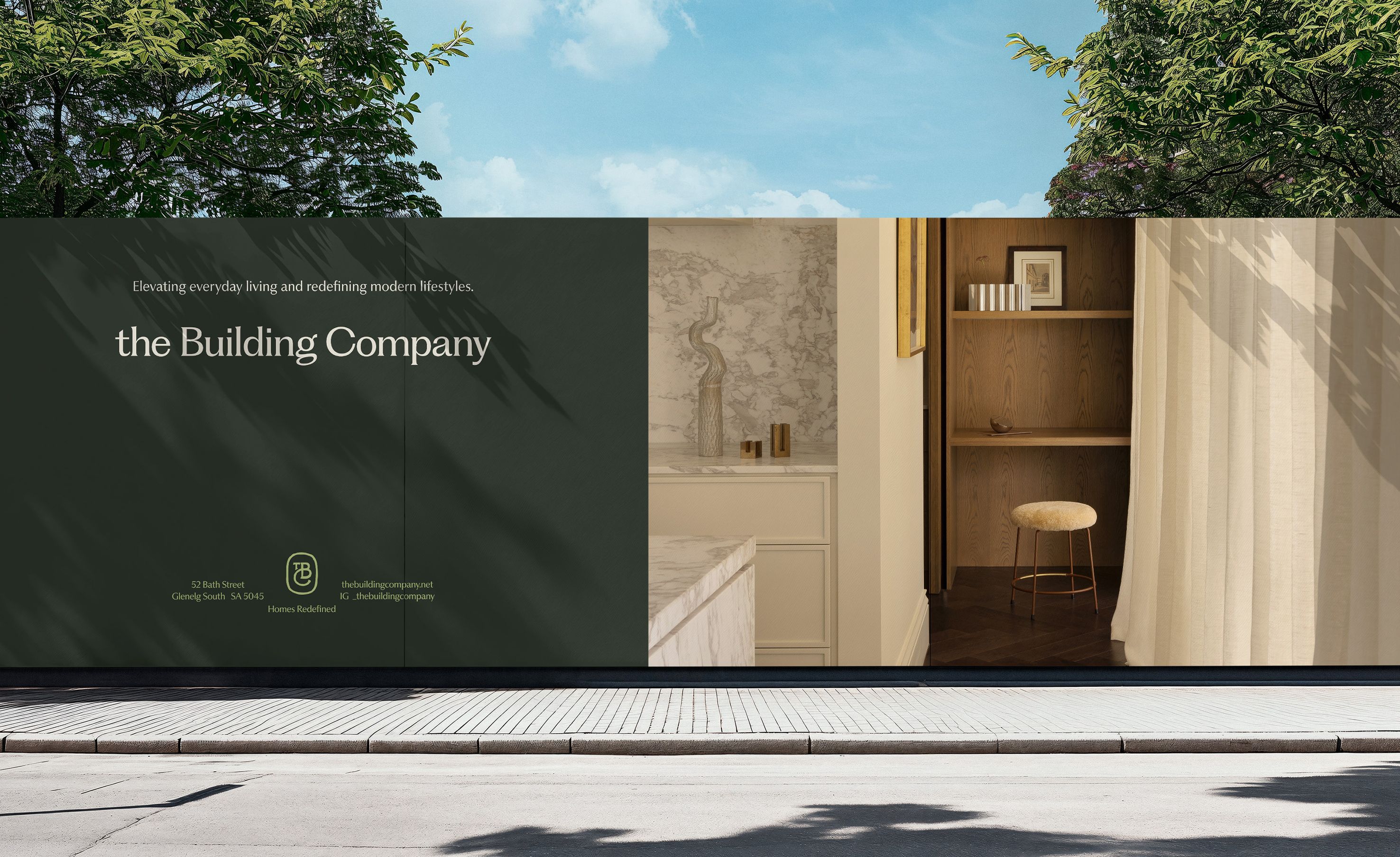
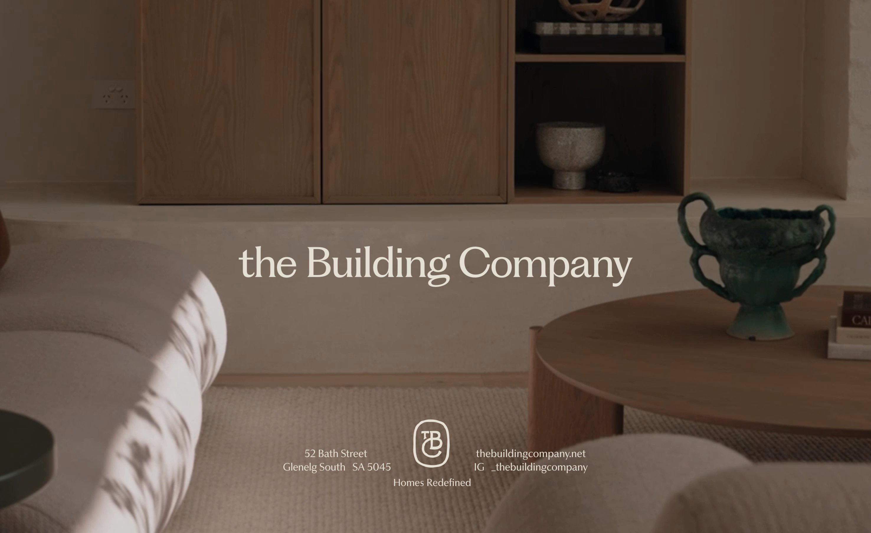
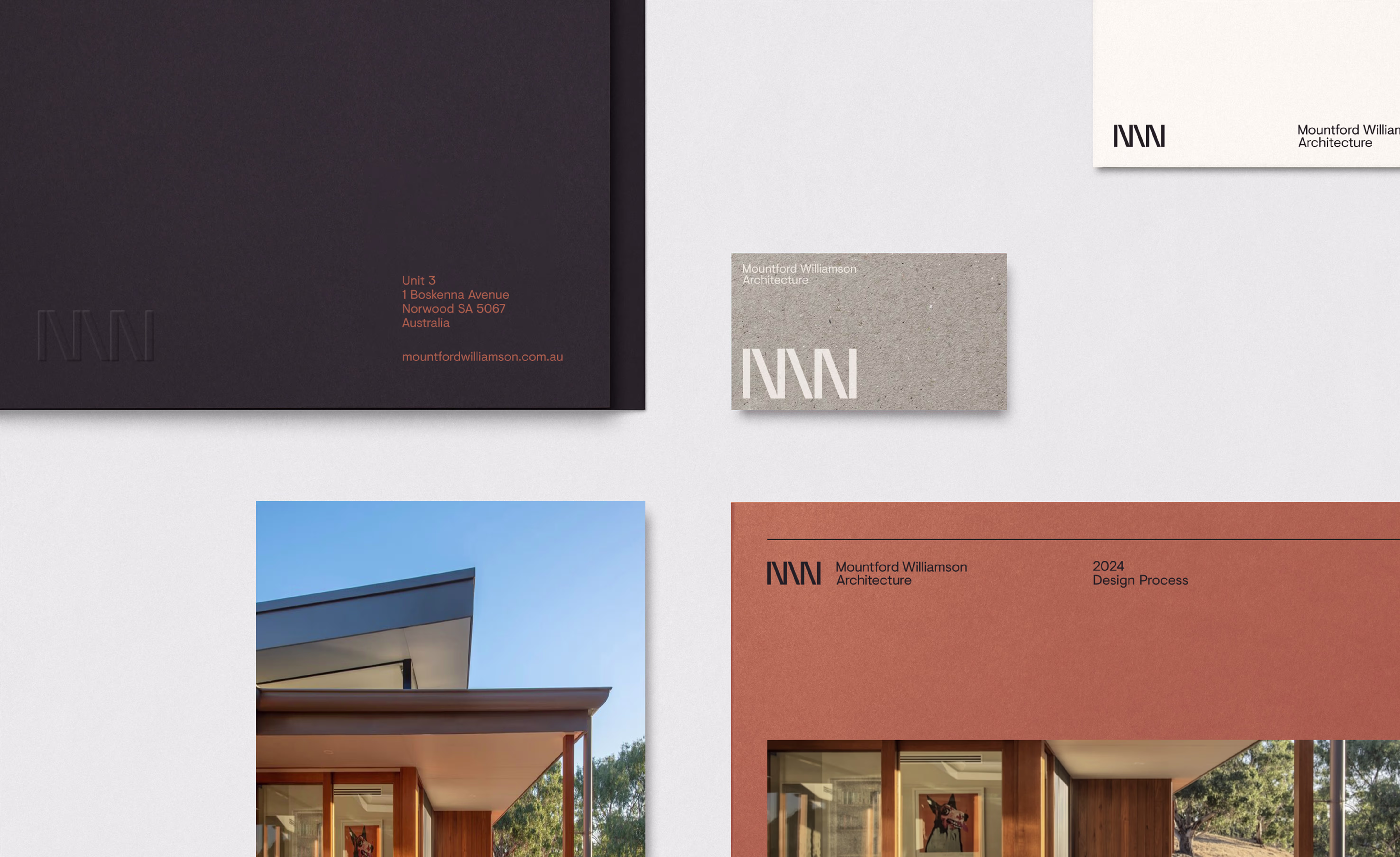
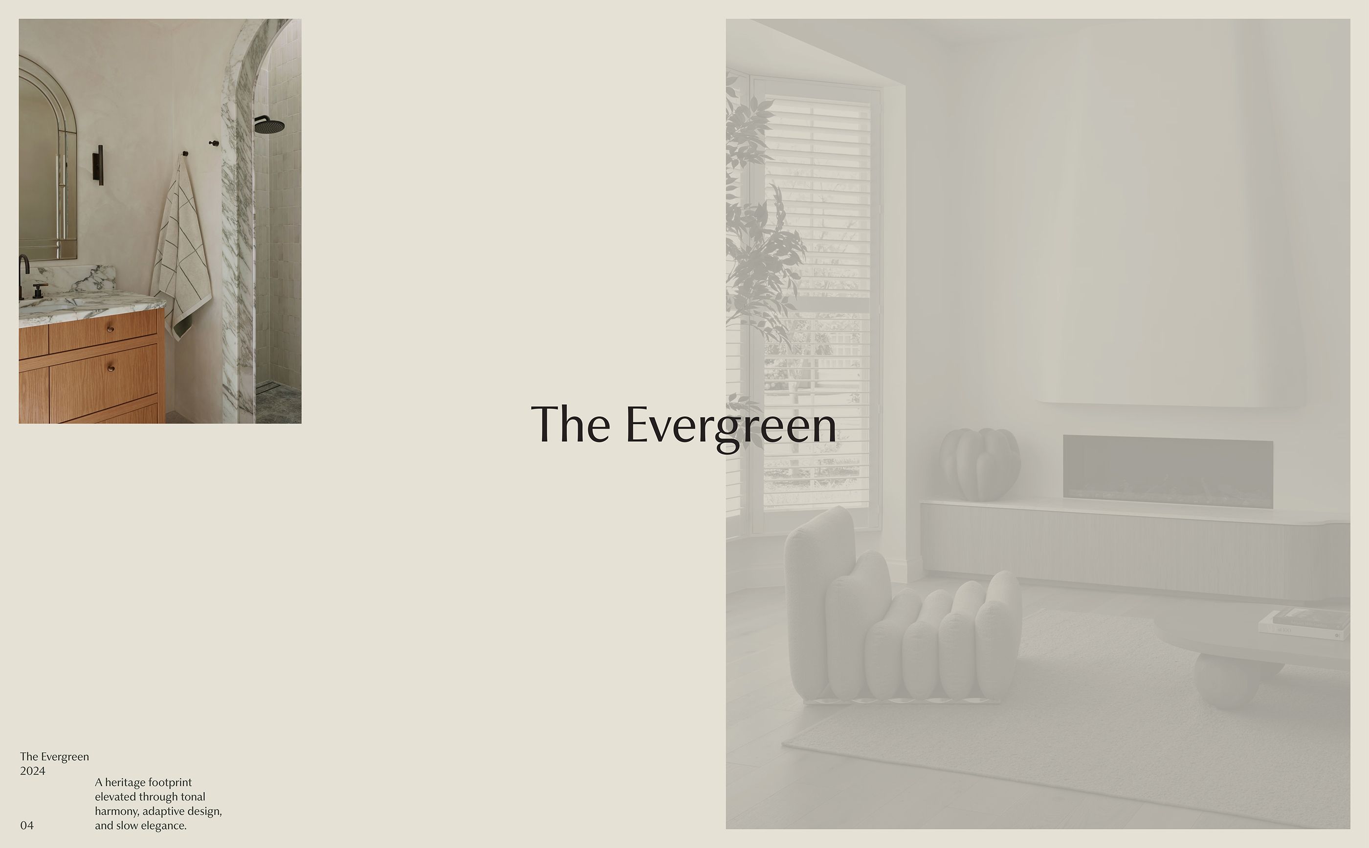
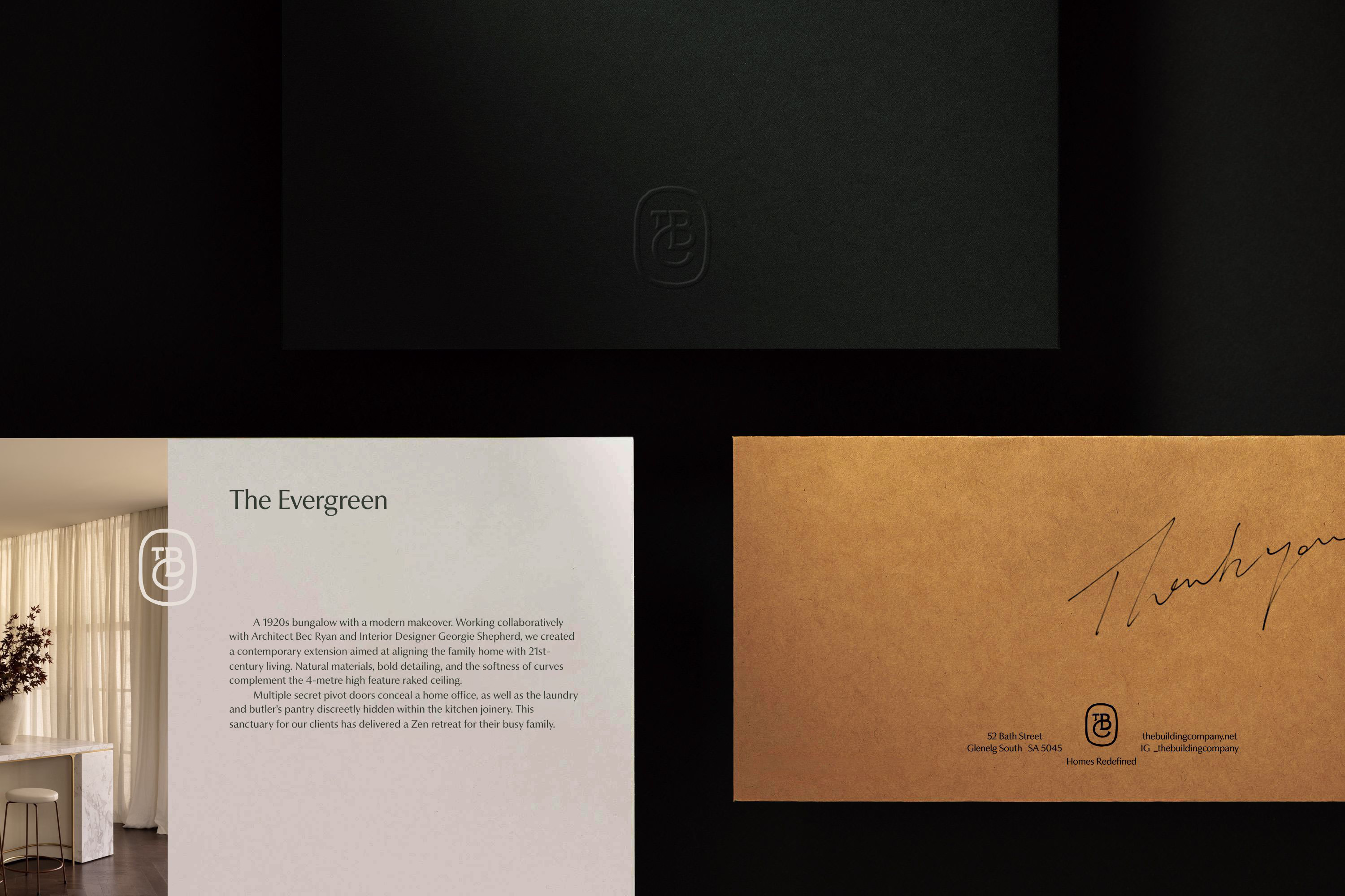
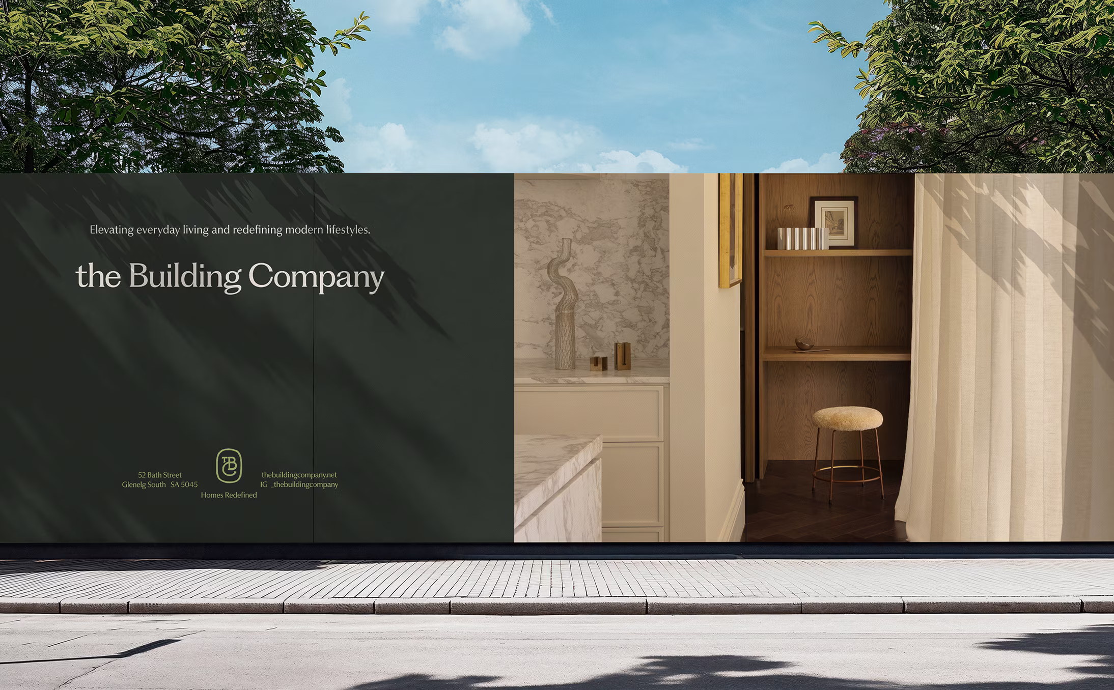
At the heart of the new brand sits a sculptural serif wordmark—an identity built to endure. Balanced and elegant, it speaks to the company’s heritage of craftsmanship while signalling ambition for the future. This elevated design language ensures that every touchpoint, from the website to the builder’s mark on a project, communicates quality and refinement. The wordmark isn’t just visual; it’s symbolic of The Building Company’s philosophy—precision in detail, beauty in proportion, and the belief that every home should feel extraordinary.

The Building Company was entering a new phase of growth. Despite a strong reputation, its brand identity no longer matched the calibre of its work. The challenge was to evolve and modernise the brand while preserving authenticity — honouring its history while positioning the business for long-term success.
A closer examination of the brand’s presence across every touchpoint revealed the need for clearer and more consistent visual and verbal language. The goal was to reinforce trust, elevate perception, and build a cohesive foundation that could support future expansion. Ultimately, the brand needed to reflect the company’s high standards and growing influence within the industry.
Through workshops and research, we clarified the company’s positioning and strategy, revealing what truly set it apart: an unwavering commitment to craft, quality, and client experience. This strategic clarity guided the creative direction.
A sculptural serif wordmark was developed as the anchor of the new identity, complemented by a bespoke maker’s mark symbolising craftsmanship and legacy. The refined colour palette—drawing inspiration from natural and luxury materials — introduced warmth, depth, and flexibility across all physical and digital applications.
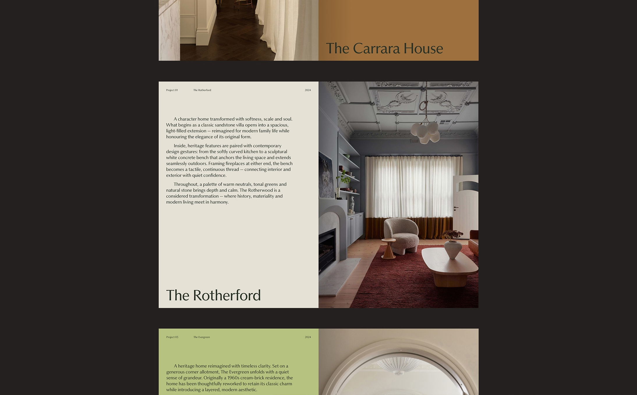
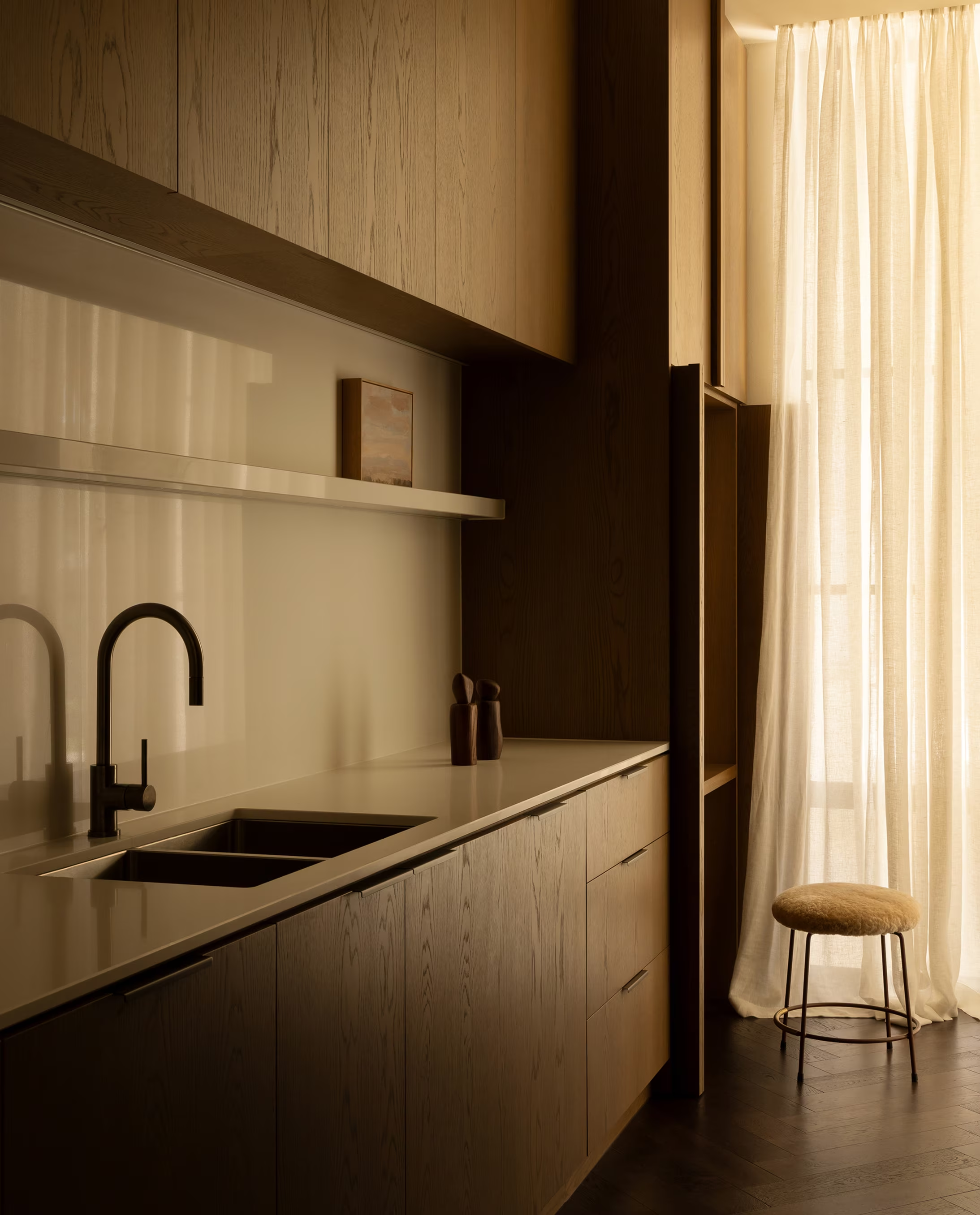
The website and brand assets were crafted to balance understated elegance with expressive character. A curated library of project imagery showcased both heritage and ambition, ensuring the brand confidently communicates the company’s position as a leader in high-end building and construction.
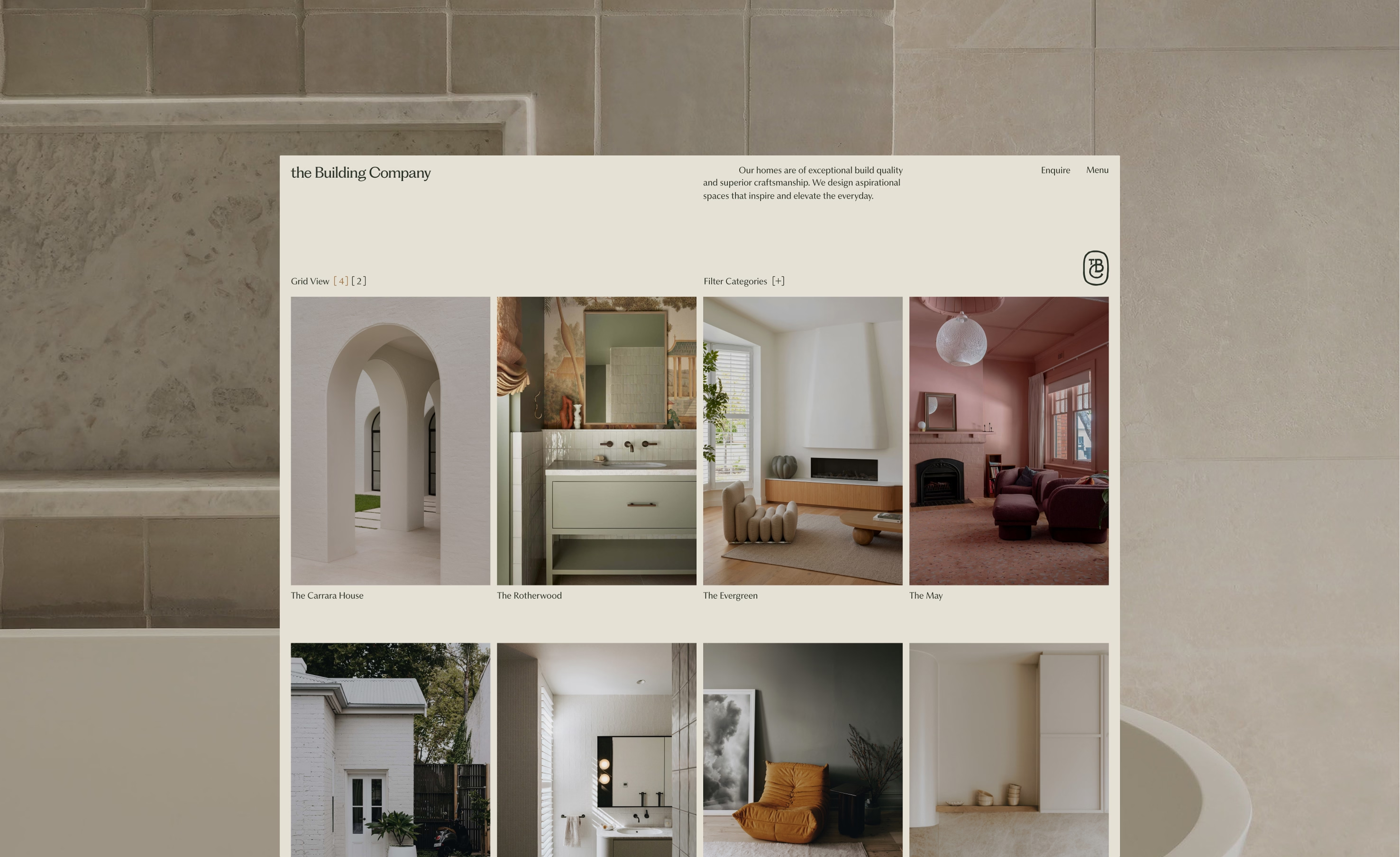
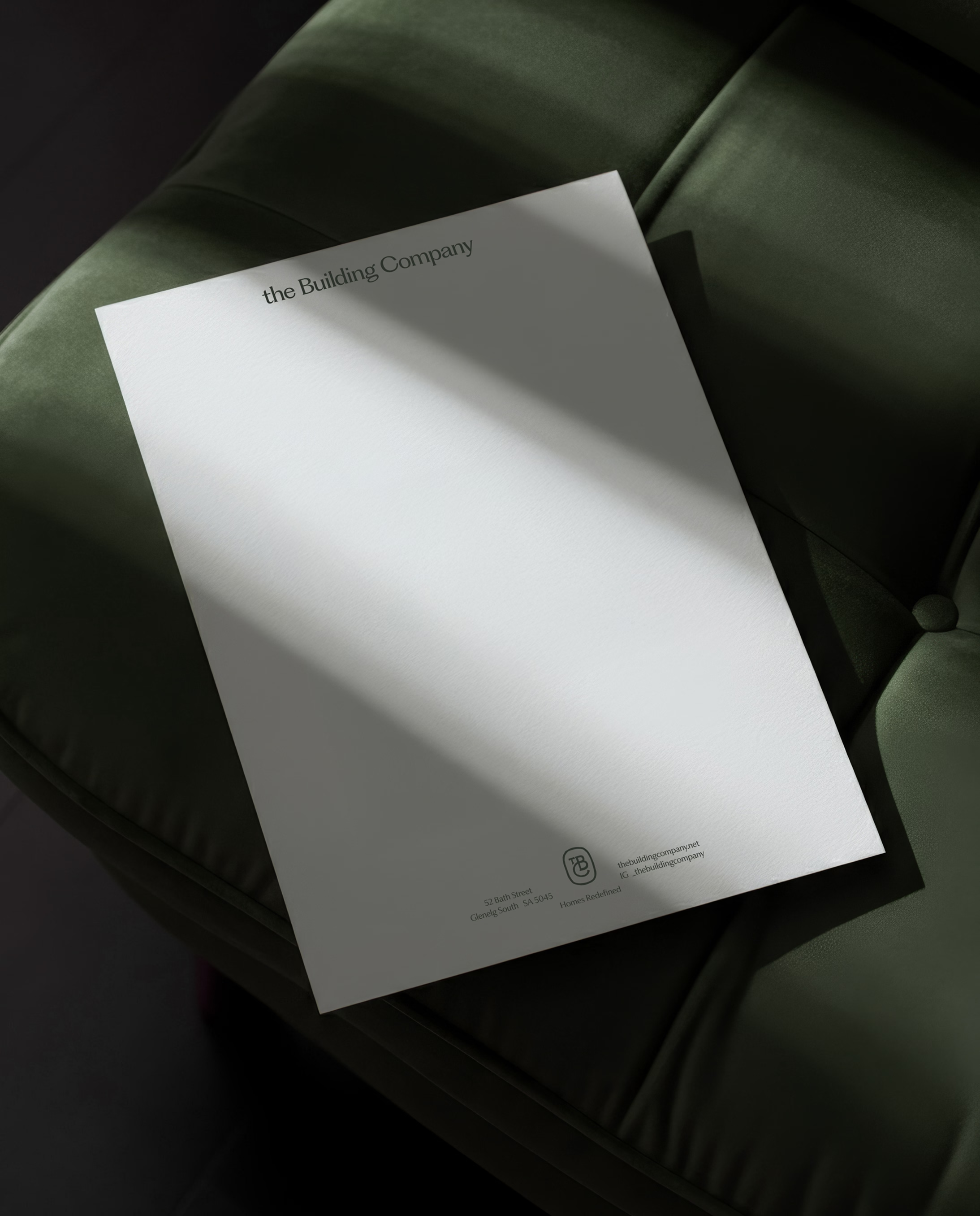

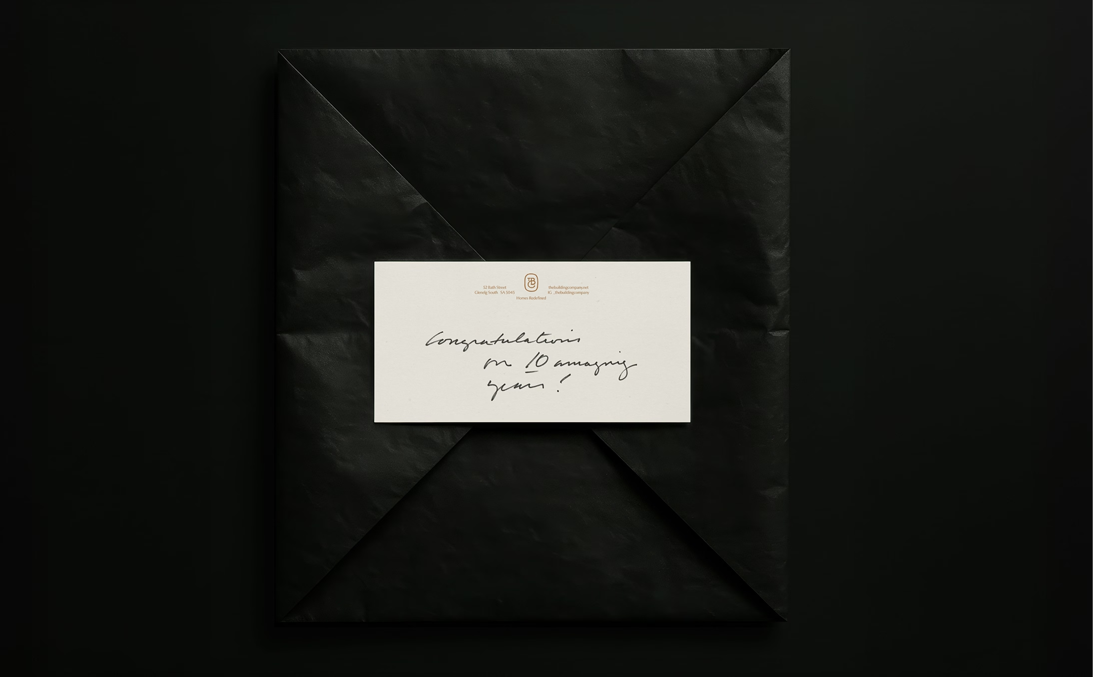
The maker’s mark is more than a symbol it’s a signature of excellence. Designed as a monogram, it embodies the individuality, care, and authenticity The Building Company brings to each project. Used across print, digital, and built environments, the mark acts as a stamp of assurance, connecting clients directly with the company’s ethos of superior craftsmanship. It adds a distinct layer of recognition and ownership, ensuring the brand is not only seen but remembered. This visual device deepens the brand’s story while celebrating its enduring dedication to craft.
For The Building Company, brand is no longer just a logo or a website — it is a system that reflects craft, signals quality, and supports future growth. The new brand identity ensures the business looks and behaves at the level it builds, reinforcing its position in the high-end construction sector.
AADC Award Finalist - Brand Identity: Small Boutique
AADC Award Finalist - Digital Design